
- DAU Stories
- UI Design Thoughts
- UI Design Issues
- ---
- UI Design Blinks 2013
- UI Design Blinks 2012
- UI Design Blinks 2011
- UI Design Blinks 2010
A Skype Story of Mappings, Standards, and Modes
By Gerd Waloszek
The Story
Recently, I installed Skype on my Apple Macintosh and eagerly awaited my first incoming call. And then it came, with an alarming ring and a floating window on the screen, asking me to accept the call or reject it. And what did I? I rejected it – probably, because the Reject button (Ablehnen) was on the right side (see figure 1).
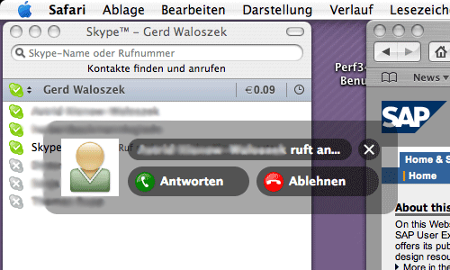
Figure 1: Floating window for accepting (left) or rejecting (right) a Skype call
But on that side, or better, in the right corner, is the default button on the Mac (see figure 2). And for good reason, dear Windows users (what I am at work, too...), because if you are using the mouse with your right hand, you typically "park" the mouse pointer more to the right of the screen and move it to the left when needed. At least I do so, even though I am originally left-handed – and it's much faster than a left default button. Should I mention that the Accept button (Antworten) has a green and the Reject button a red label? Even these strong visual cues did not work for me, when I'm in a hurry.
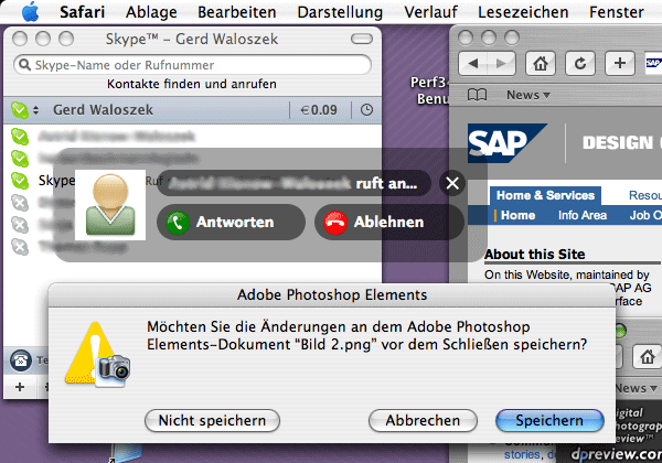
Figure 2: And here is the reason, why I failed – the Macintosh's convention for placing the default button to the right
In his book The Design of Everyday Things, Don Norman talks a lot about natural mappings and how they affect our interactions with everyday things, such as faucets or screws. Probably because I am left-handed, I never know in which direction I have to turn them for the desired result. The question arises, and of course Norman discusses this, when can a mapping be regarded as "natural" and when not? For a Windows user, the Skype button layout seems "natural," because in Windows the default button is in the left corner of popups (see figure 3).
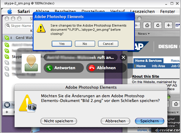
Figure 3: In Windows, the convention for the default button in popups is "the other way round"
For a Mac user, however, it is not, and even strong cues, such as the icons and their colors, may not help to "override" his "default" behavior. So what can we do about such problems? According to Norman, there is a "last resort" to mapping problems: cultural constraints and standards. If a "natural" mapping is lacking, operations may be standardized so that they are the same everywhere. None of the possible options may be better, only important is, that the standard (or convention) is the same everywhere. That's at least the theory. However, driving and – as we just saw – operating systems are examples of standards that seem to be obeyed universally – but there is a tiny French village that dares to oppose it (or a tiny fraction of computer users who own a Mac, or a not so tiny fraction of people who drive on the left side of the street instead of the right one, etc.).
Let me conclude this short story with a side-step, which touches upon another topic discussed by Don Norman in his book, modes. Modes have been blamed for long in the UI field. "Don't mode me in!" was a motto for making designers aware of the issue. But sometimes, there are limits to what a designer can do. One variant of mode-related errors is that users temporarily forget, which application they are in. This happens to me particularly when I am using graphic applications: I tend to click controls that actually are part of the image (on-screen instructions are another kind of this breed). In my case, I had loaded figure 2 into Adobe Photoshop, had processed it, and wanted to close the file. A popup window appeared that looked exactly the same as the one in the image, apart from that it could be used, and it even covered up the other one more or less completely. Isn't that weird??? Probably, the one or the other user may have also problems with situations, such as shown in figure 3 (thanks to Parallels Desktop) ...
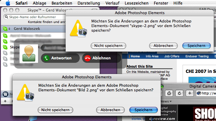
Figure 4: Can you tell, which popup is part of the image and which is a real one?
Then I decided, I should top this, move the "real" popup to the side, and take another screenshot (see figure 4). Can you tell which popup is in the image and which is the real one? Actually, as frozen in figure 3, both are in the image...
Conclusion
Finally, I asked myself, is it only me who commits such errors? Luckily not. As my wife received her first Skype call, she made the same error. She is right-handed, though – and a Mac user. And, of cause, she is NOT color-blind – color-blindness is the privilege of men as we all know...
References
Don Norman (2002). The Design of Everyday Things. Basic Books. ISBN: 0465067107
Originally Published: 02/07/2007 - Last Revision: 01/31/2009
|
Gerd Waloszek |
made by |