
- DAU Stories
- UI Design Thoughts
- UI Design Issues
- ---
- UI Design Blinks 2013
- UI Design Blinks 2012
- UI Design Blinks 2011
- UI Design Blinks 2010
UI Design Blinks 2011 – Overview
By Gerd Waloszek
 Welcome
to this column of brief, blog-like articles about various UI design topics – inspired
by my daily work, conference visits, books, or just everyday life experiences.
Welcome
to this column of brief, blog-like articles about various UI design topics – inspired
by my daily work, conference visits, books, or just everyday life experiences.
As in a blog roll, the articles are listed in reverse chronological order.
See also the overviews of UI Design Blinks from the years 2010, 2012, and 2013.
2011 Blog Roll
November 29, 2011: Bike Speedometers and Some Worst-Case Use Cases (or Scenarios)
 For
quite a while now, SAP User Experience has been promoting use cases as
an indispensable tool for the UCD (user-centered design) process. Others
favor less formal approaches such as text- or sketch-based scenarios. The "standard" example
of use cases in the literature is the automatic teller machine (ATM) – a
hardware device, not a software application. This tells us that use cases
and scenarios can be applied more generally than just to software applications.
Here, I will follow that vein and look for them in the realm of bike speedometers
(or bike computers, as some say...). I will investigate whether the designers
of these devices really had all the possible worst cases in mind that can
happen to a "dumb" user like me. ...
For
quite a while now, SAP User Experience has been promoting use cases as
an indispensable tool for the UCD (user-centered design) process. Others
favor less formal approaches such as text- or sketch-based scenarios. The "standard" example
of use cases in the literature is the automatic teller machine (ATM) – a
hardware device, not a software application. This tells us that use cases
and scenarios can be applied more generally than just to software applications.
Here, I will follow that vein and look for them in the realm of bike speedometers
(or bike computers, as some say...). I will investigate whether the designers
of these devices really had all the possible worst cases in mind that can
happen to a "dumb" user like me. ...
November 16, 2011: Technology Serves People???
 In
a blog entry in 2007 (the blog is called "bokardo"), Joshua Porter
describes five design principles, one of which is: "Technology serves humans.
Humans do not serve technology." This principle is only one of many variations
of a general theme concerning the relationship between technology and people.
Actually, I would rather phrase it as "technology should serve people" or "technology
is there to serve people". Twice a year, however, I feel that the principle
is only partially true at best – when we put our clocks forward in
March and back in late October. Changing my clocks just a few weeks ago
inspired me to write this UI Design Blink. ...
In
a blog entry in 2007 (the blog is called "bokardo"), Joshua Porter
describes five design principles, one of which is: "Technology serves humans.
Humans do not serve technology." This principle is only one of many variations
of a general theme concerning the relationship between technology and people.
Actually, I would rather phrase it as "technology should serve people" or "technology
is there to serve people". Twice a year, however, I feel that the principle
is only partially true at best – when we put our clocks forward in
March and back in late October. Changing my clocks just a few weeks ago
inspired me to write this UI Design Blink. ...
October 18, 2011: Processing "pour l'art"!
 In
a number of UI Design Blinks published last year, I reported on my experiments
with Processing, a Java-based programming language for designers.
At that time, I had used it to create chart types that were not available
in Microsoft Excel or, as I found out in the course of my experiments,
would have been available if I had rearranged the data appropriately. This
time, I would like to report on another type of experiment, namely "re-creating" computer
art. My story goes like this. ...
In
a number of UI Design Blinks published last year, I reported on my experiments
with Processing, a Java-based programming language for designers.
At that time, I had used it to create chart types that were not available
in Microsoft Excel or, as I found out in the course of my experiments,
would have been available if I had rearranged the data appropriately. This
time, I would like to report on another type of experiment, namely "re-creating" computer
art. My story goes like this. ...
October 12, 2011: A Matter of (Visual) Perception...
 Just
before I went on my summer vacation, SAP Corporate Portal received a facelift.
Before I left, I was able to check briefly that there were no severe issues
with our Portal pages. Of course, I would need to perform more careful
checks once I was back in the office. Among other things, the redesign
included changes to the third-level navigation on the left and the teasers
on the right: Both columns now have a white background, and various elements
such as header bars, selections, and separator lines appear in different
shades of gray. Therefore, I changed the background and header bar colors
of our manually-created teasers accordingly – the navigation is out
of my scope – and also applied the respective changes to further
internal SAP UX sites that mimic the Portal's look. ...
Just
before I went on my summer vacation, SAP Corporate Portal received a facelift.
Before I left, I was able to check briefly that there were no severe issues
with our Portal pages. Of course, I would need to perform more careful
checks once I was back in the office. Among other things, the redesign
included changes to the third-level navigation on the left and the teasers
on the right: Both columns now have a white background, and various elements
such as header bars, selections, and separator lines appear in different
shades of gray. Therefore, I changed the background and header bar colors
of our manually-created teasers accordingly – the navigation is out
of my scope – and also applied the respective changes to further
internal SAP UX sites that mimic the Portal's look. ...
Don't Take My 4:3 Monitor Away from Me – or Perhaps You Can? Looking at the Options for Portrait Monitors, and My Conclusions
August 11, 2011:  In
three UI Design Blinks, I discuss whether I should fight for my trusty
old 4:3 monitor or move over to a current 16:9 full-HD, wide-screen monitor.
As I have already outlined, a portrait monitor would be an interesting
option for my workplace, too. As a first step, I investigated and reported
in a previous UI Design Blink whether modern pivot LCD monitors (pivot
monitors can be rotated by 90 degrees) exhibit the same drawbacks I experienced
several years ago. I found that in modern monitors, orientation effects
caused by the microstructure of the LDC pixels cells are only minor and
acceptable. In this, my final UI Design Blink on this subject, I move to
the second step and present the results of tests that were geared to my
own use cases at work and conducted with monitors of different aspect ratios
in portrait mode. And finally, I present my conclusions. ...
In
three UI Design Blinks, I discuss whether I should fight for my trusty
old 4:3 monitor or move over to a current 16:9 full-HD, wide-screen monitor.
As I have already outlined, a portrait monitor would be an interesting
option for my workplace, too. As a first step, I investigated and reported
in a previous UI Design Blink whether modern pivot LCD monitors (pivot
monitors can be rotated by 90 degrees) exhibit the same drawbacks I experienced
several years ago. I found that in modern monitors, orientation effects
caused by the microstructure of the LDC pixels cells are only minor and
acceptable. In this, my final UI Design Blink on this subject, I move to
the second step and present the results of tests that were geared to my
own use cases at work and conducted with monitors of different aspect ratios
in portrait mode. And finally, I present my conclusions. ...
What Is a Usability Issue?
 August
10, 2011: At a recent team meeting, my colleague Theo Held reported
on his visit at the UPA International 2011 conference in Atlanta, GA,
where he had attended an interesting panel discussion led by Rolf Molich
from dialogdesign in
Denmark. In his panel, entitled "The Evaluator Effect Revisited
(CUE-9)", Molich demonstrated that when usability experts watch
the same usability test sessions and write reports about their findings,
depending on the evaluator, the number, type, priority, and severity
of findings will be extremely variable. Theo remarked that even opinions
on successful completion were highly controversial. ...
August
10, 2011: At a recent team meeting, my colleague Theo Held reported
on his visit at the UPA International 2011 conference in Atlanta, GA,
where he had attended an interesting panel discussion led by Rolf Molich
from dialogdesign in
Denmark. In his panel, entitled "The Evaluator Effect Revisited
(CUE-9)", Molich demonstrated that when usability experts watch
the same usability test sessions and write reports about their findings,
depending on the evaluator, the number, type, priority, and severity
of findings will be extremely variable. Theo remarked that even opinions
on successful completion were highly controversial. ...
Don't Take My 4:3 Monitor Away from Me – or Perhaps You Can? Checking the Feasibility of Portrait Monitors
 August
9, 2011: In a previous UI Design Blink, I complained about wide-screen
monitors, because they do not fit my use cases at work. But obviously
there are no other choices these days. Initially, it seemed to me that
all I could do was fight for my trusted 4:3 monitor to keep it on my
desk as long as possible. A closer look, however, revealed that the case
might merit reconsideration. Therefore, I will investigate this old issue
of mine, in this UI Design Blink, using LDC screens in portrait mode.
...
August
9, 2011: In a previous UI Design Blink, I complained about wide-screen
monitors, because they do not fit my use cases at work. But obviously
there are no other choices these days. Initially, it seemed to me that
all I could do was fight for my trusted 4:3 monitor to keep it on my
desk as long as possible. A closer look, however, revealed that the case
might merit reconsideration. Therefore, I will investigate this old issue
of mine, in this UI Design Blink, using LDC screens in portrait mode.
...
Don't Take My 4:3 Monitor Away from Me – or Perhaps You Can?
 August
9, 2011: There is something in front of me that is a rare species
these days: a 4:3 LCD monitor having a resolution of 1600 x 1200 pixels.
Some years ago, such monitors used to be the rule, but at a certain point
in time, the computer industry decided that computer users shall only
have wide-screen monitors. They started their "coup" somewhat
conservatively with 16:10 monitors, and in the end came up with 16:9
ones. Even the 16:10 monitors are now either unavailable or available
only at a premium price. ...
August
9, 2011: There is something in front of me that is a rare species
these days: a 4:3 LCD monitor having a resolution of 1600 x 1200 pixels.
Some years ago, such monitors used to be the rule, but at a certain point
in time, the computer industry decided that computer users shall only
have wide-screen monitors. They started their "coup" somewhat
conservatively with 16:10 monitors, and in the end came up with 16:9
ones. Even the 16:10 monitors are now either unavailable or available
only at a premium price. ...
Full Press Snap and Dumb Users Who Do Not Know Their Cameras...
 May
23, 2011: This UI Design Blink does not deal with computers. Instead,
it deals with digital cameras, or digicams for short. However, since
Alan Cooper's remarkable presentations at SAP we all know that digital
cameras are indeed computers. For example, they need some time to boot
when turned on. And the issues that I will present here definitely also
apply to computers and mobile devices. My digicam Ricoh GXR has a special
feature called full press snap (FPS) that can lead to confusion – this
is what I want to write about here. The feature was suggested to Ricoh
by a professional photographer who also insists that it should be turned
ON by default for speed of operation. I am a hobby photographer, a usability
professional, and also an advocate of "dumb" users. Therefore,
I maintain that this useful feature should be turned OFF by default.
...
May
23, 2011: This UI Design Blink does not deal with computers. Instead,
it deals with digital cameras, or digicams for short. However, since
Alan Cooper's remarkable presentations at SAP we all know that digital
cameras are indeed computers. For example, they need some time to boot
when turned on. And the issues that I will present here definitely also
apply to computers and mobile devices. My digicam Ricoh GXR has a special
feature called full press snap (FPS) that can lead to confusion – this
is what I want to write about here. The feature was suggested to Ricoh
by a professional photographer who also insists that it should be turned
ON by default for speed of operation. I am a hobby photographer, a usability
professional, and also an advocate of "dumb" users. Therefore,
I maintain that this useful feature should be turned OFF by default.
...
UI Guidelines Are a Developer's (or UI Designer's) Best Friends!
 April
13, 2011: This blink is a little different from my previous
ones. This time, I am not going to tell just another story about how
I struggled with a quirky user interface. Instead, I would like to spread
some propaganda about a topic that is not much in the limelight in times
of joy and fun: UI guidelines. We all know that UI guidelines do not
enjoy the best reputation. Some developers regard them as limiting their
creativity, others as too rigid, and still others as often incomplete
or even as unusable. Moreover, some developers regard UI guidelines people
as police officers who point to every error in the user interface and
punish it mercyless. But while some developers definitely have a negative
image of UI guidelines – and often include the people who create
them in this "love" – UI guidelines can also be seen
in a much more positive light. And this is what I would like to point
to in this UI Design Blink. ...
April
13, 2011: This blink is a little different from my previous
ones. This time, I am not going to tell just another story about how
I struggled with a quirky user interface. Instead, I would like to spread
some propaganda about a topic that is not much in the limelight in times
of joy and fun: UI guidelines. We all know that UI guidelines do not
enjoy the best reputation. Some developers regard them as limiting their
creativity, others as too rigid, and still others as often incomplete
or even as unusable. Moreover, some developers regard UI guidelines people
as police officers who point to every error in the user interface and
punish it mercyless. But while some developers definitely have a negative
image of UI guidelines – and often include the people who create
them in this "love" – UI guidelines can also be seen
in a much more positive light. And this is what I would like to point
to in this UI Design Blink. ...
Missing and Misleading Error Messages from a Bank Statement Printer...
April 12, 2011:  A
rule for good user interfaces is to design applications and Websites in
ways that errors cannot occur, instead of remedying bad design through
carefully crafted error messages. However, there will always be cases in
which errors happen. Here, we are at a point of decision: Should we still
stick to our strategy of not sending error messages and treat the error
secretly – or should we send such messages and if so, should we inform
the users about what has really happened? In the following, I will present
an example that shows where the developers opted to baffle users.
A
rule for good user interfaces is to design applications and Websites in
ways that errors cannot occur, instead of remedying bad design through
carefully crafted error messages. However, there will always be cases in
which errors happen. Here, we are at a point of decision: Should we still
stick to our strategy of not sending error messages and treat the error
secretly – or should we send such messages and if so, should we inform
the users about what has really happened? In the following, I will present
an example that shows where the developers opted to baffle users.
Enriching and Not-So-Enriching Complexity
 March
24, 2011: In his Interactions article, Simplicity
Is Not the Answer, from 2008 (also found on his website), Don Norman
highlights that complexity is an ingredient of our world and enriches
it. He emphasizes that any interesting product mirrors this and has an
inherent complexity. In his new book, Living with Complexity,
from 2010, he adds that it is complexity that makes things interesting
for us. He also points out that most of us prefer a "medium" level
of complexity – too low means dull, too high means overwhelming
and frustrating. ...
March
24, 2011: In his Interactions article, Simplicity
Is Not the Answer, from 2008 (also found on his website), Don Norman
highlights that complexity is an ingredient of our world and enriches
it. He emphasizes that any interesting product mirrors this and has an
inherent complexity. In his new book, Living with Complexity,
from 2010, he adds that it is complexity that makes things interesting
for us. He also points out that most of us prefer a "medium" level
of complexity – too low means dull, too high means overwhelming
and frustrating. ...
The Plagues of Modern Times (1): Online Software Updates
![]() March
10, 2011: Every computer user who is connected to a network
(and who is not these days?) has probably had the following frustrating
experience: You start an application on your computer to do just one "small
thing" – it's only a matter of minutes or even seconds. But
instead of taking you straight to your task, the computer asks, or even
urges, you to install the latest updates from the Internet for the application
you just launched. Arrrggghhhh!!! The last thing that you want at this
moment is to wait for an uncertain – and often undisclosed – period
of time to perform an update that possibly involves a system restart
as well. ...
March
10, 2011: Every computer user who is connected to a network
(and who is not these days?) has probably had the following frustrating
experience: You start an application on your computer to do just one "small
thing" – it's only a matter of minutes or even seconds. But
instead of taking you straight to your task, the computer asks, or even
urges, you to install the latest updates from the Internet for the application
you just launched. Arrrggghhhh!!! The last thing that you want at this
moment is to wait for an uncertain – and often undisclosed – period
of time to perform an update that possibly involves a system restart
as well. ...
A Clash of Conceptual Models Leads to Credit Card Hassles...
 March
8, 2011: Don Norman spends a lot of time talking and writing
about conceptual models. Until just recently, I did not pay much attention
to them, although I am well aware of the fact that developers and users
think differently. The following episode, however, brought me into direct
contact with them.
March
8, 2011: Don Norman spends a lot of time talking and writing
about conceptual models. Until just recently, I did not pay much attention
to them, although I am well aware of the fact that developers and users
think differently. The following episode, however, brought me into direct
contact with them.
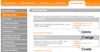
Some days ago, I found an e-mail from clickandbuy in my private e-mail inbox. It said that I should update my credit card data because the card would expire soon. So I went to their Website, logged on to the customers' area, and, following their instructions, navigated to the settings for the payment method. There, my old credit card was listed, and I clicked the "Ändern" (Change) link in order to edit the card's data and change them to my new card's data. However, on the screen that was then displayed, the card's type and number were set to read-only – I was only allowed to change the expiration date, the card security code (CVC), and my address data. ...
The Blessings of Auto-Complete
February 1, 2011:  Has
this happened to you, too? You find some strange e-mail in your inbox from
someone that you know and you wonder why on earth you received it. For
example, I exchange a lot of e-mail with my brother. One day, however,
I received an e-mail that was directed at his team at the university where
he works. I was puzzled and asked myself why I had received the e-mail
and what my brother wanted to tell me with it. When I sent him a "???" reply,
he responded that I had received the e-mail in error. Needless to mention,
this pattern repeats from time to time. ...
Has
this happened to you, too? You find some strange e-mail in your inbox from
someone that you know and you wonder why on earth you received it. For
example, I exchange a lot of e-mail with my brother. One day, however,
I received an e-mail that was directed at his team at the university where
he works. I was puzzled and asked myself why I had received the e-mail
and what my brother wanted to tell me with it. When I sent him a "???" reply,
he responded that I had received the e-mail in error. Needless to mention,
this pattern repeats from time to time. ...
Last Revision: 03/16/2014
|
Gerd Waloszek |
made by |