
- DAU Stories
- UI Design Thoughts
- UI Design Issues
- ---
- UI Design Blinks 2013
- UI Design Blinks 2012
- UI Design Blinks 2011
- UI Design Blinks 2010
UI Design Blinks 2013 – Overview
By Gerd Waloszek
 Welcome
to this column of brief, blog-like articles about various UI design topics – inspired
by my daily work, conference visits, books, or just everyday life experiences.
Welcome
to this column of brief, blog-like articles about various UI design topics – inspired
by my daily work, conference visits, books, or just everyday life experiences.
As in a blog roll, the articles are listed in reverse chronological order.
See also the overviews of UI Design Blinks from the years 2010, 2011, and 2012.
2013 Blog Roll
November 22, 2013: Thank You and Good-Bye!
 In
October 2010, I eventually came to the conclusion that I ought to join
a trend which, at the time, was no longer really new – and publish
a UI design blog. I already had some experience with writing blog-like
articles, because, between 2005 and 2007, I had published an internal SAP
design blog. However, with hindsight, the new articles, called "SAP
UI Design Blinks," were often much longer than what you would rightfully
expect from a blog...
In
October 2010, I eventually came to the conclusion that I ought to join
a trend which, at the time, was no longer really new – and publish
a UI design blog. I already had some experience with writing blog-like
articles, because, between 2005 and 2007, I had published an internal SAP
design blog. However, with hindsight, the new articles, called "SAP
UI Design Blinks," were often much longer than what you would rightfully
expect from a blog...
November 20, 2013: A Lesson from Colin Ware's Book Information Visualization
Information Visualization, Third Edition: Perception for Design by Colin Ware was the last book I reviewed for the SAP Design Guild website. In the final chapter, I hit upon a surprising figure for the capacity of our long-term memory, which inspired me to remember my roots in physics and attain a perspective based on the powers of ten. ...
October 24, 2013: A Tour de Force of Designers in the Software Realm
 In
various articles on this Website, I have discussed the different kinds
of design and designers. Therefore, a colleague asked me to describe them
in less than 500 words for an introductory article on the SAP UX Community.
However, I not only failed to comply with the 500 words limit, I also did
not bear in mind that the intended target audience knows very little about
design. So I went back to the drawing board. For this column, however,
my article seemed appropriate to me after some updates. So here is my personal
view of what kinds of designers populate the software world in (fairly)
short form. ...
In
various articles on this Website, I have discussed the different kinds
of design and designers. Therefore, a colleague asked me to describe them
in less than 500 words for an introductory article on the SAP UX Community.
However, I not only failed to comply with the 500 words limit, I also did
not bear in mind that the intended target audience knows very little about
design. So I went back to the drawing board. For this column, however,
my article seemed appropriate to me after some updates. So here is my personal
view of what kinds of designers populate the software world in (fairly)
short form. ...
October 17, 2013: Keyboard Schizophrenia...
 In
my previous UI Design Blink, I mentioned that columnist John Dvorak called
the integrated application Jazz "one of the great flopperoos in computing
history." In this Blink, I would like to complain about what I
myself find "one of the great flopperoos in computing." While
it seems to be only a "minor" and peripheral issue, it nevertheless
annoys me nearly every day...
In
my previous UI Design Blink, I mentioned that columnist John Dvorak called
the integrated application Jazz "one of the great flopperoos in computing
history." In this Blink, I would like to complain about what I
myself find "one of the great flopperoos in computing." While
it seems to be only a "minor" and peripheral issue, it nevertheless
annoys me nearly every day...
October 8, 2013: Milking the Wooly Sow for Eggs
 We
Germans have a name for something that "does everything": We
call it an eierlegende Wollmilchsau. That's an egg-laying, milk-giving,
wool-bearing sow. Such a sow would, of course, simplify a farmer's life
considerably. This is also the idea behind universal tools such as the
Swiss army knife, food processors, and other "all-in-one solutions." ...
We
Germans have a name for something that "does everything": We
call it an eierlegende Wollmilchsau. That's an egg-laying, milk-giving,
wool-bearing sow. Such a sow would, of course, simplify a farmer's life
considerably. This is also the idea behind universal tools such as the
Swiss army knife, food processors, and other "all-in-one solutions." ...
October 2, 2013: Making Life "Easier" on Vacations?
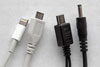 We
are constantly being told that technical devices make our lives easier
and more pleasant. We therefore accumulate quite a bunch of them during
our lifetime. As vacations are an important part of our lives, not surprisingly,
some of our devices come with us. In this UI Design Blink, I will not only
reveal, which devices my wife and I took with us on our recent vacation,
I will also discuss how these complied with the notion of "making
life easier." ...
We
are constantly being told that technical devices make our lives easier
and more pleasant. We therefore accumulate quite a bunch of them during
our lifetime. As vacations are an important part of our lives, not surprisingly,
some of our devices come with us. In this UI Design Blink, I will not only
reveal, which devices my wife and I took with us on our recent vacation,
I will also discuss how these complied with the notion of "making
life easier." ...
September 11, 2013: With a Smile on His (or Her) Face…
 In
the last few months, I've often had to take the bus instead of ride my
bicycle when commuting to work. During that time, I observed a lot of people
using their mobile or smart phones. I noticed again and again that people
started to smile when they picked up their phones, and while they talked
with their friends, relatives, or loved ones. Of course, I also observed
a number of incidents in which people were not friendly at all when talking
on their mobile phones. But as a general rule, I can state that the smiles
won hands-down. ...
In
the last few months, I've often had to take the bus instead of ride my
bicycle when commuting to work. During that time, I observed a lot of people
using their mobile or smart phones. I noticed again and again that people
started to smile when they picked up their phones, and while they talked
with their friends, relatives, or loved ones. Of course, I also observed
a number of incidents in which people were not friendly at all when talking
on their mobile phones. But as a general rule, I can state that the smiles
won hands-down. ...
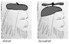
August 30, 2013: Swinging Between Designing the Big and the Small Things
![]() In
this UI Design Blink, I fit various puzzle pieces together to produce an
Aha! experience and the insight that I "knew it all along"...
I'm talking – in design terms – about tackling "big problems" versus
devoting one's attention to the "small ones" which were only
recently dubbed "microinteractions." ...
In
this UI Design Blink, I fit various puzzle pieces together to produce an
Aha! experience and the insight that I "knew it all along"...
I'm talking – in design terms – about tackling "big problems" versus
devoting one's attention to the "small ones" which were only
recently dubbed "microinteractions." ...
August 6, 2013: Coffee Machines, the Burdens of Experience, Resulting Mental Models, and a Lack of Attention – and the Role of Design
 Recently,
my team moved to a new building, meaning that we not only were confronted
with a new environment, but also with a new coffee machine. Actually, the
new machine is the same model as the ones I am used to. But, as always
and, as my story shows, the devil is in the details. ...
Recently,
my team moved to a new building, meaning that we not only were confronted
with a new environment, but also with a new coffee machine. Actually, the
new machine is the same model as the ones I am used to. But, as always
and, as my story shows, the devil is in the details. ...
August 1, 2013: Suggestions for Expanding Don Norman's New Version of His Book The Design of Everyday Things
 Just
recently, a colleague sent me an e-mail to point me to a new version of
Don Norman's all-time classic book The Design of Everyday Things and
also to a new training course developed by Udacity that is based on the
book. When I followed the link that he had sent me, I found out that the
book is now entitled, The Design of Everyday Things: Revised and Expanded
Edition, and that it will be published at the beginning of November
this year. So there is still some time left to speculate about how Norman
will revise and expand his book. ...
Just
recently, a colleague sent me an e-mail to point me to a new version of
Don Norman's all-time classic book The Design of Everyday Things and
also to a new training course developed by Udacity that is based on the
book. When I followed the link that he had sent me, I found out that the
book is now entitled, The Design of Everyday Things: Revised and Expanded
Edition, and that it will be published at the beginning of November
this year. So there is still some time left to speculate about how Norman
will revise and expand his book. ...
July 18, 2013: A Journey Across Touchpoints at Heidelberg Main Station
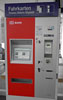 In
this UD Design Blink, I would like to tell a story that Milan Guenther
would probably characterize as a "journey across touchpoints." I
encountered this notion for the first time, while reading Guenther's book Intersection,
in which he writes about touchpoints and their orchestration, a new design
discipline. My personal journey was initiated by the simple task of buying
a train ticket and consisted of quite a few technical and human touchpoints,
and as always, it also involved a number of human and technical weaknesses.
...
In
this UD Design Blink, I would like to tell a story that Milan Guenther
would probably characterize as a "journey across touchpoints." I
encountered this notion for the first time, while reading Guenther's book Intersection,
in which he writes about touchpoints and their orchestration, a new design
discipline. My personal journey was initiated by the simple task of buying
a train ticket and consisted of quite a few technical and human touchpoints,
and as always, it also involved a number of human and technical weaknesses.
...
July 10, 2013: iPad Dog Salon
 When
you Google the words "iPad" and "children" plus "coloring" on
the Internet, the first hits you get are Web sites discussing "young
children's addiction to the iPad" and "the best drawing apps
for kids." Has the iPad led to children only wanting to draw and color
in the digital world? Nina Hollender would like to tell you a (true) story
that shows how an iPad can, in fact, inspire kids to draw and color the
traditional way, on paper. Read what Nina writes about her niece Josi and
her iPad dog salon prototype. ...
When
you Google the words "iPad" and "children" plus "coloring" on
the Internet, the first hits you get are Web sites discussing "young
children's addiction to the iPad" and "the best drawing apps
for kids." Has the iPad led to children only wanting to draw and color
in the digital world? Nina Hollender would like to tell you a (true) story
that shows how an iPad can, in fact, inspire kids to draw and color the
traditional way, on paper. Read what Nina writes about her niece Josi and
her iPad dog salon prototype. ...
July 2, 2013: An Introduction to Milan Guenther's Book Intersection and to the Enterprise Design Framework It Presents
 Currently,
I am in the process of reviewing Milan Guenther's book Intersection.
And as the review was getting longer and longer, I felt that I had to do
something to limit its length. One option was, to shorten the introduction
to the book. On the other hand, I also felt that the long version might
be interesting for other UI designers. I therefore decided to publish the
original version of the introduction with only minor adaptations as a UI
Design Blink. Here it is! ...
Currently,
I am in the process of reviewing Milan Guenther's book Intersection.
And as the review was getting longer and longer, I felt that I had to do
something to limit its length. One option was, to shorten the introduction
to the book. On the other hand, I also felt that the long version might
be interesting for other UI designers. I therefore decided to publish the
original version of the introduction with only minor adaptations as a UI
Design Blink. Here it is! ...
June 18, 2013: Another Sneak Preview of the Book Gamification at Work
![]() Gamification is
becoming a common buzzwords in business these days – and in
UI design as well. I first encountered the concept of gamification in more
detail at the Interaction 2012 conference in Dublin, Ireland. There,
Dustin DiTommaso held the presentation Beyond Gamification: Architecting
Engagement Through Game Design Thinking, in which he discussed self-determination
theory and laid out a seven-step "framework for success" in gameful
design. ...
Gamification is
becoming a common buzzwords in business these days – and in
UI design as well. I first encountered the concept of gamification in more
detail at the Interaction 2012 conference in Dublin, Ireland. There,
Dustin DiTommaso held the presentation Beyond Gamification: Architecting
Engagement Through Game Design Thinking, in which he discussed self-determination
theory and laid out a seven-step "framework for success" in gameful
design. ...
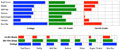
June 11, 2013: A Few Books and Links for Familiarizing Oneself with Charts and Dashboards (Data Visualization)
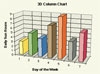 The
design of charts and dashboards is not usually included in books about
information visualization and is covered separately. Sometimes, this field
is referred to as "data visualization." Therefore, I'm following
this habit and am presenting the books around this topic that I came across
in a separate UI Design Blink. ...
The
design of charts and dashboards is not usually included in books about
information visualization and is covered separately. Sometimes, this field
is referred to as "data visualization." Therefore, I'm following
this habit and am presenting the books around this topic that I came across
in a separate UI Design Blink. ...
June 7, 2013: Some Books and Links for Familiarizing Oneself with Information Visualization
 Information
visualization is a fairly new research field attracting growing interest.
Since information visualization has always interested me, I have over the
years bought a couple of books about this topic, read some of them, reviewed
a subset of these, and also have some books still waiting for being read – and
perhaps reviewed. In this UI Design Blink, I would like to provide some
pointers to these books and to a few more. ...
Information
visualization is a fairly new research field attracting growing interest.
Since information visualization has always interested me, I have over the
years bought a couple of books about this topic, read some of them, reviewed
a subset of these, and also have some books still waiting for being read – and
perhaps reviewed. In this UI Design Blink, I would like to provide some
pointers to these books and to a few more. ...
June 6, 2013: Design Guidelines with a Backup in Research – Are There Any?
 UI
and visual design guidelines are not very popular these days and are therefore
often hidden behind labels such as "best practices." But I am
still convinced that UI design guidelines are a "developer's best
friends." Actually, they should be everybody's darling in the UI/UX
design field, because they are meant to support designers, not to constrict
their creativity. Often, however, the rationale for the guidelines is unclear.
Is a guideline backed up by research? Is it based on common sense? O does
it just follow arbitrary conventions? In fact, most UI guideline collections
are a mixture of all of these ingredients. In this UI Design Blink, I would
therefore like to point you to three attempts at basing UI design guidelines
on research findings. ...
UI
and visual design guidelines are not very popular these days and are therefore
often hidden behind labels such as "best practices." But I am
still convinced that UI design guidelines are a "developer's best
friends." Actually, they should be everybody's darling in the UI/UX
design field, because they are meant to support designers, not to constrict
their creativity. Often, however, the rationale for the guidelines is unclear.
Is a guideline backed up by research? Is it based on common sense? O does
it just follow arbitrary conventions? In fact, most UI guideline collections
are a mixture of all of these ingredients. In this UI Design Blink, I would
therefore like to point you to three attempts at basing UI design guidelines
on research findings. ...
May 29, 2013: Modern Technology Is so Fast! At least, in Theory...
 Today,
we are surrounded by digital technology like never before. Thanks to the
mobile trend, the services it provides are accessible nearly everywhere.
Not only is it at our command, it is also incredibly fast compared with
the old, mostly analog, technology that it has replaced. Thus, speed and
ubiquity of these devices make it easy and hassle-free for us today to
listen to music, watch videos and TV, or use the Internet with all its
possibilities whenever and wherever we want – at least, in theory
. ...
Today,
we are surrounded by digital technology like never before. Thanks to the
mobile trend, the services it provides are accessible nearly everywhere.
Not only is it at our command, it is also incredibly fast compared with
the old, mostly analog, technology that it has replaced. Thus, speed and
ubiquity of these devices make it easy and hassle-free for us today to
listen to music, watch videos and TV, or use the Internet with all its
possibilities whenever and wherever we want – at least, in theory
. ...
May 23, 2013: Human Memory Is Fallible...
 Many
years ago, a former university colleague of mine told me a nice story:
On a shopping trip, he went into a clothes shop, discovered a shirt he
liked, and spontaneously bought it. At home and in a good mood because
of his great purchase, he opened his wardrobe to hang up the shirt. ...
Many
years ago, a former university colleague of mine told me a nice story:
On a shopping trip, he went into a clothes shop, discovered a shirt he
liked, and spontaneously bought it. At home and in a good mood because
of his great purchase, he opened his wardrobe to hang up the shirt. ...
April 19, 2013: Spring Awakened My iPad – and Old Questions
 Back
when I eventually bought an iPad, I reported on my change of mind regarding
mobile devices in this column and promised to share my "mobile" experiences
from time to time. In my last iPad report in February 2013, I asked whether
the iPad, or any other tablet computer, is a productivity tool – or
whether it could at least be used as one, for example, for the same kind
of work done on a laptop computer or whether the iPad could even replace
a laptop. But despite some indicators that people also want to use their
tablet computers in productive ways, I found overwhelming evidence that
people in my vicinity (including myself) use their iPads primarily as a "tool
for consumption." Here, I will report on further evidence that, in
my opinion, confirms that tablet computers are primarily used as "consumption
tools." ...
Back
when I eventually bought an iPad, I reported on my change of mind regarding
mobile devices in this column and promised to share my "mobile" experiences
from time to time. In my last iPad report in February 2013, I asked whether
the iPad, or any other tablet computer, is a productivity tool – or
whether it could at least be used as one, for example, for the same kind
of work done on a laptop computer or whether the iPad could even replace
a laptop. But despite some indicators that people also want to use their
tablet computers in productive ways, I found overwhelming evidence that
people in my vicinity (including myself) use their iPads primarily as a "tool
for consumption." Here, I will report on further evidence that, in
my opinion, confirms that tablet computers are primarily used as "consumption
tools." ...
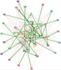
March 21, 2013: More on Multiple Skyline Graphs
 Quite
a few weeks have passed since my last UI
Design Blink about multiple skyline graphs. It was written in response
to Bill Caemmerer's reaction to my articles about skyline
graphs (graphs that convey relative and absolute changes) and, in particular,
to my attempt at multiple
skyline graphs. In the meantime, and as promised to Bill and my readers,
I have taken a closer look at his version of multiple skyline graphs – and
feel that the time has now come to share my insights. ...
Quite
a few weeks have passed since my last UI
Design Blink about multiple skyline graphs. It was written in response
to Bill Caemmerer's reaction to my articles about skyline
graphs (graphs that convey relative and absolute changes) and, in particular,
to my attempt at multiple
skyline graphs. In the meantime, and as promised to Bill and my readers,
I have taken a closer look at his version of multiple skyline graphs – and
feel that the time has now come to share my insights. ...
February 12, 2013: Is the iPad – or Any Other Tablet Computer – a Productivity Tool?
 It's
more than six months since I reported on my usage habits in the – for
me – new
mobile world (Retrospect
after Five Weeks of Owning an iPad, Now
I Know What "Cloud" Means). Some readers of this column might
therefore be wondering why there has been so little news in the meantime.
Actually, my summer vacation caused a major break in my publishing activities,
and, thereafter, I had so much other work to do that I found little time
for experimenting or being "productive" with my iPad. ...
It's
more than six months since I reported on my usage habits in the – for
me – new
mobile world (Retrospect
after Five Weeks of Owning an iPad, Now
I Know What "Cloud" Means). Some readers of this column might
therefore be wondering why there has been so little news in the meantime.
Actually, my summer vacation caused a major break in my publishing activities,
and, thereafter, I had so much other work to do that I found little time
for experimenting or being "productive" with my iPad. ...
February 1, 2013: Bill Caemmerer on Multiple Skyline Graphs
 You
may or may not remember that I attended the Interaction 2012 conference
in Dublin, Ireland last year. Not only did I write a report on
what I had seen at this conference, I also published two UI Design Blinks, Skyline
Graphs – New Insights on the Horizon... and More
Experiments with Skyline Graphs, about the topic of a presentation
that I was regrettably not able to attend: Bill Caemmerer's presentation Telling
the Data Comparison Story Using A Skyline Graph (Instead of Two Pies).
Luckily, an attendee told me about skyline graphs and briefly explained
the basic concept behind them to me. Yesterday, I received an e-mail from
Bill Caemmerer describing his latest investigations in multiple skyline
graphs – which were stimulated by my Blinks. ...
You
may or may not remember that I attended the Interaction 2012 conference
in Dublin, Ireland last year. Not only did I write a report on
what I had seen at this conference, I also published two UI Design Blinks, Skyline
Graphs – New Insights on the Horizon... and More
Experiments with Skyline Graphs, about the topic of a presentation
that I was regrettably not able to attend: Bill Caemmerer's presentation Telling
the Data Comparison Story Using A Skyline Graph (Instead of Two Pies).
Luckily, an attendee told me about skyline graphs and briefly explained
the basic concept behind them to me. Yesterday, I received an e-mail from
Bill Caemmerer describing his latest investigations in multiple skyline
graphs – which were stimulated by my Blinks. ...
January 15, 2013: A New Approach to the Gamification of Websites – Finding the Relevant Content
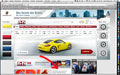
Many people still believe that everything on the Web should be free. Others regard the Web as a money-printing machine that will make people who take their chances rich. In fact, I would not be too surprised if, one day, we had to start paying for useful content instead of obtaining it free of charge. But even today, free Web content already comes at a price in many cases. The price that you may have to pay is that you have to look very hard to find relevant content on a page. In this UI Blink, I take a look at this trend and come to a surprising conclusion. ...
Last Revision: 05/29/2016
|
Gerd Waloszek |
made by |