
- DAU Stories
- UI Design Thoughts
- UI Design Issues
- ---
- UI Design Blinks 2013
- UI Design Blinks 2012
- UI Design Blinks 2011
- UI Design Blinks 2010
UI Design Blinks 2013
By Gerd Waloszek
 Welcome
to this column of brief, blog-like articles about various UI design topics – inspired
by my daily work, conference visits, books, or just everyday life experiences.
Welcome
to this column of brief, blog-like articles about various UI design topics – inspired
by my daily work, conference visits, books, or just everyday life experiences.
As in a blog roll, the articles are listed in reverse chronological order.
See also the overviews of Blinks from others years: 2010, 2011, 2012.
November 22, 2013: Thank You and Good-Bye!
In October 2010, I eventually came to the conclusion that I ought to join a trend which, at the time, was no longer really new – and publish a UI design blog. I already had some experience with writing blog-like articles, because, between 2005 and 2007, I had published an internal SAP design blog. However, with hindsight, the new articles, called "SAP UI Design Blinks," were often much longer than what you would rightfully expect from a blog...
Actually, were were not the ones who referred to the blinks as a blog. I myself regarded them more as a "column" in the traditional sense. I know that the following is an oversimplification, but, for me, a typical blog is something in which people write about how they got out of bed, whom they met, what they encountered in the course of the day, and what thoughts all this inspired. Thus, it is the events of the day that drive bloggers. Of course, this was never my intention when I conceived the blinks. In the same way as in my internal articles, I wanted to report on personal encounters with hardware and software issues and, in so doing, shed some light on the complex interplay between designed artifacts and human beings with their strengths and limitations – by being a user advocate and often taking over the role of a DAU (dumbest assumable user).

With this intention in mind, I was not able to follow a strict publishing schedule for the blinks (if I didn't want to accumulate stories for later use...). Instead, I had to wait until I encountered design issues, was "kissed" by inspiration, or hit on interesting thoughts, for example, in books that I reviewed. In some cases, I also had to conduct some research or experimentation for the blink, which also took time. For me, this uncertainty was not only challenging, but it was also part of the game. In the end, I was confident that, one day, the next topic would emerge "out of the blue," but I never knew when it would happen. And sometimes, several incidents happened all at once, leading to the effect of one blink running straight into the next...
With a small tear in my eyes, I have to concede that this is definitely the final UI Design Blink that I will write for the SAP Design Guild Website. Perhaps I will feel inspired to revive the blinks in a private format some day. But, for the time being at least, I would like to take a breather and relax for a while. Not that that will prevent me from encountering a lot more design issues in the future, as experience shows...
Finally, I would like to say good-bye and once again thank all our visitors most sincerely for their trust in and loyalty toward the SAP Design Guild Website (which is no longer availabe...)!
P.S.: I decided to republish my UI Design Blinks with minor adaptions on my walodesign Website. I also republished the above-mentioned SAP-internal articles with slightly stronger adaptations on this site. For more infomation, see page walodesign Columns - Overview.
November 20, 2013: A Lesson from Colin Ware's Book Information Visualization
Information Visualization, Third Edition: Perception for Design by Colin Ware was the last book I reviewed for the SAP Design Guild Website (no longer available). In the final chapter, I hit upon a surprising figure for the capacity of our long-term memory, which inspired me to remember my roots in physics and attain a perspective based on the powers of ten. Ware points out that:
- "Using a reasonable set of assumptions, Landauer (1986) estimated that only a few hundred megabytes of information are stored over a lifetime."
For my journey across the powers of ten, I make a simplifying assumption, namely that we store 400 megabytes over a lifetime. I do not think that this assumption is critical, because I am only interested in the overall pattern. After all, a real physicist never worries about a factor of two or three...
Here is my "storage powers of ten" table with some numbers, factors, examples, and comments:
| Bytes | Factor (Brain) | Factor (Page) | Examples | Comment |
| 4 KB | 0.00001 | 1 |
Amount of RAM in my first computer; text-only book page (2,000 double-byte characters) | I use double-byte characters in this table to simplify the calculations |
| 40 KB | 0.0001 | 10 |
Storage size for a typical Web photo (600*450 pixels, low-quality JPEG compression) | This may serve as an example of a low resolution image. |
| 400 KB | 0.001 | 100 |
100 text-only book pages; text for my father's autobiography; an early floppy disk for the Apple Macintosh | My father typed his autobiography on an MSDOS computer. It uses only a thousandth of our memory's capacity. I added photos to it at a later stage. |
| 4 MB | 0.01 | 1,000 |
Storage size for a typical digital photo (10 megapixels, JPEG compression); amount of RAM in my Apple Macintosh SE30 | Compare this with our brain... |
| 400 MB | 1 | 100,000 |
Information stored in human memory over a life-time; 100 typical digital photos; 100,000 text-only book pages; a CD (approximately...) | This is the starting point for everything , the storage needed for a lifetime of experiences... |
| 4 GB | 10 | 1,000,000 |
Typical amount of RAM in a laptop computer; USB memory stick (small); SD card; 100,000,000 text-only book pages; a DVD (approximately) | |
| 400 GB | 1,000 | 100,000,000 |
100,000 typical digital photos; a typical hard disk in a laptop computer | |
| 4 TB | 10,000 | 1,000,000,000 |
Traces that we leave during our lifetime on the Internet (Marc Smith,
2006); 1,000,000 typical digital photos; a large hard disk |
Actually, when Marc Smith made this remark at a conference that I attended in Bonn, Germany, in 2006, I believed that he was underestimating the storage space needed... |
| 40 TB | 100,000 | 10,000,000,000 |
Storage space required for video life logging (Alan Dix has noted that even 70 years of high-quality video recording would require something less than 30 terabytes of storage; after O'Hara et al., 2008) | This is about how much storage space one would need for video lifelogging – 100,000 times the amount of what our memories require... |
For those who find the brain's capacity somewhat disappointing, Ware explains that "the power of human long-term memory, though, is not in its capacity but in its remarkable flexibility. The reason why human memory capacity can be so small is that most new concepts are made from existing knowledge, with minor additions, so there is little redundancy. The same information is combined in many different ways and through many different kinds of cognitive operations. ... Human long-term memory can be usefully characterized as a network of linked concepts." Hopefully, there are not too many tautological circles in our networks...
There also seems to be a purely visual memory in our brain, but since 100 digital photos require the same storage capacity as a human memory over a lifetime would do, we can conclude that the images stored in long-term memory cannot be detailed (though we can store 10,000 small Web photos). Ware points out that visual long-term memory does not have the network structure of verbal long-term memory and that "the power of images is that they rapidly evoke verbal-propositional memory traces." Thus, an image can rapidly evoke numerous remembrances, which is an experience that we all know well...
All in all, I would be able to store the life-time memories of a thousand people on my laptop's hard disk (512 GB), which is not such a pleasant thought for me... And I remember that artificial intelligence pioneer Marvin Minsky once stated that he would love to dump his brain on a CD to achieve eternal life. When I read this, I believed that a CD would never suffice for the content of a brain. Regrettably, I was not able to find his original statement when preparing this Blink, but I found an interview with him, in which he confirms that a CD (650 MB) would suffice for a brain dump. In the meantime, however, Ware had already convinced me that it could be done – at least, in terms of storage capacity...
References
- Colin Ware (2012). Information Visualization, Third Edition: Perception for Design. Morgan Kaufmann • Review
- Kieron O'Hara, Mischa M. Tuffield & Nigel Shadbolt (2008): Lifelogging: Issues of Identity and Privacy with Memories for Life
- Renato M.E. Sabbatini (1998): The mind, artificial intelligence and emotions – Interview with Marvin Minsky
October 24, 2013: A Tour de Force of Designers in the Software Realm
In various articles on the SAP Design Guild Website (no longer available), I have discussed the different kinds of design and designers. Therefore, a colleague asked me to describe them in less than 500 words for an introductory article on the SAP UX Community. However, I not only failed to comply with the 500 words limit, I also did not bear in mind that the intended target audience knows very little about design. So I withdrew the article and went back to the drawing board. For this column, however, the article seemed appropriate to me after some updates, even though I "stole" the beginning from a book review and have written about the topic before. So here is my personal view of what kinds of designers populate the software world in (fairly) short form – and please excuse some repetitions.
When I was young, there were only three design disciplines I was aware of: fashion design, product or industrial design, and graphic design. Naive as I was at the time, I understood the first to be responsible for fashionable clothes, the second for the design of cars, vacuum cleaners, Scandinavian furniture, and so on, and the third for book illustrations, stamps, and advertising. Today, there are design disciplines galore. Particularly in the software world, we find designers who specialize in, say interaction design, user interface (UI) design, user experience (UX) design, graphic/visual design, Web design, as well as design thinkers, to name just the most prominent ones. I would therefore like to shed some light on this variety and look for differences as well as commonalities.
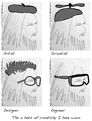
Figure 1: Designers may feel differently and may also have a different background (image from my review of The Plenitude)
First of all, the names of the types of designers are neither exclusive, nor do they necessarily reflect everything they do. So keep in mind that my characterizations will unavoidably be gross oversimplifications.
Interaction designers (interaction design, IxD) typically design physical devices, albeit with a lot of software "under the hood" these days. Their focus is on how people "interact" with their designs. Typical applications are museum installations and prototypical devices to explore ideas with people. Some interaction designers (the research through design, or RTD, proponents) claim that this is a viable way of doing research. Often, these designers have an art school background and some of them also feel a bit like artists. Others, like the "critical designers," also feel and act as provocateurs. They often explore future scenarios and want to make people think – and to persuade them to change their behaviors (persuasion/persuasive design).
User interface designers (UI design) typically design user interfaces for software applications. Some people say, they just put controls on screens and arrange them to optimize the users' workflow. Good UI designers, however, think holistically, design the complete interaction of users with their software, and take care of the context in which it is used (they think about use cases and scenarios, and prototypical users or personas). Not surprisingly, some UI designers therefore call themselves interaction designers (think of Cooper Interaction Design, now just Cooper). UI designers often have a background in computer science or cognitive psychology – they feel more like researchers or engineers than artists.
(User) experience designers (UX design) can be regarded as a more recent breed of UI (and interaction) designers who put the user's overall experience with a system at the center of their design efforts. This, again, requires a more holistic view. A user's experience can be good or bad, and, of course, the preferred outcome is that it is good or satisfying. This approach is, of course, not limited to software; it can be applied to any man-made artifacts, to processes such as services (service design), and even to organizational structures (organizational design).
Visual/graphic designers style the visual aspects of products or software applications, be they static or, increasingly, dynamic: colors, forms, shapes, transitions, movements, and more are their realm. Many visual designers, however, do not want to be constrained to the design of visual aspects only. They also address interaction aspects and regard themselves as interaction designers. When they are, for example, involved in the design of screen controls, they are indeed doing interaction design. In contrast to UI and UX designers, most visual designers have an art-related background and feel a little bit like artists, although there are also many self-made designers in this realm.
Web designers were initially regarded as a kind of visual designers who specialize in Web pages. However, with the evolution of the Web into a dynamic medium, the boundaries between Web, UI, and visual designers get more and more blurred. Nonetheless, their technical domain is the Web and, increasingly, mobile apps are based on Web technology. Web design, too, attracted and still attracts many self-made designers...
Design thinkers, that is, proponents of the design thinking approach, encourage designers to bring their methods into the business world – by either taking part in business processes themselves or by training business people to use design methods. They maintain that "everyone is a designer," which makes some professional designers frown because people may conclude that they are no longer needed. And much like already reported for UX designers, for design thinkers there are almost no limits to applying their approach (except for some reservations on including designers in the team at all...).
So, now it is up to you to choose what kind of designer you want to be. But whatever job title you will have on your business card, in your professional life you will probably get involved in most of the topics listed above...
References
- September 1, 2012: Design Thinking, Interaction Design, and UI Design (UI Design Blink)
- Milan Guenther (2012). Intersection: How Enterprise Design Bridges the Gap between Business, Technology, and People. Morgan Kaufmann • ISBN-10: 0123884357, ISBN-13: 978-0123884350 • Review
- Rich Gold (2007). The Plenitude: Creativity, Innovation, and Making Stuff. The MIT Press • ISBN-10: 0262072890, ISBN-13: 978-0262072892 • Review
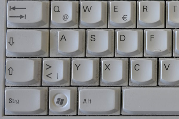
October 17, 2013: Keyboard Schizophrenia...
In my previous UI Design Blink, I mentioned that columnist John Dvorak called the integrated application Jazz "one of the great flopperoos in computing history." In this Blink, I would like to complain about what I myself find "one of the great flopperoos in computing." While it seems to be only a "minor" and peripheral issue, it nevertheless annoys me nearly every day...
The Background Story
Long ago, maybe in 1984, when the Macintosh entered the market, but maybe even earlier with the arrival of the Lisa, Apple decided to deviate from the standard computer keyboard and introduced the "Command" ("Cmd") and "Option" keys as substitutes for the "Control" ("Ctrl") and "alt" keys. (This probably "inspired" Microsoft years later to add the "Windows" key to their keyboards…) For many years, this "feature" did not bother me at all because I owned a Mac and used it exclusively.
Later, and for reasons unknown to me, Apple added a "ctrl" key to its keyboards and also an "alt" label to the "option" key (probably for design reasons, they labeled both in lower case; the "Cmd" key one day also got a lower case "cmd" label...). The presence of Apple's "ctrl" key remained a mystery to me for a long time. Apart from its use in some early and slow Windows emulators, it seemed to be useless on the Mac. However, when context menus became popular on the Windows platform, which were evoked with the right mouse button, Apple finally found a use for it: Since an Apple mouse has one button only, you press the "ctrl" key together with the mouse button to invoke the context menu. At some point in time, however, I decided to buy a non-Apple mouse with two buttons – and the need for the "ctrl" key workaround vanished for me.
 |
 |
Figure: Sections of Windows (left) and Apple (right) keyboards showing the differences in modifier keys and layout
Using Two Systems Alternatively or Even in Parallel
In the early 1990s, I found a job at SAP and had to switch to Windows computers at work. All of a sudden, an interaction element, which was targeted at proficient users and the use of which I had highly automated over the years, turned into a disaster for me: keyboard shortcuts. Whenever I switched between the computers at work and at home, I had to keep in mind – and in my hands or, more precisely, in my automatic motor programs – that I needed to use different modifier keys. For example, at work, I had to press "Ctrl-C" to copy something, and at home "Cmd-C" – and analogously for all the other keyboard shortcuts... Moreover, most of the modifier keys had different locations on the keyboards. It took me a long time to get back to speed and use keyboard shortcuts without errors.
Matters got even worse when Apple switched to Intel CPUs. Thanks to this move, using Windows on a Mac became feasible, using either Apple's Boot Camp solution or a virtual machine such as Parallels Desktop. With the latter, I am able to run both operating systems in parallel on my MacBook (I run Windows typically in a window) – and both use the Apple laptop keyboard. In my work, I often switch between both platforms, for example, to copy something from a Mac application and paste it into a Windows application. This required me to learn "useful" shortcut sequences, such as "Cmd-C + Ctrl-V" for a simple cut-and-paste operation. Actually, these keyboard and memory acrobatics drive me almost crazy. From time to time, I press the "Cmd" key when using Windows – and, to my dismay, the Windows 8 home screen appears and hides the desktop (it seems to emulate the "Windows" key...). I would be able to see the funny side were not me who was affected. And I wonder for how many more years I will need to cope with this absurdity.
More Issues...
But there are more keyboard-related issues, for example, the "Delete" key topic. On the Mac, you press the "Backspace" key to delete unwanted characters in a "backward" fashion. In Windows, you typically use the "Delete" key to delete them, albeit in a "forward" fashion. A backward delete using backspace may also be possible in some Windows applications, but does not seem to be popular. For deleting more complex entities, however, you have to press a "Cmd-Backspace" key combination on the Mac, whereas in Windows the "Delete" key alone does this job. Things became even more confusing when I started to connect my Mac to the SAP company network using a Citrix client, working within a Windows environment there. In this context, the "Delete" key is emulated by an "Fn-Backspace" key combination on my Mac. There may be logic behind all this, but it does not appear user-friendly to me...
Final Comments...
All of these examples share one common theme: The keyboard-related inconsistencies between operating systems (or working environments) prevent – for people who use more than one system – keyboard shortcuts from becoming what they are intended to be: fast routes for proficient users. These users have at least a hard time to work efficiently under such conditions. In other words: small cause, big impact.
I am unsure as to whether this "compatibility issue" is on anyone's radar at all – nobody seems to complain about it except me. But this cannot be true given the many "switchers" and people in a situation like me: different computers at home and work, different platforms on one computer.
Finally, think of the poor people who have to write computer documentation. A number of applications can be used in nearly identical form on both platforms. Most of the technical writers seem to feel that they have to document the keyboard shortcuts for both platforms – what a waste of time and effort (and documentation space). The same is true for platform-independent browser-based applications.
Admittedly, I would like to give Steve Jobs, or whoever was responsible for the decision to modify the Apple keyboard, a good shaking. Probably, pure marketing considerations were the reason for this decision (or was it arrogance?). But regrettably, Steve no longer is with us...
October 8, 2013: Milking the Wooly Sow for Eggs
We Germans have a name for something that "does everything": We call it an eierlegende Wollmilchsau. That's an egg-laying, milk-giving, wool-bearing sow. Such a sow would, of course, simplify a farmer's life considerably. This is also the idea behind universal tools such as the Swiss army knife, food processors, and other "all-in-one solutions." By the way, in this article I will use the acronym "ElWoMS" to refer to this concept.

Figure 1: My interpretation of the eierlegende Wollmilchsau (ElWoMS) using an image from an old biology textbook
Naturally, the "all-purpose" concept also spread to the software world, for example, in the form of so-called "integrated applications." The short-lived Jazz office suite – columnist John Dvorak called it "one of the great flopperoos in computing history" – was an early instance of this on the Apple Macintosh. Microsoft Office is another one and is still "the reference" for integrated applications, although – in contrast to Jazz – it consists of a bundle of separate applications. One might also regard a single application like Microsoft Word as an "ElWoMS" – albeit one with a smaller scope – because Word attempts to be "everybody's darling" by offering functionality for all the potential uses that might emerge in the realm of text processing. And, last but not least, the SAP Business Suite is also a highly integrated system, this time on a much larger scale, offering an extensive range of business functionality within one coherent framework.
Integration has a lot of advantages, but it also has severe drawbacks. People bemoan, among others, the complexity of all-embracing applications and application suites and criticize that essential, or the just needed, functionality is buried within huge menu structures and therefore hard or even impossible to find. Quite often, people don't even know what functions are available. Therefore and quite naturally, a counter-movement emerged: simple applications that serve just one purpose. For example, extremely simple applications that allow you to compose text without any distractions such as formatting. On the other hand, they lack more advanced functionality and are thus limited in scope. The advent of mobile devices and their limited resources gave a strong boost to this approach: We entered the "age of the apps." Today, we have "apps" galore, many of them serving a single purpose or only a few purposes, and we can buy them online in app stores for just a few dollars or euros.
In her book The Mobile Frontier, Rachel Hinman declares "In mobile UX, applications are the star." And indeed, instead of zillions of menu commands in one application or application suite, we now have zillions, or at least tens to hundreds, of apps installed on our mobile devices – be they phones, tablets, or, in the near future, "intelligent" clocks and glasses. On my iPad, I have already accumulated four home screens with a total of 72 apps – and this number will definitely grow. Do I know on which screen I can find a certain app's icon to start the app? Of course not. I have to browse the home screens to spot the icon of the app that I need at the moment*. Are we just replacing one source of complexity with another?
For a while, I believed that documents are the important entities on my computer. They are the things that persist over the years, irrespective of computers, operating systems, and application versions (provided that there is an app that still can read them, which is another sad story...). I regarded applications just as the "tools" that I needed to manipulate them, but times – and opinions – seem to have changed. Considering what Hinman writes, I feel that, in the "brave new app world" of mobile computing, things have become even worse:
- "Because many mobile interactions are inherently ephemeral and have no output – no file to save and store – the application becomes a natural set point for the interaction. Files that are created as output on a mobile device, such as pictures taken with a camera phone, are usually saved in either the application itself or a 'space' strongly associated with the application (such as a gallery), reinforcing that the application is the set point of the experience, not the file."
Actually, these "jealous" apps drive me and many other mobile users crazy. Burying documents within apps makes it hard or even impossible to exchange them between apps. Consequently, tool apps flourish that promise to perform such transfers easily – and lead to even more apps that you have to care for.
Conclusion
Complexity will be the death of ElWoMSs, while the rise of mobile computing is bringing on a boom in small, single-purpose apps. But I doubt that, in the long run, this change will really take us any nearer "ease of use" (or whatever we call the idea that software simplifies our lives instead of making it more complex), particularly when we perform more complex and demanding tasks on our mobile devices. But I may well be wrong with my prediction – only the future will tell...
I am also worried about the "sustainability" of documents that are tied to potentially short-lived apps. My experience on desktop computers in this respect is not encouraging. There is no reason to expect any e better from mobile apps. Hinman does not seem to worry much about that because she focuses on mobile interactions that "are inherently ephemeral and have no output." Sadly, that's only half the story.
Comments
*) Of course, I could sort the apps into groups that make more sense to me, but this is cumbersome on the iPad. It seems to be easier using iTunes, but till I started writing this article, I was too lazy**. Anyway, I am skeptical whether such an arrangement would last for long. On my Macintosh and Windows computers, the computer from time to time "helpfully" rearranges icons for me that I had laboriously arranged my own way on the desktop. It always takes me an awful lot of time to restore my own icon arrangement. So I hesitate to do any icon arrangement work on my iPad's home screens.
**) While writing this article, out of curiosity I made a first attempt at organizing my iPad apps using iTunes. It took me some time, but the effort was not excessive. (It would be for hundreds or thousands of apps...). I even discovered by accident that you can organize apps in folders. Now I am waiting to see how long my arrangement of app icons on five home screens (that’s one more than before) will last. It did survive the update from iOS 6 to iOS 7...
References
- Rachel Hinman (2012). The Mobile Frontier: A Guide to Creating Mobile Experiences. Rosenfeld Media • ISBN: 1-933820-55-1 (Paperback), ISBN: 1-933820-05-5 (Digital editions) • Description at Rosenfeld Media • Short presentation • Review
October 2, 2013: Making Life "Easier" on Vacations?
We are constantly being told that technical devices make our lives easier and more pleasant. We therefore accumulate quite a bunch of them during our lifetime. As vacations are an important part of our lives, not surprisingly, some of our devices come with us. In this UI Design Blink, I will not only reveal, which devices my wife and I took with us on our recent vacation, I will also discuss how these complied with the notion of "making life easier."
A Deceptively Small Collection
Apart from our two mobile phones, which I will not discuss here, our device collection for our vacation seemed to be fairly small: It comprised two cameras, one for each of us, and an iPad, which we wanted to use to store and preview the many photos that we would take, to store my wife's voice annotations, assuming she really would use her voice recorder (see Fitting a Device to Usage Habits – A Usability Lesson), to listen to music, and to stay connected with the rest of the world via e-mail and the Internet. The Internet was very important for us, as we wanted an up-to-date weather forecast (from three weather Websites so that we could pick the weather that suited us best...). But while these devices definitely made our vacation more pleasant, there was also a dark side to them – in fact, more than one dark side. In the following, I will shed some light on this "darkness."
The "Dark Sides"
The "darkness" refers to the sad fact that all three devices I mentioned above require that you take additional devices with you (by the way, the same is true for the mobile phones).
Firstly, you need extra devices to take full advantage of the iPad's capabilities: The iPad does not have a – for us – good enough loudspeaker for listening to music. So I took a small loudspeaker that I can connect to it. Thanks to Apple's "higher insights," the iPad does not allow you to connect USB devices other than cameras or SD cards to store data on it. So I purchased a storage device called iUSBPort that allows me to transfer my wife's voice annotations from her voice recorder to the iPad. Finally, if, like me, you did not buy the cellular version of the iPad, you also need a device to connect the iPad to the Internet, at least if you stay at a simple campsite where there is no WiFi. So I also took a MiFi device with me. All in all, instead of one device, I actually had four...
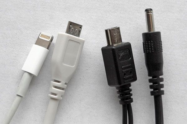
Figure 1: Plugs for connecting some of my devices with a USB charger
But there is more of the "dark": As Alan Cooper liked to point out already years ago, today's cameras are computers and need a battery to operate. Actually, apart from the voice recorder, all of the devices that I have mentioned so far have a built-in or extra battery that needs to be recharged. Four of my devices could, at least in theory, use the same USB charger, but each of them has a different cable and plug that connects to it (see Figure 1). This meant that we had to add a number of battery chargers to our luggage. For example, each camera uses a different battery, and because these batteries are not charged within the cameras – something some newer cameras do – every camera requires its own charger. Since these chargers need 220V, I also had to take a 12V to 220V converter with me. So we arrived at a total of five more devices and a number of cables for charging purposes (see the table below).
Finally, from a usability and "making life easier" point of view, the real bummer is that there were not even two devices that use the same conventions for charging the battery. To get an overview of the situation, I created the table below (to which I added my older camera, which nearly joined us, but was replaced with a newer "toy"):
| Device | Charging | Fully Charged | Low Battery (Incomplete) | Charger | Plug | Used? |
| iUSBPort (Storage) | Orange LED | Green LED | Shown on the LCD display | USB charger (not included with device) | Plug used for power supplies (rightmost in Figure 1) | No |
| Huawei MiFi E5331 | Blinking green battery symbol | Steady green battery symbol | Red battery symbol | USB charger* | Special plug, similar to mini USB (second from left in Figure 1) | Yes |
| x-mini loudspeaker | Red LED | Blue LED | Blue LED dims | USB charger (not included with device) | USB mini plug (third from left in Figure 1) | No |
| Ricoh GXR camera | Green LED | LED off | Shown on camera display (green battery symbol with three steps, turns to orange) | Special 220V charger plus 12V to 220V converter | 220V plug | No (not included) |
| Ricoh CX 4 camera | Orange LED | LED off | Shown on camera display (green battery symbol with three steps, turns to orange) | Special 220V charger plus 12V to 220V converter* | 220V plug | Yes |
| Leica X Vario camera | Red LED | Green LED | Shown on camera display (green battery symbol with three steps, turns to red and blinks) | Special 220V charger plus 12V to 220V converter* | 220V plug | Yes |
| iPad | Shown on iPad display (green progress bar in battery symbol, % value) | Ditto (progress bar is white when not charging; 100 %) | Shown on iPad display (progress bar is white in battery symbol when not charging; % value) | USB charger* | Special plug (Apple Lightning; leftmost in Figure 1) | Yes |
*) Included chargers etc.
The table above reveals that some of the chargers and devices indicate the state of the charging process using an LED. When the battery is charging, they glow in green, red, or orange. When the battery is full, the LED may turn to green, blue, or "off." A low battery is indicated in many different ways. Yes, there are two devices in the table that use an orange LED, but in one case, the LED turns to green when the battery is fully loaded, and in the other to "off" (which some other LEDs do as well).
My Personal Lament...
Who is not confused by all this variety? Who always knows when a battery has finished charging, or how much power it still has? Well, I do, but it took me a lot of effort to learn. It would probably have been a good idea to print the table and have it ready when one of the devices required recharging. Making life easier? That's laughable! Not at all! Why can't manufacturers agree on a standard for charging batteries and displaying their power level? After all, humans agreed – admittedly, more or less – to drive on the right, and thanks to this agreement we survive in the traffic jungle... I would have survived my vacation in much better shape if battery charging had been easier – and also if I had needed fewer devices to satisfy my needs.
I have just finished reading Dan Saffer's new book Microinteractions. It inspires me to frame displaying battery power level and charging progress as microinteractions. Obviously, the designers of the devices mentioned in this article conceived these as "signature moments," that is, as product differentiators and not as something that needs to be consistent and standardized...
P. S.: I would like to point out that, except for the addition of a camera to the table above (which might have been included in my vacation list), I have not made up this example – it is the simple truth (and, as indicated, the list is not even complete). I am also proud to point out that we do all the charging from our car battery: we do not use extra electricity.
References
- Dan Saffer (2013). Microinteractions – Designing with Details. O'Reilly Media • ISBN-10: 144934268X, ISBN-13: 978-1449342685 • Short presentation • Review
September 11, 2013: With a Smile on His (or Her) Face…
 In
the last few months, I've often had to take the bus instead of ride my
bicycle when commuting to work. During that time, I observed a lot of people
using their mobile or smart phones. I noticed again and again that people
started to smile when they picked up their phones, and while they talked
with their friends, relatives, or loved ones. Of course, I also observed
a number of incidents in which people were not friendly at all when talking
on their mobile phones. But as a general rule, I can state that the smiles
won hands-down.
In
the last few months, I've often had to take the bus instead of ride my
bicycle when commuting to work. During that time, I observed a lot of people
using their mobile or smart phones. I noticed again and again that people
started to smile when they picked up their phones, and while they talked
with their friends, relatives, or loved ones. Of course, I also observed
a number of incidents in which people were not friendly at all when talking
on their mobile phones. But as a general rule, I can state that the smiles
won hands-down.
This smile is not restricted to the use of phones, of course. The same things happens, for example, when my wife gets her camera ready to take a picture of me. After some fiddling around with her camera, there is a certain moment when she starts to smile. Over the years, I have learned that this is precisely the moment when I should smile as well, so that she can take a nice photo. But I think that this smile also expresses her enjoyment in taking a photo of me.
There are many more stories telling how technical devices, or products, make us smile when we use them. The advertising industry has been well aware of this phenomenon for a long time now, of course. There is not one advertisement, in which people are not smiling – well, OK, except maybe for the ads that are meant to intimidate us because we do not use a certain toothpaste or eat a certain company's health food… But this omnipresent smile is not what I want to point to here. The advertising industry has also learned to use more subtle marketing cues because these seem to be much more effective. Here is an example: Years ago, when my wife and I visited the Volkswagen Autostadt in Wolfsburg, Germany, we watched a video promoting the new Skoda Superb. It showed a man driving the car through Prague, who gradually started smiling, apparently because he really seemed to enjoy driving it. At least this was what the video wanted to convey to its audience…
The Superb example differs from the previous ones in that no other people are involved. Thus, the mere use of a technical device can make us smile, but obviously we smile even more if other people are involved – after all, we humans are a social species. The Superb video tries to suggest that using a certain product makes people smile. I am somewhat skeptical of this message although it might hold true in the case of "designer products" (which people are proud of to own). I believe that most mobile phone users don't actually care whether they use a Samsung, Nokia, or Apple phone. Contacting other people with ease – or just thinking of the person they are going to contact – makes them smile. The lesson for designers that I draw from all this is: If people smile using a product, the technology does not interfere with their needs and therefore plays a subordinate role. So the designers of such products can rest assured that they did their job well. They probably didn't attract people to that particular brand or product as such – they just made it easy for people to satisfy their needs.
 |
 |
 |
||
Figure 1-3: Figures revisited – A slight smile can be observed in front of an iPad…(click images for larger versions) |
||||
By the way, I see very few people smile in front of their desktop or laptop computers. Are we UI and UX designers doing something wrong?
August 30, 2013: Swinging Between Designing the Big and the Small Things
In this UI Design Blink, I fit various puzzle pieces together to produce an Aha! experience and the insight that I "knew it all along"... I'm talking – in design terms – about tackling "big problems" versus devoting one's attention to the "small ones" which were only recently dubbed "microinteractions."
Puzzle Piece #1: Dan Saffer and Design Thinking
At the Interaction 2012 conference in Dublin, Ireland, I attended Dan Saffer's 10-minute presentation (or should I say "performance"?) "How to Lie with Design Thinking" (see references below). After his presentation, I was very clear on one point at least: Dan Saffer does not like Design Thinking. At SAP, this direction – driven by the d.schools in Stanford and Potsdam – has attracted a great deal of attention and gained momentum. While I am not involved in any Design Thinking activities, I wrote an article about it on this Website to become more familiar with its much- heralded approach. But I have to admit that the spark has not yet jumped over and that I still observe Design Thinking from a distance. Promoters of this direction point out that Design Thinking brings the design approach into the business world. Thus, they "think big" and apply design methods to areas beyond its classic confines, thereby turning everyone into a designer.

Figure 1: Some of the inspirational sources for this UI Design Blink
Puzzle Piece #2: Thinking Big – The Role of Design in Society and Designing "Big Systems"
I have encountered two more instances in which, in my opinion, designers use the term "design thinking" but, in my opinion, not to mean the Design Thinking direction explicitly, but more generally to mean "thinking like a designer." In practice, this may not be too far away from what Design Thinking proponents have in mind... My first encounter of this kind happened when I reviewed Harold G. Nelson's and Erik Stolterman's book, The Design Way: Intentional Change in an Unpredictable World. This book advocates establishing design as a human tradition in its own right, on a par with other traditions such as arts and science. Since the authors highlight the role of design in society, I would hold that they too "think big."
Reviewing Milan Guenther's book, Intersection: How Enterprise Design Bridges the Gap between Business, Technology, and People, entailed another encounter with the trend of designers to "think big." Guenther's book addresses the redesign of enterprises, but its framework can be applied to any "big problem." Both encounters helped me broaden my horizon and my view of design, but they also made me feel somewhat uneasy in my role as a (UI) designer. Is "thinking big" really what I want to do as a designer?" I asked myself.
Puzzle Piece #3: Dan Saffer's Microinteractions
Once again, my inspiration stems from a book that I am currently reading for review: Dan Saffer's new and highly acclaimed Microinteractions: Designing with Details. At the time of writing this article, I have only read the first 20% of the book (in an e-book pages don't tell you much...), but I think that what I have read already suffices for a provisional fixing of my position as a designer.
In the preface to his book, Saffer explains why he decided to write a book about microinteractions:
"Over the last decade, designers have been encouraged to think big, to solve "wicked problems," to use "design thinking" to tackle massive, systemic issues in business and in government. No problem is too large to not apply the tools of design to, and design engagements can involve everything from organizational restructuring to urban planning. The results of this refocusing of design efforts are unclear. But by working at such a macro scale, an important part of design is often lost: the details that delight."
These words really struck a chord with me. Saffer summarizes my – and perhaps the overall – situation perfectly. It is not the "big picture" that attracts me as a designer: It is the details.
And now to this Column...
In his foreword to Saffer's book, Don Norman points out that designing satisfying microinteractions requires "great observational skills: watching people interact, watching yourself interact, identifying the pain points, ..., and then determining which things make sense to bring together." In my case, being more a writer than a practicing designer, it is often the second activity, watching myself interact and stumble, that provides inspiration for me. Sometimes, it is also my wife, my friends, or my colleagues. And as soon as I make such an observation, a new UI Design Blink is born, telling a story about the difficulties that humans have with technology, about people's weaknesses, and also about instances of mindless design, mostly at the level of microinteractions...
References
- Dan Saffer (2013). Microinteractions – Designing with Details. O'Reilly Media • ISBN-10: 144934268X, ISBN-13: 978-1449342685 • Short presentation • Review
- Hasso Plattner, Christoph Meinel & Ulrich Weinberg (2009). Design Thinking. mi-Wirtschaftsbuch • ISBN-10: 3868800131, ISBN-13: 978-3868800135 • Review
- Milan Guenther (2012). Intersection: How Enterprise Design Bridges the Gap between Business, Technology, and People. Morgan Kaufmann • ISBN-10: 0123884357, ISBN-13: 978-0123884350 • Review
- Harold G. Nelson & Erik Stolterman (2012). The Design Way: Intentional Change in an Unpredictable World (2nd Ed.). The MIT Press • ISBN-10: 0262018179, ISBN-13: 978-0262018173 • Review
- Dan Saffer (2012): How to Lie With Design Thinking on Vimeo (video)
August 6, 2013: Coffee Machines, the Burdens of Experience, Resulting Mental Models, and a Lack of Attention – and the Role of Design
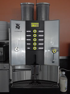
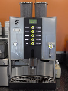
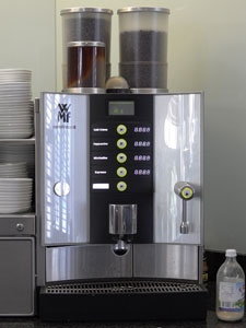
Recently, my team moved to a new building, meaning that we not only were confronted with a new environment, but also with a new coffee machine. Actually, the new machine is the same model as the ones I am used to. But, as always and, as my story shows, the devil is in the details (see Figures 1-3 for the coffee machines).
 |
 |
 |
||
| The coffee machine on my level in the old building | The coffee machine one level lower that brews decaffeinated coffee (old building) | The coffee machine on my level in the new building |
Figures 1-3: The coffee machines that play a role in this UI Design Blink
Introduction and Story
Figure 4 shows an example coffee machine control panel. Labels indicate the available coffee specialties and the associated buttons allow you to brew them – everything is neatly arranged in rows. Let us ignore the LCD panel at the top of the control panel, which shows a simulation of the brewing progress – you can watch the real process, though, if you look at the coffee mug itself... As I usually do not wear glasses, I therefore cannot read what the panel also wants to tell me, anyway. All in all, the control panel is straightforward. I should also mention that the machine in Figure 1 brews regular coffee, while the machine in Figure 2 brews decaffeinated coffee, indicated by a label at the top left (see Figure 2 above and Figure 6 below for details). Therefore, over the years, I built up the expectation (or mental model, for the pros...) that a coffee machine can brew only regular or decaffeinated coffee, but not both. Now to my story: On my first day in the new building, I went to the, for me, new coffee machine on my level and found a white label stating "Decaffeinated" (see Figures 5 and 7 below). "Oh", I said to myself, "I have to go to another level for regular coffee, what a nuisance!" And so I did. The next day, when my colleague returned to the office after a short vacation, I made him aware that there is only decaffeinated coffee available on our level. Much later, we talked about this nuisance again, and he told me that there was not at all a problem with regular coffee on our level. |
Figure 4: Coffee machine control panel |
A little confused, I went to the coffee machine to investigate how I had arrived at my – wrong – conclusion. There were indeed four buttons for regular coffee specialties. The fifth, and bottom, button was, however, reserved for decaffeinated coffee. The respective label was inverted and thus highlighted so that people would not select decaffeinated coffee by mistake. I found that there was nothing really wrong with the control panel, perhaps apart from the fact that there was just one unspecified type of decaffeinated coffee so that, at the beginning, you do not know what kind of drink you will get. It seems, by the way, to be café crème...
Analysis
Now let me analyze my misunderstanding:
- Expectations (mental model): Based on my past experience, I expected coffee machines to provide either regular or decaffeinated coffee but not both. Therefore, whenever I find a label "Decaffeinated" attached to a coffee machine, wherever it may be, I immediately assume that the machine delivers only decaffeinated coffee.
- Lack of attention and care: I spotted the "Decaffeinated" label, drew my quick – and wrong – conclusion, went away, and even spread the "message." A more careful look at the machine would have revealed that I was wrong.
By the way, at the top of the coffee machines there are two storage containers for coffee beans (see Figures 1-3). When I analyzed how I arrived at my wrong conclusion, this fact made me wonder whether these machines can really brew both types of coffee. However, as far as I can see, two containers are used for reasons that are unrelated to the regular/decaffeinated question (the small container on the top left of the new machine seems to be dedicated to ground decaffeinated coffee).
 |
 |
Figures 5-6: "Decaffeinated" label on the machine from Figure 3 in my new location (detail; left); label stating that the machine from Figure 2 delivers only decaffeinated coffee (right)
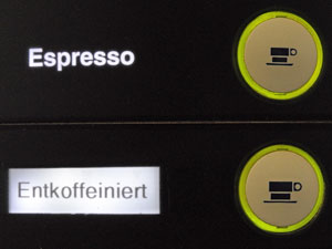
Figure 7: Detail of Figure 5 – label "Entkoffeiniert" ("Decaffeinated")
There is a famous saying by designers that "there are no user errors, only designer errors." But after analyzing my behavior I was inclined to question this statement. What can a poor designer do if users are as rigid and inattentive as I was? Isn't this design fully adequate, considering that the label "Decaffeinated" is next to a button as it is for all the other coffee specialties and not in a "global" location as I was used to (see Figures 5, 6 , and 7)? However, when I discussed the current design with my colleague, he pointed me to a number of inconsistencies in it, and we came to the conclusion: The "poor" designer of this control panel could indeed have done better. Here are a few reasons why:
- The labeling is inconsistent: For regular coffee the label indicates the respective specialty, for decaffeinated coffee it only says that it is just that but not what kind of drink it is.
- The "Decaffeinated" label is inverted and thus looks different from the labels for coffee specialties. One might therefore assume that it points to something different. On the other hand, it is in the position of a label indicating a coffee specialty. One might call this argument "hair-splitting", but all this considered together makes it a little confusing.
Suggestion for Improvement and Take-Away
Given that my colleague and I discovered some inconsistencies in the design of the coffee machine's control panel, how could the panel be improved? Since I do not want to put the coffee machine maker's designer out of a job, here is just a quick-and-dirty proposal that, at least, is more consistent:
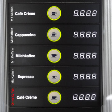
Figure 8: One of many possible ways to make the coffee machine labeling more consistent and to avoid confusion ("Ohne Koffein" = decaffeinated coffee) (click the image for seeing the whole control panel)
From a health point of view, the regular coffee should probably be flagged red. From an SAP employee point of view, however, it should be the way I proposed it – and my colleagues may be right because, according to more recent research, caffeine may not be as bad for us as we have been told in the past... And as a quick take-away from this story we, once again, find that – just as Dan Saffer explains in his new book Microinteractions – small details do matter.
References
- Dan Saffer (2013). Microinteractions – Designing with Details. O'Reilly Media • ISBN-10: 144934268X, ISBN-13: 978-1449342685 • Short presentation • Review
August 1, 2013: Suggestions for Expanding Don Norman's New Version of His Book The Design of Everyday Things
Just recently, a colleague sent me an e-mail to point me to a new version of Don Norman's all-time classic book The Design of Everyday Things and also to a new training course developed by Udacity that is based on the book. When I followed the link that he had sent me, I found out that the book is now entitled, The Design of Everyday Things: Revised and Expanded Edition, and that it will be published at the beginning of November this year – I thought that it had already been published. The Udacity course will be available in fall as well. So there is still some time left to speculate about how Norman will revise and expand his book. And where better to do this than in a UI Design Blink?
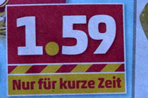
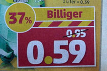
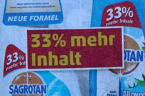
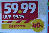
In his seminal book, Norman discusses design issues for a bunch of everyday things, such as switches and switchboards, doors, faucets, ovens, thermostats, but it appears to me that he does not deal with traffic signs and lights. Taking a closer look at this omnipresent aspect of our everyday life might present us some opportunities for expanding Norman's book. And why not combine this with another ubiquitous aspect of our lives: advertising. This idea came to my mind when I was browsing the leaflet of a popular German discount supermarket. Figures 1 to 4 show a small selection of snippets from the leaflet that inspired me:
 |
 |
|
Only for a short time |
37% cheaper |
|
 |
 |
|
33% more content |
You save 40% |
Figure 1-4: Advertising elements that inspired most of my design proposals
Soon, a few initial ideas of how advertising techniques might make traffic signs and traffic lights more persuasive and thus more "usable" emerged. I present them below to the UI Design Blinks readers.
Green Traffic Lights
At road junctions, you typically have to wait for the traffic light to turn to green. When it eventually does, the driver in front of you, instead of dashing across the junction to allow as many other drivers as possible to pass it, often does not set off or hesitates before doing so. It seems as if a lot of drivers need a gentle reminder that time is limited after the traffic light has turned to green. What about a sign next to the green light that turns on together with it and that starts to flash when there are only a few seconds left? Here is a simple prototype based on Figure 1 demonstrating my proposal:

Figure 5: Traffic light that makes it clear to drivers that the green light will not be on forever
Deviations
Nobody likes detours, because they often force you to take longer route on small and slow roads. On the other hand, it may take you to places you would otherwise never have discovered. There are many ways of turning a detour into a great experience. Drivers might, for example, stop at a small cafe and have a cozy break. But how can we make detours more attractive to drivers so that they do not feel compelled to try out whether they can somehow pass the blocked road (and have to drive all the way back because it is indeed blocked)? Here is one proposal on how we could make a detour more attractive: The construction team might announce it as a special offer:

Figure 6: Announcing a detour (Umleitung) as a special offer
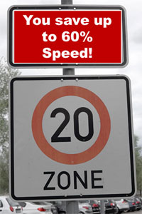
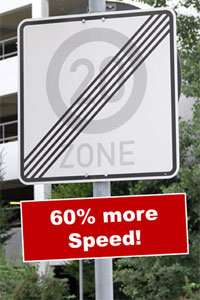
Start and End of Speed Limit Zones
Drivers hate speed limit zones for a number of reasons, one of them being that they often come with radar traps. However, if we presented the speed limit as a special offer (Save up to 60%!), and the end of the zone as a bonus (60% more speed!), who would not be willing to obey the traffic signs?
 |
 |
|
Savings of up to 60% – an offer you wouldn't want to refuse (after Figure 4)... |
... in order to gratefully welcome the speed increase at the end of the speed limit zone (after Figure 3) |
Figures 7-8: Additional advertising elements to persuade drivers to stick to the speed limit and showing what they will gain afterwards
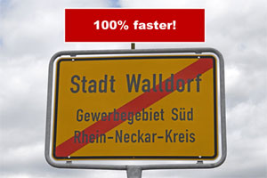
City limits are also a great opportunity for addressing drivers in persuasive ways:
 |
 |
|
Reducing speed when entering a city looks like a real bargain... |
.... as does increasing speed when leaving a city (after Figure 2) |
Figure 9-10: Similar advertising elements can also be used at city limits.
Conclusions
I firmly believe that Donald Norman has his own plans on how he will expand his classic book The Design of Everyday Things. But perhaps our ideas will coincide, who knows. And perhaps our readers also have some ideas of their own to add...
References
- Donald A. Norman (November 2013). The Design of Everyday Things: Revised and Expanded Edition. Basic Books • ISBN-10: 0465050654, ISBN-13: 978-0465050659 (Paperback)
- Blog post on upcoming Udacity course based on the book
- Donald A. Norman (2002). The Design of Everyday Things. Basic Books • ISBN: 0465067107 (Paperback) • Review
July 17, 2013: A Journey Across Touchpoints at Heidelberg Main Station
Several years ago, I attended a presentation at the World Usability event in Stuttgart, Germany, in which designers reported on the redesigned ticket machines of Deutsche Bahn (DB; German Railway). This UI Design Blink is about these machines. But instead of referring much to their – hopefully now improved – usability, I would like to tell you a story that Milan Guenther would probably characterize as a "journey across touchpoints." I encountered this notion for the first time, while reading Guenther's book Intersection, in which he writes about touchpoint orchestration, a new design discipline. My personal journey was initiated by the simple task of buying a train ticket and consisted of quite a few technical and human touchpoints. As always, it also involved a number of human and technical weaknesses. Here it goes:
Recently, I made a short trip to Heidelberg to buy myself a new "toy." My touchpoint journey that I want to disclose here started with entering Heidelberg Main Station to return to Walldorf by suburban train (S-Bahn). I needed a ticket for the trip back, so I looked around for a ticket machine. I found two machines standing side-by-side, but both were occupied. I waited behind a young couple who needed quite some time to fish out all their change from the machine. Then it was my turn! I had some difficulties entering my destination station – not because of bad machine usability, but because I was too lazy to get my glasses out of my backpack. And because I did not always press the touchscreen keys hard enough. Without glasses, I was not able to spot the backspace key to correct my incomplete input, with the result that the machine suggested and selected unsuitable locations. After three attempts, I was finally ready to buy my train ticket. I inserted a €20 bill into the machine, but the machine spit it out. The bill was a little bit crumpled, so I smoothed it out and tried it once more – again, without success. I had a second €20 bill in my wallet, so I tried that one, too – in vain. Finally, I took a closer look at the machine and, to my dismay, realized that it accepted only €5 and €10 bills, which I did not have. "Damn, how can I get such bills here?" I cursed to myself and looked desperately for a change machine. I could not see one, but there were two old men in a small office whom I asked for assistance. They told me that there weren't any change machines in the whole railway station and suggested I go to the bank located in the station and ask them to give me change for the €20 bill. As I left, they further suggested I visit the DB travel center and ask for help there, which I felt was the better idea.
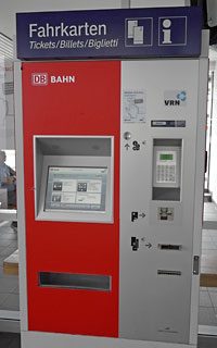 |
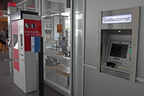 |
Figures 1-2: DB ticket machine at the Wiesloch-Walldorf train station (left) with bank machine located near-by (right) (Photos taken with my new "toy")
When I entered the travel center, I was a little bit confused: There were lots of counters and lots of people waiting to be served, but when and how could I be served? Did I have to line up, or what did they expect me to do? Luckily, I found out pretty quickly that I had to pull a number ticket. The number ticket machine had a large touchscreen with a huge button for requesting a ticket. That was easy enough, even without glasses, but probably complete overkill from a technical point of view. Anyway, my number was a lot higher than the one currently being served, so I walked around the travel center a bit, found a few more ticket machines, and finally observed an older employee helping a blind person access a counter. The employee soon returned and asked if anyone else needed help. I asked if it was possible to change a €20 bill in the travel center. He took the bill, went to a counter, and soon returned with two €10 bills. I was relieved, thanked him, and rushed to one of the ticket machines I had discovered while walking around the travel center.
Everything went like clockwork at the ticket machine now – I didn't even need to put my glasses on. However, when I inserted one of the €10 bills to pay for the ticket, the machine did not accept it and returned it immediately. After a second futile attempt, I repeated these steps with my second €10 bill – again, no luck. At this point, another older employee approached me and asked me whether he should try inserting the bill for me. He appeared trustworthy and I figured he probably wouldn't be able to run away with the bill quickly, so I agreed. And voilà! This time the machine accepted the bill, and I got my ticket and some change. I asked the man whether he had a certain technique for inserting the bill. With a smile, he answered, "Maschinen sind auch nur Menschen!" (machines are just human beings too). I thanked him and rushed to the departure platform. But thanks to all the technical delays, or touchpoints, to be more precise, I was two minutes late and the train had already left (go figure: on my trip to Heidelberg, the train was more than 5 minutes late; but now, as luck would have it, it left on time). Luckily, the next train departed only ten minutes later. So there was no reason to be disappointed – and I had learned another lesson as well.
Moral of the Story...
Years ago, I would have lined up at a counter to buy a train ticket. This would probably have involved some waiting, but only one – human – touchpoint. I would have preferred this over my recent "experience," which featured a total of six touchpoints – three machine-based and three human ones although a refined analysis would probably reveal even more. I am certain that no good designer thinking about how people buy train tickets would have orchestrated something like this. Shouldn't designers have to deal with all the complexities of life before they can rightfully state that they maintain a holistic view? Nevertheless, I assume that DB had at least a hunch this would happen. Otherwise they would not employ those helpful employees in their travel centers.
References
Milan Guenther (2012). Intersection: How Enterprise Design Bridges the Gap between Business, Technology, and People. Morgan Kaufmann • ISBN-10: 0123884357, ISBN-13: 978-0123884350 • Review
July 10, 2013: iPad Dog Salon
By Nina Hollender, SAP AG
When you Google the words "iPad" and "children" plus "coloring" on the Internet, the first hits you get are Web sites discussing "young children's addiction to the iPad" and "the best drawing apps for kids." Has the iPad led to children only wanting to draw and color in the digital world?
I'd like to tell you a (true) story that shows how an iPad can, in fact, inspire kids to draw and color the traditional way, on paper: My eight-year-old niece Josi, who doesn't have a real iPad at her diposal as much as desired, decided one day to create her own iPad and dog salon app with the help of paper, scissors, coloring pencils, and a few other utensils. (I swear I never discussed paper protoyping or the aspects of an interaction designer's job with her before then :-))
Her dog salon app includes more than 20 screens in 6x8 inch paper format, all representing different user interfaces, such as a dog status overview (Figure 1), or a selection of different dog collars and ribbons (Figure 2).
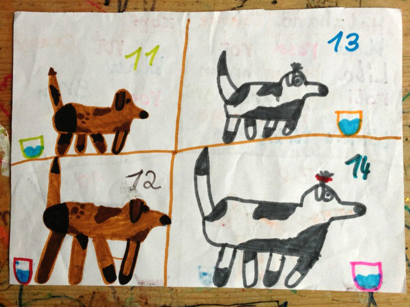 |
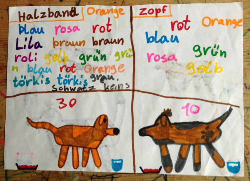 |
Figures 1-2: Dog status overview (left); Selection of dog collars and ribbons (right)
Figure 3 shows the iPad itself, set to home screen with the icon for the dog salon app at the top left. Here, Josi drew the front frame of the iPad on a piece of 8x11 inch paper, cut out the screen, and glued the frame to a clear plastic sheet. She then stapled the frame and sheet to another piece of 8x11 inch paper.
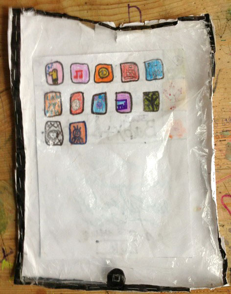
Figure 3: iPad prototype set to home screen
Josi later revealed that she had also made games for the Nintendo DS console in the same way, but that the iPad was better because you had more room to draw. On paper, that is, not on the real thing…
July 2, 2013: An Introduction to Milan Guenther's Book Intersection and to the Enterprise Design Framework It Presents
When I recently began reviewing Milan Guenther's book Intersection, my review quickly took on a life of its own, eventually getting so long I needed to curtail it somehow. One option was to shorten my introduction to the book. On the other hand, though, I felt that the long version might be interesting for other UI designers. I ultimately decided to publish the original version of my introduction, with only minor adaptations, as a UI Design Blink. Here it is!
When I was young, there were only three design directions I was aware of: fashion design, product or industrial design, and graphic design. Naïve as I was at the time, I understood the first to be responsible for fashionable clothes, the second for the design of cars, vacuum cleaners, Scandinavian furniture, and so on, and the third for book illustrations, stamps, and advertising. Much later, in my mid-40s, I encountered another design direction, which has since become my "home turf": User interface (UI) design – often disguised under such names as usability, human-computer / man-machine interaction, user-centered design, or even human factors. Fortunate to be able to attend conferences like CHI and Interact, I gradually became and felt like a member of this professional community. Our domain is, in short, the dialog between human users and computers, and we strive to make it as effective and efficient as possible. Some people, however, still believe that UI design is just about putting controls on a screen.
At more recent conferences, gurus like Don Norman pointed out that our field has matured. Criteria like satisfaction (see its inclusion in the ISO norms), joy of use, and a great user experience are now important – users take the availability of functionality and ease of use for granted. All of a sudden, a new design direction was born: Experience design. This change in orientation was, among other things, reflected in the renaming of SAP's usability group from "user productivity" to "user experience" (UX) in 2005. Hordes of "experience designers" came on the scene, numerous books on this topic were published, and debates about"experience" abounded at conferences.
It took quite a while for me to discover that the UI design community, with its focus on the design of user interfaces for software applications, is just a subset of design approaches that deal more generally with interactions between humans and technical systems, or artifacts. Contrary to what the name of the famous design consultancy "Cooper Interaction Design" (now "Cooper") suggests, many designers regard interaction design as different from UI design and label it "IxD" to indicate this. At various (mostly smaller) conferences, I came across interaction designers from art schools and universities who, by the way, were not at all interested in jobs for UI designers, who applied their own approaches to design and research – like the Research-Through-Design (RTD) direction in the USA (for example, Zimmermann, Forlizzi, Paulos), or Critical Design in the UK (for example, Dunne & Raby, Gaver). This difference is also reflected in the backgrounds of those designers. While UI designers often have a background in science and are trained in the psychology of perception, memory, thinking, and so on, interaction designers tend to come from art or design schools and often feel more like artists – think of the infamous stereotype of the "artist" or "genius" designer. Probably the last thing they would do is ask a user how something should be designed. Nevertheless, they do observe people interacting with their gadgets and ask them afterwards...
In their book The Design Way, Nelson and Stolterman suggest that we understand design as a "third approach" with methods of its own that is on par with art and science. They and other designers use terms like "design thinking," "thinking like a designer," or "designerly ways of working." For me, this promotion of the role of design in society is also reflected in a broadening of the scope of design by applying design methods beyond traditional realms. For example, the "Design Thinking" approach – driven by the design consultancy ideo and the Stanford and Potsdam d-schools – encourages designers to bring their methods into the business world – by either taking part in business processes themselves, or by training business people to use design methods (after Tim Brown). More and more designers, not only "Design Thinking" proponents, push this direction, often viewing themselves in the role of a social conscience, a moderator, or even an elite that guides others. I attended a presentation by Jonathan Kahn expressing this point of view at the Interaction 2012 conference in Dublin (Interaction Designers as Agents of Change) – and there are many more statements and books in this vein.
 Milan
Guenther's new book Intersection is just one of these books, and
is devoted to perhaps one of the biggest challenges that designers can
face: The redesign of large corporations and other institutions, that is,
the transformation of enterprises (the author uses this "umbrella
term" for "companies, organizations, public services, and other
types of projects or endeavors") from an actual, unsatisfying state
into a future, desired state. According to Guenther, such a daunting endeavor
has to be addressed in a holistic manner in order not to lose direction
and get discouraged by the myriads of details. In his book, he therefore
tries to find a balance between dealing with complexity and maintaining
a holistic view. He proposes and delineates an "enterprise design
framework," which is comprised of 20 design aspects to be considered
in strategic design initiatives. He clusters them into five groups that
range from abstract concepts to concrete actions and are connected with
appropriate design disciplines that serve as "methodological backbones." And
that brings my introduction to the book full-circle: All in all, Guenther's
enterprise design framework brings 24 design disciplines into play – not
just three, the number with which I started my introduction. And, of course,
all of the directions that focus around my "home turf" are included
in one facet or another: human-centered design (or user-centered design),
a-kind-of UI design, experience design, interaction design, information
architecture, media design, a-kind-of visual design, and more.
Milan
Guenther's new book Intersection is just one of these books, and
is devoted to perhaps one of the biggest challenges that designers can
face: The redesign of large corporations and other institutions, that is,
the transformation of enterprises (the author uses this "umbrella
term" for "companies, organizations, public services, and other
types of projects or endeavors") from an actual, unsatisfying state
into a future, desired state. According to Guenther, such a daunting endeavor
has to be addressed in a holistic manner in order not to lose direction
and get discouraged by the myriads of details. In his book, he therefore
tries to find a balance between dealing with complexity and maintaining
a holistic view. He proposes and delineates an "enterprise design
framework," which is comprised of 20 design aspects to be considered
in strategic design initiatives. He clusters them into five groups that
range from abstract concepts to concrete actions and are connected with
appropriate design disciplines that serve as "methodological backbones." And
that brings my introduction to the book full-circle: All in all, Guenther's
enterprise design framework brings 24 design disciplines into play – not
just three, the number with which I started my introduction. And, of course,
all of the directions that focus around my "home turf" are included
in one facet or another: human-centered design (or user-centered design),
a-kind-of UI design, experience design, interaction design, information
architecture, media design, a-kind-of visual design, and more.
So, if I was able to whet your appetite for more, have a look at my review of Guenther's book Intersection.
References
- Milan Guenther (2012). Intersection: How Enterprise Design Bridges the Gap between Business, Technology, and People. Morgan Kaufmann • ISBN-10: 0123884357, ISBN-13: 978-0123884350 • Review
- Book Website: intersectionbook.com • Homepage Milan Guenther: www.guenther.cx • eda.c (Milan Guenther's design consultancy)
- Harold G. Nelson & Erik Stolterman (2012). The Design Way: Intentional Change in an Unpredictable World (2nd Ed.). The MIT Press • ISBN-10: 0262018179, ISBN-13: 978-0262018173 • Review
June 18, 2013: About the Book Gamification at Work
Gamification is becoming a common buzzwords in business these days* – and in UI design as well. I first encountered the concept of gamification in more detail at the Interaction 2012 conference in Dublin, Ireland. There, Dustin DiTommaso held the presentation Beyond Gamification: Architecting Engagement Through Game Design Thinking, in which he discussed self-determination theory and laid out a seven-step "framework for success" in gameful design. Regrettably, his presentation was not the critical examination of this topic that I had hoped for. Nevertheless, it inspired me to start writing an introductory article about gamification for the SAP Design Guild – but somehow I never managed to get beyond a first collection of ideas...

Figure 1: A progress indicator – a standard element of "game mechanics" (from the book)
While collecting materials for the article, I learned about points, badges, and leaderboards, but admittedly, the older I get, the less interested I am in competing with other people – including myself – so I have remained a gamification skeptic. Other people think differently and positively about this approach, though. Take, for example my SAP colleagues Janaki Kumar and Mario Herger. Just recently, they finished their book Gamification at Work – Designing Engaging Business Software, which will be published by the Interaction Design Foundation (IDF) shortly. In their book, they repeatedly point out that there is more to gamification of business applications than "simply adding game mechanics such as points, badges, and leaderboards to their applications and calling them gamified." Like DiTommaso, the authors provide a framework for success, this time for the gamification of business applications. Oriented at the User-Centered Design approach, their Player Centered Design framework consists of the following five steps:
- Know your player
- Identify the mission
- Understand human motivation
- Apply [game] mechanics
- Manage, monitor, and measure
Rikke Friis Dam of the IDF wrote already a sneak preview of the book for the SAP UX Community. In this UI Design Blink, I would also like to point readers to the new book – without giving away too much information. Chapter 1, Mixing Work and Play, seems to have been written specifically for me, a gamification skeptic. After "busting" some myths about gamification, the authors surprise their readers with the statement that they (the readers) have already been gamified. I was amazed to learn that some well-known UI controls and principles, such as progress bars and feedback, are actually standard elements of "game mechanics." Thus, the annoying but nonetheless useful progress bar telling me that copying my user data from my old computer to my new one will take about 50 hours (a true example!) is just an attempt to gamify the situation and make it more fun. But perhaps I got it all wrong, because in the authors' example it's a little bit different: It's not the system performance that is reported back, it's the user's progress in doing something, such as completing his or her LinkedIn profile. I would like to add one more remark. In Chapter 8, Legal and Ethical Considerations, the authors point to possible legal and ethical consequences of gamifying business applications. The first aspect had not even crossed my mind yet, but, as the authors explain, both have to be taken seriously.
Hopefully, I have now whetted the readers' appetite to rush to the preview of the book on the IDF Website – or even to the book itself as soon as it has been published officially.
*) This statement was taken from the book.
References
- Janaki Mythily Kumar & Mario Herger (2013). Gamification at Work: Designing Engaging Business Software. Interaction Design Foundation • ISBN-10: 8792964079, ISBN-13: 978-8792964076
- Gamification at Work (Interaction Design Foundation)
June 11, 2013: A Few Books and Links for Familiarizing Oneself with Charts and Dashboards (Data Visualization)
The design of charts and dashboards is not usually included in books about information visualization and is covered separately. Sometimes, this field is referred to as "data visualization." Therefore, I'm following this habit and am presenting the books around this topic that I came across in a separate UI Design Blink.
Charts
The GUI Style Guide by Susan Fowler and Victor Stanwick from 1994 was probably the first book in which I found guidelines for the design and use of charts (chapter 7). Regrettably, this book is no longer available. Later, I came across Stephen M. Kosslyn's book Elements of Graph Design, which covers this topic in more detail – and with more reference to human perception, because he is a researcher in psychology. I published a brief review of Kosslyn's book on the SAP Design Guild.
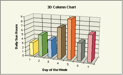
Figure 1: An example of how column charts should not look ...
Based on these two books and a few other sources, I created recommendations for charts in the format of SAP guidelines (Recommendations for Charts and Graphics). Initially part of SAP's guidelines for miniApps/iViews, they were later published as separate guidelines and offered in the Goodies section on the SAP Design Guild. Please note that they are NOT official SAP guidelines.
References
- Susan Fowler & Victor Stanwick (1994). The GUI Style Guide (Chapter 7 Charts and Graphs). AP Professional • ASIN: 0122635906 (Paperback, out of print)
- Stephen M. Kosslyn (1993). Elements of Graph Design. W. H. Freeman & Co • ISBN: 0716722631, ISBN: 071672362X (Hardcover) • Review
- Gerd Waloszek (2001). Recommendations for Charts and Graphics (SAP Design Guild; in parts based on The GUI Style Guide and Elements of Graph Design)
Information Dashboards
Stephen Few's book Information Dashboard Design: The Effective Visual Communication of Data from 2006 seems to be "the" classic book about dashboard design. Kai Willenborg, who, by the way, is also an expert in this matter, published a review and particularly an overview of Few's book on the SAP Design Guild.
References
- Stephen Few (2006). Information Dashboard Design: The Effective Visual Communication of Data. O'Reilly • ISBN: 0596100167 • Review by Kai Willenborg
Hands-On Experiences
Casey Reas and Ben Fry developed the Processing programming language, a Java-based programming language that is tailored to the needs of designers and open source, free software (they ask for a donation on the download page). Just recently, version 2 of the language has been published. The authors also published a book about this language, entitled Processing, which I reviewed on the SAP Design Guild. Personally, I have used Processing particularly for programming chart types that are not available in Microsoft Excel, such as bubble charts (later, I found out that they are available, but needed a different arrangement of the data...) and skyline graphs (I published a number of UI Design Blinks on this matter on the SAP Design Guild).
Visualizing Data: Exploring and Explaining Data with the Processing Environment is Ben Fry's book about "computational information design," or just "data visualization." It covers the path from raw data to how we understand it, detailing how to begin with a set of numbers and produce images or software that lets you view and interact with information. This hands-on guide is intended for people who want to learn how to actually build a data visualization. They do so using Rea's and Fry's programming language Processing. I am considering buying the (e)book to improve my fluency in Processing.
Recently, I purchased Scott Murray's book Interactive Data Visualization for the Web as an ebook. Utilizing D3, a JavaScript library for expressing data visually in a Web browser, the book teaches readers the fundamental concepts and methods of D3 and helps them to create and publish interactive data visualization projects on the Web – even if they have little or no experience with data visualization or Web development. Thus, this is the "Web variant" of creating one's own data visualizations. Admittedly, I need some spare time to get to grips with this book and work on its exercises...
Finally, if you would like to experiment with data visualization techniques but do not want to program, visit the Many Eyes Website (provided by IBM) where you can explore your or other people's data in various visual presentation formats.
References
- Ben Fry (2007). Visualizing Data: Exploring and Explaining Data with the Processing Environment. O'Reilly • ISBN-10: 0596514557, ISBN-13: 978-0596514556 (Paperback) • Short presentation
- Casey Reas & Ben Fry (2007). Processing: A Programming Handbook for Visual Designers and Artists. The MIT Press. ISBN-10: 0262182629, ISBN-13: 978-0262182621 • Processing Website • Review • Short presentation
- Scott Murray (2013). Interactive Data Visualization for the Web. O'Reilly. ISBN-13: 9781449339739
- Many Eyes Website (IBM):www-958.ibm.com/software/analytics/manyeyes (allows you to experiment with data visualizations)
Further References
- Links on Visualization (SAP Design Guild)
- Books (SAP Design Guild)
June 7, 2013: Some Books and Links for Familiarizing Oneself with Information Visualization
Information visualization is a fairly new research field attracting growing interest. According to the Robert Spence (2000), information visualization differs from scientific visualization in the following respect: In scientific visualization what is seen primarily relates to, and represents visually, something physical, for example the flow of water in a pipe. By contrast, information visualization tends to deals with abstract quantities such as baseball scores.
Since information visualization has always interested me, I bought a couple of books about this topic, read some of them, reviewed a subset of these, and also have some books still waiting for being read – and perhaps reviewed. In this UI Design Blink, I would like to provide some pointers to these books and to a few more...
Introduction to Information Visualization: Riccardo Mazza
Riccardo Mazza's book Introduction to Information Visualization from 2009 is an introductory textbook that "focuses on the human aspects of the process of visualization rather than the algorithmic or graphic design aspects." I bought this book at Interact 2009 conference in Uppsala, Sweden, reviewed it on the SAP Design Guild, and decided that this was the book I should have read first when initially diving into the topic of visualization – unfortunately it did not appear earlier.
While Mazza wrote his book "as a support text for a university course", he regards it as "also suitable for a wide and heterogeneous reading audience" that is concerned with communications systems on the basis of or predominantly using visual representations (practitioners). Thus, UI designers and HCI practitioners who want an easy introduction to the emerging field of information visualization are definitely included. Mazza's book closes a gap by being – at least to my knowledge – the first introductory book to the relatively new field of information visualization. The book is mostly easy to read, and it comes in a handy format that is ideally suited to reading anywhere. There are plenty of illustrations, a must for a book on a visual topic.
References
- Riccardo Mazza (2009). Introduction to Information Visualization. Springer • ISBN: 9781848002180 • Review • Short presentation
The "Classic" Book on Information Visualization: Robert Spence
Robert Spence's textbook Information Visualization is a "classic" on this topic that appeared in its second edition in 2007. Spence, who invented a number of visualization techniques such as the Attribute Explorer, talked to me about plans for a third, differently structured edition, but I am not sure whether we will eventually see one. Three chapters constitute the core of the second edition. Each of them is devoted to one of the three principal issues of information visualization:
- Chapter 3 Representation: covers the encoding of value (uni-, bi-, tri-, and hypervariate data) and relation (lines, maps and diagrams, tree representations)
- Chapter 4 Presentation: covers approaches to dealing with space limitations (scrolling, overview and detail, distortion, suppression, combinations of both, zooming and panning) and time limitations (for example, through rapid serial visual presentation, a technique developed by Spence and his coworkers)
- Chapter 5 Interaction: covers, among others, continuous, stepped, passive, and composite interaction; in relation to stepped interaction the concepts of sensitivity, residue, and scent are discussed
The book boasts a multitude of colorful illustrations, many of which have been updated in the second edition. As many visualization techniques involve dynamic aspects, 37 videos are provided on DVD to aid the understanding of the dynamic approaches. There is also a book companion Website. I reviewed both editions on the SAP Design Guild (see references below).
References
- Robert Spence(2007). Information Visualization (2nd edition). Prentice-Hall (Pearson) • ISBN: 0132065509 (Hardcover) • Review • Short presentation • Book Website
- Robert Spence (2000). Information Visualization. Addison-Wesley (ACM Press) • ISBN: 0201596261 (Hardcover) • Review
Another "Classic" Book: Chaomei Chen
When I met Robert Spence briefly at the INTERACT 2009 conference in Uppsala, Sweden, he mentioned that there was a good book about visualization for display at the Springer book stand. I had already seen that there was "something" available about this topic – but actually it was two books: a new introductory book by Riccardo Mazza and a second, much more advanced one in its second edition by Chaomei Chen. The big question for me was: Which book had Robert Spence been referring to? I decided to buy both, and when I looked into them found that both referred to Robert Spence in one or another way. However, Chen seems to have cooperated with Spence sometime in the past. Anyway, I decided to leave my question unanswered, because the two books target different audiences: Chen's book Information Visualization addresses an advanced audience and even contains some mathematical formulas, whereas Mazza's book is targeted at beginners.
Regrettably, I never managed to read or even review Chen's book. However, after scanning the book for its content, I have to admit that it seems to be the most technical and demanding of all the visualization books that I present here.
References
Chaomei Chen (2006). Information Visualization (2nd ed.). Springer • ISBN-10: 184628340X, ISBN-13: 978-1846283406 (Paperback)
Yet Another "Classic" Book and a "Key Resource": Colin Ware
Colin Ware's book Information Visualization is another highly regarded book about this topic. It appeared in its third edition in 2012. I recently purchased an online version of the book and plan to review it on the SAP Design Guild in summer 2013.
The book presentation states that "like previous editions of Information Visualization, this third edition, which essentially is a complete update of its predecessor from 2004, strives for becoming the key resource for practical design guidelines, based on perception, which can be applied by practitioners, students, and researchers alike. It includes the latest research and state of the art information on multimedia presentation, lists more than 160 explicit design guidelines based on vision science, and offers a new final chapter that explains the process of visual thinking and how visualizations help us to think about problems."
A look at the table of contents immediately reveals that this book differs considerably from other books about information visualization by using human visual perception as its guiding principle, not data structures and presentation and interaction techniques. These are, of course, also covered, but in the context of human perception. Another difference to other books is the list of guidelines based on vision science. Moreover, like in his book Visual Thinking: For Design, Ware connects the concepts that he presents in his book with his notion of visual thinking.
References
- Colin Ware (2012). Information Visualization, Third Edition: Perception for Design. Morgan Kaufmann • ISBN-10: 0123814642, ISBN-13: 978-0123814647 • Review • Short presentation
- Colin Ware (2004). Information Visualization, Second Edition: Perception for Design. Morgan Kaufmann • ISBN-10: 1558608192, ISBN-13: 978-1558608191
A Framework for Information Visualization: Bill Ferster
Bill Ferster's new book Interactive Visualization: Insight through Inquiry was suggested to me by Ben Shneiderman, one of the pioneers in visualization research. The book offers an introduction to the field, presenting a framework for exploring historical, theoretical, and practical issues. It is not a "how-to" book, but a guide to the concepts that are central to building interactive visualization projects. The author developed a framework, known as the ASSERT model, which allows the reader to explore the process of interactive visualization in terms of:
- Ask: choosing good questions to ask
- Search: finding appropriate data for answering them
- Structure: structuring that information
- Envision: exploring and analyzing the data
- Represent: representing the data visually
- Tell: telling a story using the data
References
- Bill Ferster (2012). Interactive Visualization: Insight through Inquiry. The MIT Press • ISBN-10: 0262018152, ISBN-13: 978-0262018159 • Review • Short presentation
Looking at Research in Visualization: Ben Shneiderman & Ben Bederson (HCIL)
On the 20th anniversary of the Human-Computer Interaction Lab (HCIL) at the University of Maryland, Ben Bederson, the current director of the lab, and Ben Shneiderman, its founder and longtime director, presented their book The Craft of Information Visualization: Readings and Reflections. This book is a collection of 38 key papers on information visualization from the past ten years and thus offers a closer view into the research history of the topic of information visualization.
Shneiderman is, among others, known for tree maps, starfield displays (HomeFinder, FilmFinder), and the Visible Human Explorer project. Bederson explored, among others, focus+context techniques (e.g. in the PhotoMesa application). Further details could be found in my review of the book on the SAP Design Guild.
References
- Benjamin B. Bederson & Ben Shneiderman (2003). The Craft of Information Visualization: Readings and Reflections. Morgan Kaufmann • ISBN: 1558609156 (Paperback) • Review • Short presentation
Finally, the Definitive "Classics": Edward R. Tufte
Edward R. Tufte is regarded as the pioneer of information visualization. His books from the 1980s and 1990s are definitive "classics" and already counted among the bibliophile books. I only managed to get a few brief glimpses at them because our visual design team kept these "precious items" under protection. I definitely have to buy used copies of them one day...
References
- Tufte, Edward R. (1983). The Visual Display of Quantitative Information. Graphics Press • ISBN: 096139210X (Hardcover) (Reprint Graphics Press, 1999)
- Tufte, Edward R. (1990). Envisioning Information. Graphics Press • ISBN: 0961392118 (Hardcover)
- Tufte, Edward R. (1997). Visual Explanations: Images and Quantities, Evidence and Narrative. Graphics Press • ISBN: 0961392126 (Hardcover)
Further References
- Links on Visualization (SAP Design Guild)
- Books (SAP Design Guild)
June 6, 2013: Design Guidelines with a Backup in Research – Are There Any?
UI and visual design guidelines are not very popular these days and are therefore often hidden behind labels such as "best practices." But I am still convinced that UI design guidelines are a "developer's best friends" (see below). Actually, they should be everybody's darling in the UI/UX design field, because they are meant to support designers, not to constrict their creativity. Often, however, the rationale for the guidelines is unclear. Is a guideline backed up by research? Is it based on common sense? Or does it just follow arbitrary conventions? In fact, most UI guideline collections are a mixture of all of these ingredients. In this UI Design Blink, I would therefore like to point you to three attempts at basing design guidelines on research findings.
 |
 |
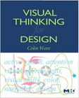 |
Figures 1-3: Research-Based Web Design & Usability Guidelines, Designing with the Mind in Mind, Visual Thinking: For Design
Research-Based Web Design & Usability Guidelines (RBWDUG)
I came across the concept of research-based design guidelines for the first time at the CHI 2003 conference in Fort Lauderdale, Florida. In a panel entitled, Research-Based Web Guidelines: Do They Make Better Websites?, the so-called Research-Based Web Design & Usability Guidelines (RBWDUG, for short) were presented. These guidelines were introduced in 2003, but work on them dates back to at least 2001. They were assembled by members of the U.S. National Cancer Institute, together with a number of consulting researchers – including Bonnie John – who also attended the panel. At the time of its release, the collection consisted of 187 guidelines, was grouped into 14 topics, and was backed up by 435 references to research findings. These guidelines were primarily targeted at the design of Websites and, as I remarked in my comments on the panel, were rather general in scope. In the panel, the authors pointed out that rules that they found in existing guidelines were often based on "common sense," but did not have any evidence from research. Conversely, they also often found useful research results, but no corresponding guidelines.
I hit on the Research-Based Web Design & Usability Guidelines for a second time in 2008, when I was involved in the PeP (perceived performance) project and was searching the literature and the Web for performance-oriented design guidelines. In the meantime, the RBWDUG had been published in a second edition (dated from 2006), now offered by the U.S. Department of Health and Human Services. This current edition consists of 209 guidelines, which are arranged in 18 chapters and, within the chapters, ordered according to their relative importance (based on a ranking procedure). They are also given evidence ratings. Regrettably, I could not find a note about how many references the current version of the guidelines is based on – you have to count the sources in the appendix to find this out.
By the way, I found the RBWDUG quite useful for collecting an initial set of performance-oriented guidelines that are backed up by research (see references below).
References
- U.S. Department of Health and Human Services (2006): Research-Based Web Design & Usability Guidelines • Complete guidelines (PDF)
- Performance-Oriented Design and Guidelines (SAP Design Guild) • Part 4: On the Way to Performance-Oriented UI Guidelines (SAP Design Guild)
- UI Guidelines Are a Developer's (or UI Designer's) Best Friends! (UI Design Blink)
Jeff Johnson – Designing with the Mind in Mind
Jeff Johnson's book Designing with the Mind in Mind (2010) is another example of connecting design guidelines with research findings. It has been characterized as an attempt to "unite design rules with the supporting cognitive and perceptual science that is at their core." I heard of the book for the first time shortly after the 2010 UPA International Conference, but it took a couple of months for it to eventually become available. I reviewed the book on the SAP Design Guild and added an appendix to the review, which includes overviews of the book and of the design implications and recommendations listed in the book. (I took parts of this text from the review.) I also wrote an article entitled, A Lengthy Substantiation of Jeff Johnson's Book, Designing with the Mind in Mind, to discuss how a research background can help designers make design decisions.
The book presentation states that Johnson's book "provides designers with just enough background in perceptual and cognitive psychology that UI design guidelines make intuitive sense rather than being just a list of rules to follow." Johnson himself points out that early UI practitioners were trained in cognitive psychology, from which UI design rules were derived, but that, as the field evolves, designers enter it from many disciplines. While they have sufficient experience in UI design and have been exposed to design rules, they lack the background and do not understand the psychology behind the rules. Johnson believes that his book provides a format that enables them to acquire the necessary background fast and efficiently.
Dan Rosenberg, former Senior Vice President, SAP User Experience, once wrote in an e-mail to me: "I think everyone on the guidelines team should read this." But is it sufficient that only the members of guideline teams read the book? Johnson himself envisages the audience of his book as consisting more of people who apply guidelines (and their managers) than of those who write them. I would, however, recommend the book to anyone who is concerned with UI design in one way or the other – including those who create UI design rules (and back them up with research findings), thise who design user interfaces and observe design rules (UI and visual designers), and the many people who take part in UI design discussions, such as UI managers, product/solution managers, developers, writers of end user documentation, and marketing people (just to name the most important ones).
By the way, Johnson's book also includes a chapter entitled, Additional Guidelines for Achieving Responsive Interactive Systems, which I was able to draw on for my collection of performance-oriented guidelines.
References
- Johnson, Jeff (2010). Designing with the Mind in Mind: A Simple Guide to Understanding User Interface Design Rules. Morgan Kaufmann • ISBN-10: 1-012375030X, ISBN-13: 978-0123750303 (Paperback) • Review • Short presentation
- October 20, 2010: A Lengthy Substantiation of Jeff Johnson's Book, Designing with the Mind in Mind (UI Design Blink)
Colin Ware – Visual Thinking: For Design
As a third example of connecting research findings with design practice, I would like to present Colin Ware's book Visual Thinking: For Design, which I also reviewed for the SAP Design Guild. (The following is a brief "extract" from the review.) The author conceived his book as "an introduction to what the burgeoning science of perception can tell us about visual design" and thus to help "make us better designers." He introduces two new and, probably unfamiliar, concepts: (1) the cognitive thread, which helps humans establish a stable environment over time, and (2) active vision. According to Ware, active vision has profound implications for design: "Understanding active vision tells us which colors and shapes will stand out clearly, how to organize space, and when we should use images instead of words to convey an idea."
In nine chapters, the book traverses from the simple to the complex, thereby introducing "the key elements of the apparatus of vision and how each element functions" (...) "from the eye and the act and machinery of seeing to the brain and the processes of generating meaning from what is seen." In the final chapter, Ware reviews the concepts covered in his book and presents them as a list of eleven items. The twelfth item in the list goes beyond the scope of the book and addresses how the mind controls itself. Finally, Ware extracts four implications for design from his review and discusses these in the remainder of the book: How to design to (1) support pattern finding, to (2) optimize the cognitive process, to (3) support learning and take the economics of cognition into account, and to (4) take attention and the cognitive thread into consideration. Most of the chapters end with a conclusion and occasionally also include implications for design. Where appropriate, design lessons are also interspersed into the text.
In his book, Ware addresses designers of various otientations, which begs the question: "Is this really a book for designers?" My simple answer is: "Yes and no." "No" because it is not a practical guidebook that can be easily applied to the day-to-day world of design. I also suspect that many designers will simply smile to themselves when they read the tips given in the book and think: "I knew that all along. We designers have known that for centuries." "Yes" because it is an introductory textbook that explains the science that underpins visual design and demonstrates how this knowledge can guide designers – thus helping them understand the rationale for what they "knew and did all along." In this role, it is not only useful for visual designers, Web designers, and designers of information graphics – that is, Ware's intended audience – but also for a much wider audience. I would therefore recommend the book to anyone who works in the HCI and UI design field.
References
- Colin Ware (2008). Visual Thinking: For Design. Morgan Kaufmann • ISBN: 0123708966 • Review • Short presentation
May 29, 2013: Modern Technology Is so Fast! At least, in Theory...
Today, we are surrounded by digital technology like never before. Thanks to the mobile trend, the services it provides are accessible nearly everywhere. Not only is it at our command, it is also incredibly fast compared with the old, mostly analog, technology that it has replaced. Thus, speed and ubiquity of these devices make it easy and hassle-free for us today to listen to music, watch videos and TV, or use the Internet with all its possibilities whenever and wherever we want. Only the older readers will remember that back in the fifties you had to turn on your TV set timely if you wanted to listen to the news or start watching a soccer match or TV show on time. At that time, the receivers were equipped with vacuum tubes, which had to warm up before they worked (later this procedure was somewhat accelerated by pre-heating the tubes). These days, I don't even own a TV set and watch TV on my computer using the Zattoo service. All I have to do is find the app's icon on my computer's desktop and double-click it – or tap at it on my iPad. Then I am immediately ready to watch whatever TV station I want – provided that Zattoo offers it.
Well almost. First, I am forced to watch a commercial spot of about 20 seconds (not on my iPad), which appear like an awful lot of time these fast-paced days. Then I select the TV channel and have to watch another spot of about the same length. If I want to switch to another channel for a "quick look" the story repeats, and again when I switch back. Thus, every channel switch that I initiate costs me about 20 seconds. All in all, waiting for the tubes to warm up was a lot more acceptable and pleasant than this experience, and switching channels using buttons or a dial was much faster – provided there was more than one. Through these and other experiences with Zattoo, I have got into the habit of starting the service even earlier than I would need for a TV set with vacuum tubes.
Computers are generally a great example of where mankind has made immense technical progress. The computer that I currently own is about 10,000 times faster than my very first one (see Figure 1). But does it feel 10,000 times faster? Nope, I would say. Perhaps it would if I calculated Mandelbrot sets (see Figure 2), but I rarely do this these days. In everyday use, however, it sometimes feels even slower – thanks to all the workload that it has taken over. New computers typically feel a little bit faster than the previous ones at the beginning. However, they tend to "age" over time until they feel incredibly slow at the end of their life cycle. It appears as if someone secretly turns the clock speed down from time to time. In reality, however, it is new software that helps out here. Consider all the updates, including the operating system updates, that are performed during a computer's life cycle, and you'll know what I am writing about. But software updates not only slow computers down over time, on especially "wicked" occasions the computer can also play on this feature to tax your patience by asking you to install one or more software updates*, sometimes including a restart. It can take quite a while before you are finally able to start or continue work – or watch TV, as in the Zattoo example.
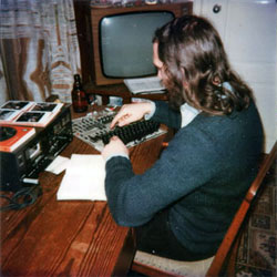 |
 |
|
| Figure 1: Reusing a photo – my first computer and one of my first TV sets | Figure 2: Some Mandelbrot sets that I calculated many years ago |
All in all, it looks as if there were a hidden law stating that every technological progress that mankind makes is by far outweighed by other factors or "plagues" such as commercials, technically conditioned waits, higher workload for the devices, software updates – and also human habits and errors like channel hopping and selecting the wrong channel, on which others can capitalize (as my Zattoo example above demonstrates).
*) I know that I usually do not need to install the update(s) immediately, but in most cases I do – because you never know...
References
May 23, 2013: Human Memory Is Fallible...
Many years ago, a former university colleague of mine told me a nice story: On a shopping trip, he went into a clothes shop, discovered a shirt he liked, and spontaneously bought it. At home and in a good mood because of his great purchase, he opened his wardrobe to hang up the shirt. But to his great surprise and dismay, the very same shirt was already hanging there. Obviously, he had bought an identical shirt some weeks ago and had completely forgotten about it. Stories like this tend to create a lot of gloating. This is especially true if you are, like my university colleague, a cognitive psychologist and a professional in understanding the inner workings of human memory. He was even able to impress his students with surprising feats of memory. But who should know better than he that human memory is also fallible?
Figure 1: Two identical shirts in my own collection, though one is already somewhat faded. I did buy the second one deliberately.
The malicious joy that such stories create does not last for long though, and eventually those laughing end up making the same mistake. I met my fate last week – and the story goes as follows. I have subscribed to O'Reilly to receive notifications about special ebook offers; and these e-mails arrive every few days. This time, there was a 50% discount on ebooks about visualization. The featured ebook, Interactive Data Visualization for the Web, attracted my attention and, at $11.99, it looked like a bargain to me. So I ordered the book and proceeded to the download page. But after I had downloaded two online versions of the ebook and then tried to move them to a dedicated folder on my computer, a dialog box appeared telling me that the folder already contained the ebook. I opened it and – to my great dismay – found out that I had already purchased the book three months ago. Oh my gosh! I suppose this definitely showed that the topic interests me. But I evidently hadn't started reading the book, as it had not left any traces on my memory.
What could I do in this situation? I emailed the O'Reilly customer service and told them my story. They were so nice as to offer me either a refund or the choice of another ebook, irrespective of the price difference. I opted for the latter and chose one that was considerably more expensive than the one I had ordered, because I could not find a suitable ebook in the same price range. Thank you very much! In acknowledgement, I am considering reviewing the ebook (Colin Ware: Information Visualization, Third Edition: Perception for Design). (P. S.: I succeeded in reviewing the book before my retirement...).
However, in a column about how human weaknesses and technology interact or interfere with each other the story cannot end here. I therefore have to ask whether and how we can avoid doing this. In a good book store, the shop assistant might realize that I am going to buy a book for a second time and therefore ask me whether this is deliberate. Then I might either reply that it's a birthday present for my colleague, or say "Oops!" and silently and red-faced return the book to its shelf (or the shop assistant does it for me)... In the case of ebooks, the situation should be much easier – at least in theory: Usually, you do not need them twice. O'Reilly knows all my ebook purchases. They can therefore check a new purchase against the products that I have already bought. If the ebook is already on the list they could open a dialog box and ask whether I really want to proceed with the purchase.
The same applies to apps, and having briefly checked Apple's App Store, it looks as if I cannot buy an app twice there. Admittedly, I never really thought about this issue until my duplicate purchase of an ebook. There seems to be fundamental differences between traditional online shops for "physical" goods and shops or stores that sell "digital" goods, such as music, videos, apps, and ebooks. Maybe O'Reilly is still sticking with the "physical model," that is, printed books, and is not aware of the intricacies of selling purely digital products...
April 19, 2013: Spring Awakened My iPad – and Old Questions
Back when I eventually bought an iPad, I reported on my change of mind regarding mobile devices in this column and promised to share my "mobile" experiences from time to time. In my last iPad report in February 2013, I asked whether the iPad, or any other tablet computer, is a productivity tool – or whether it could at least be used as one, for example, for the same kind of work done on a laptop computer or whether the iPad could even replace a laptop. Admittedly, I have not come to a definitive conclusion in this matter yet. On the one hand, there are people (including myself) who want to use their tablet computers in productive ways – at least, they express this intention and tinker around in this direction from time to time. On the other hand, I found overwhelming evidence that people (including myself) use their iPads primarily as a "tool for consumption." They use them for reading ebooks, watching videos or TV, looking at photos, playing games, surfing the Web (a kind of "information consumption"), or reading and, to a lesser degree, sending e-mails. The efforts that people make in the direction of "productivity" seem mostly to be made intermittently and halfheartedly. In this UI Design Blink, I will report on further observations that, in my opinion, confirm that tablet computers are primarily used as "consumption tools."
I am typically much more productive in winter than in summer. Since the nights are long, and the weather outside is cold and nasty, I sit at the kitchen table in front of my laptop computer and do a lot of things with it, for example, compose our annual newsletter that wraps up the past year. I gradually realized that during this period, my iPad had to endure a "wallflower existence." In other words, I tended to use it only on weekends in the mornings, surfing a little bit or reading ebooks while still lying in bed. All of my "investigation projects" regarding new and productive uses for my iPad came to a halt: because I used the iPad only intermittently, I simply forgot about all those file transfer, drawing, and office apps that I had bought – and I forgot how to use them, too...
But as soon as the weather got milder – which was awfully late this year – I felt pressed to go outside again and spend my time on the garden terrace. Usually I bring my laptop there, but compared to pre-iPad times, I now use it only for a short time. I then turn to my iPad and listen to music while watching the evening or nightly sky, surf the Web, read ebooks, or wade through masses of photos that I have stored on my iPad for review. I find it much more comfortable to sit in a garden chair, put my legs up on a second chair, and fiddle around with my iPad, than doing the same things with my laptop computer in an "office worker style." In the aforementioned February report, I discussed the home use of mobile devices and the notion of "comfortable computing." Well, here you have it!
|
|
|
||
Figure 1-3: Investigating various "comfort modes": Sitting with just the iPad is quite comfortable (left); combining the iPad with a keyboard is less comfortable and also dangerous for the iPad (center); adding a cushion for support is better but reminds of office work (click images for larger versions) |
||||
As one of my first spring activities with the iPad, I investigated my "comfort options" – Figures 1 to 3 show three of them – and how they relate to "productive work." Option 1 (iPad alone, Figure 1) is, except for the weight, quite comfortable, but is restricted to activities such as surfing, reading, watching videos or TV, or viewing photos. It is not really useful for productive work because I can use only one hand to operate the tablet. Option 2 (Figure 2) is actually none for me, because I am afraid that my iPad will fall to the ground and break (the setup is much less stable than it looks). And option 3 (Figure 3), while acceptable from a "safety perspective," reminds me too much of office work. Actually, it is the only "productivity option" for outdoor tablet computing that I have found so far. Options 4 and 5 would be to lay the iPad on the table and listen to music, or to put it on a stand and watch soccer matches on TV (the only use that I have for TV...) – by far the most comfortable options. All in all, comfortable computing for me seems to in conflict with productive work – options 1, 4, and 5 are the ones I use most often.
To sum up, the winter-summer dichotomy shows that my iPad retreats to the background at times when I get really productive, and my preference of "comfortable computing" in summer largely leads to using the iPad as "a consumption tool." The question remains, whether there are any times at all, when I use my iPad in productive ways as well. You probably wouldn't believe it: It is when I go on vacation and leave my laptop at home.
References
- Rachel Hinman: Tablets
and the age of comfortable computing (The Web and Beyond 2012,
September 25-26 2012, Royal Tropical Institute, Amsterdam)
(Comfortable Computing: How users are seeking experiences that provide a sense of comfort and connection through tablet devices and how designers can better support these needs.) - Related UI Design Blink: Is the iPad – or Any Other Tablet Computer – a Productivity Tool?
March 21, 2013: More on Multiple Skyline Graphs
Quite a few weeks have passed since my last UI Design Blink about multiple skyline graphs. It was written in response to Bill Caemmerer's reaction to my articles about skyline graphs (graphs that convey relative and absolute changes) and, in particular, to my attempt at multiple skyline graphs. In the meantime, and as promised to Bill and my readers, I have taken a closer look at his version of multiple skyline graphs. I have to admit that, to begin with, I stared at them day after day waiting in vain for enlightenment. I seemed to have some curious fundamental problems with interpreting the graphs. I understood how Bill had constructed them on the basis of a grid structure and marginal totals and what they meant in principle, but I could not relate them to "classic" skyline graphs. Then, as so often happens, I was interrupted for an extended period of time and was only able to return to my investigations last weekend. Yet again, I started off with a strong sense of despair, which only gradually gave way to a better understanding. Anyway, I feel that the time has now come to share my insights.
Understanding Bill Caemmerer's Graph Better…
To overcome my confusion when re-engaging with Bill's graphs, I looked for differences between the "classic" skyline graph and his "multiple" version – and wrote them down. I revived Processing and programmed several classic skyline graphs to allow me to check certain assumptions that I had made. And I also used Excel to compute margin totals, expected values, and differences between actual and expected values for the cells (see my tables) in order to have a numerical counterpart to Bill's graphs at hand. However, because of time constraints, I did not reprogram Bill's graphs. Finally, I applied the table lens paradigm to the original data (see below). This chart resembles Bill's "Sudoku" approach for multiple skyline graphs by arranging data values in a grid. But in table lenses the grid is just a grid and has no relation to data values, and the cells only display absolute values (as lengths). As a result of all these activities, I gradually developed a better understanding of Bill's graphs.
In retrospect, I think that my problems with interpreting Bill's graphs were the following:
- Firstly, as Bill noted, the "basis of comparison" is important for understanding the graphs. "Expected values" as a basis of comparison was too abstract for me – at least in the "students/chocolate brands" example. My goal was not to compare the data sets with abstract reference data that was derived from marginal totals and thus, not obvious to me: It was to compare the data sets with each other.
- Secondly, while I understood how Bill had created the grid from marginal
totals (the grid itself reminded me of table lenses), I was nevertheless
lost when it came to interpreting the graphs because I always tried to
interpret them as I would interpret "classic" skyline graphs.
Thus, I tended to fall back into the habit of applying interpretation
techniques that I had laboriously acquired in the past. But these habits
often misled me and were probably the reason why I stared and stared
at Bill's graphs and felt puzzled overall (which does not mean that I
could not extract certain information from them...).
One indicator of this behavior was that I expected box widths to represent absolute values of real data, that is, of one of the data sets, as is the case in "classic" skyline graphs (I now know that I should have known better...) – but they represent marginal totals (or fractions).
Preparations for Asking Questions
When asking the "promised" questions, I also wanted to compare Bill's graphs with other chart types to find out which one would answer the questions faster and easier. For this purpose, I chose the multiple column chart from my second article and the newly programmed table lens charts mentioned above. This is my chart zoo:
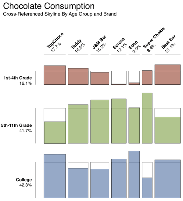 |
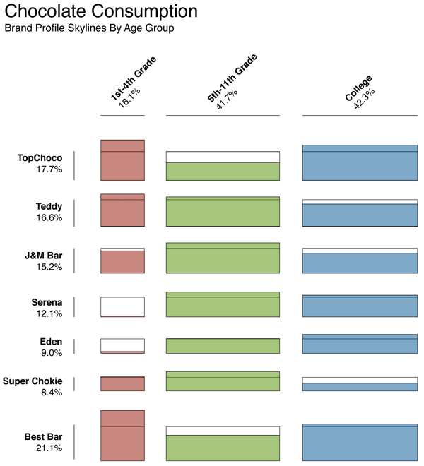 |
Figure 1: Bill Caemmerer's version of the multiple skyline graph in two orientations (there are minor differences in the numbers, because he extracted them from the column chart in my article).
|
Figure 3: "Quick & dirty" transposed version of the table lens version using column charts in two variants |
Figure 2: The original multiple column chart (created in Excel: Click image for larger version)
|
|
Figure 4 : Bar charts arranged in a table lens fashion in two variants (click image for larger version) |
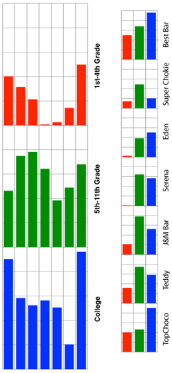
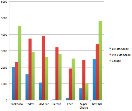
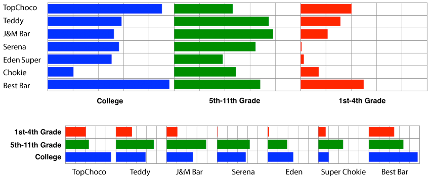
Answering Some Questions...
I used the following questions and investigated how easily I could answer them using the different chart types shown above:
- Question 1: Absolute TopChoco chocolate consumption for the three student groups
- Question 2: Absolute chocolate consumption per brand for college students (or any other group)
- Question 3: Overall largest/lowest chocolate consumption (any chocolate, any brand/student group)
- Question 4: Comparison of two specific data points (absolute values)
- Question 5: Which chocolate brand shows the greatest difference/change between middle and college students? For younger students there are two brands that can be picked easily…
Due to space restrictions, I will not divulge my – highly subjective – detailed results here, but will leave this as an exercise for the reader. But I do, of course, want to share my overall results:
- I found that both the multiple column chart and the table lens charts
answered my questions about absolute values and absolute differences more
easily than multiple skyline graphs.
A plausible reason for this observation is that absolute values are represented as lengths in the former, which are easier for people to compare than areas, which are used in the latter. - In the case of relative differences, however, it was a mixed bag, and the multiple skyline graph showed its advantages here. Admittedly, I found it hard to ask good questions referring to differences. Better questions would perhaps have revealed a more pronounced advantage of multiple skyline graphs here.
- Due to the overall grid that the boxes are arranged in, vertical
dimensions are much smaller for multiple skyline graphs
than for "classic" ones, making it more difficult for me
to estimate differences.
This is also the reason why I found the "column" version of Bill's chart easier to interpret than the "bar" version. - Personally, I do not find the "reference lines" indicating
estimated values particularly useful, because they have little concrete
meaning for me. I look primarily at the colored areas.
However, if you are interested in averages – the information is there.
To sum up, Bill's multiple skyline graphs look nice and clean, but regrettably they do not tell me the whole story in the same way as "classic" skyline graphs would do. I could answer most of the questions that I posed more easily and faster with the multiple column and table lens charts. Better questions might perhaps have led to different results.
"Final" Word
Please do not regard my observations as a "final verdict" – they are just an attempt to answer Bill Caemmerer's question, "What do you think?" Regrettably, I do not have time to investigate this interesting topic further. But my comments will perhaps help Bill improve this interesting chart type. Of course, it would also be nice to include his comments in this article or add them to it later.
References
- Interaction 2012 – Again, a UI Design Practitioner's Report (SAP Design Guild)
- Skyline Graphs – New Insights on the Horizon... (UI Design Blink)
- More Experiments with Skyline Graphs (UI Design Blink)
- Bill Caemmerer on Multiple Skyline Graphs (UI Design Blink)
- Processing Strikes Back: Simple Table Lenses Programmed Using Processing (UI Design Blink)
February 12, 2013: Is the iPad – or Any Other Tablet Computer – a Productivity Tool?
It's more than six months since I reported on my usage habits in the – for me – new mobile world (Retrospect after Five Weeks of Owning an iPad, Now I Know What "Cloud" Means). Some readers of this column might therefore be wondering why there has been so little news in the meantime. Actually, my summer vacation caused a major break in my publishing activities, and, thereafter, I had so much other work to do that I found little time for experimenting or being "productive" with my iPad.
This experience alone already tells me a great deal about how mobile devices are typically used. And I have to admit that I "knew it all along": I ended my report on using the iPad for five weeks with the conclusion that – for me – it had become a media player and surf combo. My experiments with photo editing apps had been informal only – and this hasn't changed yet. To complete the picture, I need to add another major usage area for mobile devices that I have not explored much myself: communication with other people using various social media platforms such as Facebook, Twitter, e-mail, and so on (and, in the case of a smart phone, the phone function itself, of course).
Looking at people in my proximity and asking them how they use their iPads confirmed that consumption and communication (or the other way round…) seem to be the primary use of mobile devices. The smart phone users whom Rachel Hinman observed when commuting with the 38 Geary bus in San Francisco and about whom she reports in her book The Mobile Frontier typically did the same – often deeply immersed in their devices (the ones whom I observed recently when commuting showed the same pattern). All in all, there is not much “productivity” involved when people are "computing on the go" – it's just too difficult when holding the device in one hand and "thumbing along". Personally, I would even dismiss the term "computing." People are handling computing devices when they use smart phones, but nobody really seems to care. What they do is consume and communicate, whatever seems appropriate in the given context...
On the other hand, there are quite a few people who insist on using their iPads or smart phones for "serious", or "productive", work. They want to exchange photos and office documents with their main computers, and not only want to view all the documents on their mobile devices, but also edit them there and feed them back. As an example, my friend told me that he had bought an iPad as a replacement for his broken laptop computer. I guess that Rachel Hinman will shake her head when reading this statement – an iPad is not meant as a replacement for a laptop computer, but people don’t seem to care... My brother wants to use his iPad for showing presentations to students, preferably imported from Microsoft PowerPoint, not from Apple's own office applications. As for me, I created text and spreadsheet files on my iPad to document our hiking tours and the locations we visited during our vacation. But that was only meant as a starting point, as a first exploration into the iPad’s capabilities for productive work. Last but not least, the fairly large number of office applications in Apple's App store (in addition to Apple's own) demonstrates that there must be, at least, some interest in such usage.
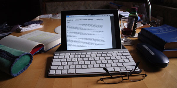
Figure 1: Productive work requires, of course, a laptop-like look, an external keyboard, and other ingredients…
Returning to Rachel Hinman and her book, I would like to point out that she also promotes a second usage style for mobile devices, which she calls "comfortable computing." Recently, she even gave a talk about this computing style (see link below). In his book Responsive Web Design, Ethan Marcotte also refers to “comfortable computing” without explicitly using this term. He links to an article by Luke Wroblewski, who lists where and when people use mobile devices: 84% of people use them at home, which was the most often mentioned location. Marcotte cautions his readers to summarize all mobile computing under "computing on the go." Such a view has, of course, implications for which "uses" designers support on mobile devices and which they do not. "On the go," our attention to the device is limited. Many channels compete for attention and interruptions are frequent. Therefore, when using mobile devices, people only process information in a shallow fashion. They jump right into interesting bits and pieces, but do not go into detail. They also switch frequently and quickly between topics (I no longer dare to say tasks...), but nevertheless only focus on one thing at a time. For "comfortable computing," many of the constraints and assumptions that are valid for "computing on the go" do not exist. People have the time to dig deeper into matters. They may also want to play more challenging games. And they may even want to write or design something. My friend, for example, told me that – together with his wife – he is writing a script for a potential movie in a German TV detective series: He lies comfortably on the couch and enters the text that they put together into a text-processing app on his iPad. (I immediately also bought the app and used it for this article.) All in all, "comfortable computing" adds a new dimension to the use of mobile devices suggesting that mobile devices can also be used for productive work.
Thus, in answer to the question posed in the title, I have shown that there are potential scenarios in which mobile device users may want to be productive in the sense of producing some output and not just consuming information, playing games, or communicating with people – and also that there are users who use or want to use their devices in this manner. Different mobile devices are more or less suited to this purpose, and there are lots of tools in the form of apps available – the quality and appropriateness of which need to be investigated more closely. I myself am just starting to explore some of them. And I have to admit that this is not always fun: I had to force myself to persevere in writing this article on my iPad – the handling seemed cumbersome to me compared with my "outdated", mouse-driven laptop computer (an interaction style that is nowadays called "indirect" manipulation).
It's far too early to proclaim any victories or other results of my attempts at using my iPad productively. As a preliminary result and perhaps an issue to investigate further, I would like to point out that mobile devices are "one-thing-at-a-time" devices. While people, much like butterflies, flit a great deal between different apps, they briefly focus on just one of them at a time – just as a butterfly stops on one flower for a moment or for a while. This is appropriate if, for example, you are creating a text as my friend does when writing his detective story, or as I did for the initial draft of this article. But it is no longer appropriate if you need to edit a longer article, compare different parts of it, apply major changes to the structure, and so on. At the moment, at least, mobile devices are not well suited to such usage. But this seeming inappropriateness is intentional, as Rachel Hinman tells us in her book. She points out that mobile devices are different from the "classic" GUI-based computers that we have become used to for decades. Whatever you may think of Hinman’s statement, I believe that there is ample room for improvement, particularly on the app side. And wait! I forgot to mention one new element in the equation: Windows 8, which set out to bridge the gap between desktop computers and mobile devices. At the moment, there is no decisive evidence as to whether this approach is successful or not. But I am confident that the future will tell...
References
- Rachel Hinman (2012). The Mobile Frontier: A Guide to Creating Mobile Experiences. Rosenfeld Media • ISBN: 1-933820-55-1 (Paperback), ISBN: 1-933820-05-5 (Digital editions) • Description at Rosenfeld Media • Short presentation • Review
- Ethan Marcotte (2011). Responsive Web Design. A Book Apart • ISBN: 978-0-9844425-7-7 • Description at A Book Apart • Short presentation
- Luke Wroblewski: When & Where Are People Using Mobile Devices?
- Rachel Hinman: Tablets
and the age of comfortable computing (The Web and Beyond 2012,
September 25-26 2012, Royal Tropical Institute, Amsterdam)
(Comfortable Computing: How users are seeking experiences that provide a sense of comfort and connection through tablet devices and how designers can better support these needs.) - Related UI Design Blink: Retrospect after Five Weeks of Owning an iPad, Now I Know What "Cloud" Means
February 1, 2013: Bill Caemmerer on Multiple Skyline Graphs
You may or may not remember that I attended the Interaction 2012 conference in Dublin, Ireland last year. Not only did I write a report on what I had seen at this conference, I also published two UI Design Blinks, Skyline Graphs – New Insights on the Horizon... and More Experiments with Skyline Graphs, about the topic of a presentation I was regrettably unable to attend: Bill Caemmerer's presentation Telling the Data Comparison Story Using A Skyline Graph (Instead of Two Pies). Luckily, an attendee told me about skyline graphs and briefly explained the basic concept behind them to me. I was so intrigued by the new graph type that I started a Web search for more information. This allowed me to experiment with them a little bit using the programming language Processing. As already mentioned, you can find the results of my experiments in my two Blinks from February and March 2012.
Inspired by a comment from a reader of the first Blink, I experimented with multiple data sets in the second Blink and eventually asked myself: "Why not combine two skyline charts into one?" So, at that time I proudly presented the first result of my experiments with multiple skyline graphs (Figure 1):
 |
|
| Figure 1: Combined skyline chart with college students (100% boxes) as a reference (click image for larger version) | Figure 2: 2D multiple column chart using the same data (created in MS Excel: Click image for larger version) |
Admittedly, I wasn't really convinced of my first result, and maybe Bill Caemmerer – who obviously stumbled across my Blinks – wasn't either. Therefore, he started his own explorations in multiple skyline graphs. Here is what he recently reported about them in an e-mail to me:
Thanks for your UI Design Blink articles on Skyline graphs, I was very happy that my talk last year generated some interest and conversation, and your in-depth analysis of multiple series in one chart was very stimulating. I thought about your proposal quite a lot, and it brought two things into focus that I think are important with a Skyline graph. One is to maintain this idea that it's easy to look at – it should be simple and obvious – yet the design depends on a certain amount of superimposing one layer of data on top of another, and as we add layers it can get hard to read very quickly. The other is, it becomes very important to choose the horizontal series carefully, that is, what is the basis of comparison? In a simple skyline that compares one state to another, it's pretty simple, but in a slightly more complex example like yours, it quickly becomes a big question, and how you choose this will determine what the graph actually means. Is there some reason why college students make a compelling reference to the other age groups? If so, that's great; but are there other comparisons we can make, and what impact would they have on the design? Here's what I came up with, following your chocolate consumption examples (I just approximated the values based on the 2-D three-column chart). The idea is a cross-referenced skyline that uses the total market-share breakdown per brand to set widths, and the total breakdown by age group to set heights; that creates a grid of 21 coordinates, and we plot the actual values against the grid we've drawn.
Figure 3: Bill Caemmerer's basic idea for the multiple skyline chart is to use the total market-share breakdown per brand to set widths and the total breakdown by age group to set heights, creating a grid of 21 coordinates
Figure 4: Bill Caemmerer's version of the multiple skyline graph We could actually turn it sideways as well, and get an age-profile for each of the brands – this might be more useful if we had more age groups than just three, but the point is, you could take any two data dimensions and cross-reference them to look at distributions.
Figure 5: Transposed multiple skyline graph I also like that there's a Sudoku-like quality to the new chart: for any of these skylines, the white space 'below' the reference line is the same as the green, red or blue space above it. Because the shaded area has to total the same as the reference area. The same applies for the columns! What do you think? |
The first thing that came to my mind was that Bill has thought much longer about the best way to present data in a multiple skyline chart than I had. My approach was just straightforward and superimposed several skyline graphs in one graph, making the overall graph hard to interpret (it was meant to stimulate ideas, not to be a solution). In his e-mail, Bill refers to the resemblance of his graph to Sudoku puzzles or grids. Having no experience with these, my own first associations as to his graphs were more in the direction of table lenses and bubble charts (which I explored somewhat in the UI Design Blink Processing Strikes Back: Simple Table Lenses Programmed Using Processing from December 2010). Anyway, the grid-like structure makes the multiple graphs clear and easy to understand, and – as Bill rightfully points out – "you could take any two data dimensions and cross-reference them to look at distributions." In other words, you can have more than three data sets without cluttering the graph.
Nevertheless, I have to admit that after nearly a year of not dealing with skyline graphs, I had to get used to them again. I also realized that I have some elementary problems understanding Bill's multiple graphs (as well as my own). I found myself repeatedly resorting to a simple 2D multiple column chart using the same data (Figure 2 above) to regain orientation. Therefore, following the tradition of my Blink Let the Graph Tell Us the Answer, I decided to ask some questions that might come up when looking at the 2D graph, and try to find out how easily these can be answered using Bill's and my graphs. This investigation will, however, take some time – and would also consume a lot of space in this Blink. I therefore have decided to report on my experiences in a forthcoming UI Design Blink.
References
- Interaction 2012 – Again, a UI Design Practitioner's Report (SAP Design Guild)
- Skyline Graphs – New Insights on the Horizon... (UI Design Blink)
- More Experiments with Skyline Graphs (UI Design Blink)
- Processing Strikes Back: Simple Table Lenses Programmed Using Processing (UI Design Blink)
Note: You will find more references at the end of the two UI Design Blinks about skyline graphs.
January 15, 2013: A New Approach to the Gamification of Websites – Finding the Relevant Content
Many people still believe that everything on the Web should be free. Others regard the Web as a money-printing machine that will make people who take their chances rich. In fact, I would not be too surprised if, one day, we had to start paying for useful content instead of obtaining it free of charge. But even today, free Web content already comes at a price in many cases. The price that you may have to pay is that you have to look very hard to find relevant content on a page. In this UI Blink, I take a look at this trend and come to a surprising conclusion.
In his book Responsive Web Design, Ethan Marcotte reports on how Merlin Mann collected a set of screenshots on flickr entitled, Noise to Noise Ratio, to showcase some of the most "content-saturated pages" on the Web. Marcotte describes the screens as follows, "The pages are drowning in a sea of cruft. And the actual article ... is nigh "unfindable." Have a look at the screens yourself and, depending on your mood, enjoy them or get annoyed.

Figure 1: Find the content on this screen that I encountered recently (click the image for a larger version)
Marcotte points out that while the sites in Mann's gallery may be new to his readers, the problems they demonstrate should be pretty familiar to them. To me, they are indeed very familiar. Figure 1 shows a screen that I recently encountered when surfing the Web. Although I used a fairly large screen, there is not much content to find on the respective screen shot – the red arrow points to it. You may of course argue that stock data is the sort of information you're looking for, in which case there is a little more content on the screen...
It is well known that older people and those with little Internet experience have severe problems finding relevant content on Web pages. In his book Net Smart, Howard Rheingold therefore sets out to teach his readers to direct their attention to the right targets (find the content) and develop effective "crap detectors" (evaluate the content) in order to get to relevant information on the Internet. But this requires a lot of training and it made me wonder why all this effort seems to be necessary. Is it really a successful – design and business – strategy to annoy people and to prevent them from getting want they want?
Having thought about this phenomenon more deeply, I came to the conclusion that something must be going on on the Web that I have overlooked so far. In line with other design fields, such as business applications, the gamification trend seems to have reached the Web too. Designers now seem to be encouraging Website visitors to have fun on their sites and to join in the fascinating and engaging game of searching for relevant content. I can envisage bonus points being awarded to visitors when they find relevant bits of content and click on links that lead to more information. The points might be used to increase the level of difficulty of the "find-the-content" game: The more points you gain, the harder it will become for you to find useful content – and the easier it will be to stumble on ads...
References
- Merlin Mann: Noise to Noise Ratio Flickr set
- Ethan Marcotte (2011). Responsive Web Design. A Book Apart • ISBN: 978-0-9844425-7-7 • Short presentation
- Rheingold, Howard (2012). Net Smart: How to Thrive Online. The MIT Press • ISBN-10: 0262017458, ISBN-13: 978-0262017459 • Short presentation • Review
Last Revision: 05/29/2016
|
Gerd Waloszek |
made by |
 on
a mac!
on
a mac!