
- DAU Stories
- UI Design Thoughts
- UI Design Issues
- ---
- UI Design Blinks 2013
- UI Design Blinks 2012
- UI Design Blinks 2011
- UI Design Blinks 2010
UI Design Blinks 2010 – Overview
By Gerd Waloszek
 Welcome
to this column of brief, blog-like articles about various UI design topics – inspired
by my daily work, conference visits, books, or just everyday life experiences.
Welcome
to this column of brief, blog-like articles about various UI design topics – inspired
by my daily work, conference visits, books, or just everyday life experiences.
As in a blog roll, the articles are listed in reverse chronological order.
See also the overviews of UI Design Blinks from the years 2011, 2012, and 2013.
2010 Blog Roll
 December
16, 2010: Caught in an Accessibility Trap...
December
16, 2010: Caught in an Accessibility Trap...
Recently, the phone rang, while I was busy at my computer. My wife handed the phone over to me because my old friend Fiete was at the other end of the line and needed some assistance. He had issues with his telephone equipment and asked me to call him back and also send him a fax to check whether the equipment was working properly now. While talking with him, I tried to complete a task at my computer that I had already begun: prepare and print out a Christmas postcard. After having started the print job, I went downstairs to send the fax. ...
December 14, 2010: Virtual Possessions
 At
the DIS (Designing Interactive systems) 2010 conference in Aarhus Denmark,
Will Odom from Carnegie Mellon University (CMU) was one of the speakers
who stood out for me. In two talks, one directly devoted to the topic and
another one touching on it, he discussed "virtual
possessions" – a new category of possessions that people have
increasingly acquired over the past few years. I had not heard of this
term before, but was familiar with the concept. Others, however, may
well ask: "What on earth are virtual possessions?" ...
At
the DIS (Designing Interactive systems) 2010 conference in Aarhus Denmark,
Will Odom from Carnegie Mellon University (CMU) was one of the speakers
who stood out for me. In two talks, one directly devoted to the topic and
another one touching on it, he discussed "virtual
possessions" – a new category of possessions that people have
increasingly acquired over the past few years. I had not heard of this
term before, but was familiar with the concept. Others, however, may
well ask: "What on earth are virtual possessions?" ...
December 7, 2010: Processing Strikes Back – Simple Table Lenses Programmed Using Processing
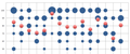
![]() In
my previous UI Design Blink, I was very imprudent: I promised to write
a further blink about my experiments with presenting the bubble chart data
as a Table Lens that I would program using Processing.
This promise committed me to actually perform such experiments, despite
the fact that I had more pressing tasks in my work queue than playing
around with Table Lens charts. ...
In
my previous UI Design Blink, I was very imprudent: I promised to write
a further blink about my experiments with presenting the bubble chart data
as a Table Lens that I would program using Processing.
This promise committed me to actually perform such experiments, despite
the fact that I had more pressing tasks in my work queue than playing
around with Table Lens charts. ...
 November
25, 2010: Excel Strikes Back – Bye-Bye Processing – Hello
Excel?
November
25, 2010: Excel Strikes Back – Bye-Bye Processing – Hello
Excel?
After my colleague had presented her slides to her team, another colleague – who is interested in data visualization – contacted her and made a number of suggestions for improving them. In particular, he suggested using the table lens as a graphical representation of some of the data that was presented in the slides. He also suggested using Excel's bubble chart feature to present the rating data on one of the slides and provided some sample graphs and data. However, as you may recall, I previously reported that I had failed to create bubble charts from my colleague's rating data using Excel and instead used Processing to program a chart myself. ...
November 16, 2010: Bye-Bye Excel – Hello Processing!
![]() Recently,
my colleague had to prepare a presentation that included two tables full
of numbers. We realized immediately that these tables were hard to read
and the main phenomena difficult to detect. Therefore, I decided to export
both tables to Excel and create diagrams from them. One of the tables consisted
of ratings for test stations and also included the mean values. A scatter
diagram was the solution to this presentation problem, and the mean values
could be highlighted so that they would stand out. ...
Recently,
my colleague had to prepare a presentation that included two tables full
of numbers. We realized immediately that these tables were hard to read
and the main phenomena difficult to detect. Therefore, I decided to export
both tables to Excel and create diagrams from them. One of the tables consisted
of ratings for test stations and also included the mean values. A scatter
diagram was the solution to this presentation problem, and the mean values
could be highlighted so that they would stand out. ...
November 12, 2010: Annotators Not Welcome in the Age of Ebooks
![]() I
was recently busy preparing a review of the book Analyzing
Social Media Networks with NodeXL by Derek Hansen, Ben Shneiderman,
and Marc Smith. This was my first "real" review of an ebook
because I do not have a printed copy of the book as backup. So this review
was my test bed for reviewing ebooks. ...
I
was recently busy preparing a review of the book Analyzing
Social Media Networks with NodeXL by Derek Hansen, Ben Shneiderman,
and Marc Smith. This was my first "real" review of an ebook
because I do not have a printed copy of the book as backup. So this review
was my test bed for reviewing ebooks. ...
October 20, 2010: A Lengthy Substantiation of Jeff Johnson's Book, Designing with the Mind in Mind
 In
his foreword to Jeff Johnson's book, Designing with
the Mind in Mind, HCI pioneer Stuart Card states that the design
of interactive computer systems is, at least aspirationally, a science.
But he immediately confines this activity to "a kind of joint computer-cognitive
engineering, that is, science-based techniques to create interactive
systems satisfying specified requirements." The phrase "science-based
techniques" implies that there is a counterpart to UI design in
science. Card, who together with Allen Newell and Thomas Moran, gave
a name to this counterpart back in 1983, reveals it: "Providing
a supporting science and engineering for building interactive artifacts
has been a founding aspiration of the field of human-computer interaction." ...
In
his foreword to Jeff Johnson's book, Designing with
the Mind in Mind, HCI pioneer Stuart Card states that the design
of interactive computer systems is, at least aspirationally, a science.
But he immediately confines this activity to "a kind of joint computer-cognitive
engineering, that is, science-based techniques to create interactive
systems satisfying specified requirements." The phrase "science-based
techniques" implies that there is a counterpart to UI design in
science. Card, who together with Allen Newell and Thomas Moran, gave
a name to this counterpart back in 1983, reveals it: "Providing
a supporting science and engineering for building interactive artifacts
has been a founding aspiration of the field of human-computer interaction." ...
October 7, 2010: People, Elevators, and Sustainability...
 Sustainability
has become a frequent topic in the UI field, be it in magazines (such as Interactions), at conferences, or
in practical work to design products that help reduce carbon footprint
or energy consumption. Nathan Shedroff's book, "Design is the Problem",
is a good and comprehensive resource for starting activities in this
field. In particular, I found the following distinctions in his book
useful: Reduce, Reuse, Recycle, Restore, and Process. I can quickly assign
activities, presentations, or papers to one of these five categories
and thus get an idea of their significance and possible impact on the
overall sustainability issue. ...
Sustainability
has become a frequent topic in the UI field, be it in magazines (such as Interactions), at conferences, or
in practical work to design products that help reduce carbon footprint
or energy consumption. Nathan Shedroff's book, "Design is the Problem",
is a good and comprehensive resource for starting activities in this
field. In particular, I found the following distinctions in his book
useful: Reduce, Reuse, Recycle, Restore, and Process. I can quickly assign
activities, presentations, or papers to one of these five categories
and thus get an idea of their significance and possible impact on the
overall sustainability issue. ...
October 7, 2010: User Experience??? Hmmm...
The term "User Experience" resounds throughout the world. Today, many companies claim that their products offer an outstanding user experience. After all, UI professionals have conferences at which to discuss what the term actually means. Not surprisingly, everyone seems to have a different opinion, as I learned at the INTERACT 2009 conference. ...
October 7, 2010: Means and Thresholds as Attractors – The Boomerang Effect
 After an election, there are usually heated debates about
why a party lost votes, particularly if it turned in an excellent result
at the previous election. Similarly, people wonder why a sportsman fails
in a competition if he excelled in a previous one, when he performed
much better than usual. However, this "movement toward the average" is
not at all mysterious – it is just the effect of a statistical
phenomenon known as "regression toward the mean". ...
After an election, there are usually heated debates about
why a party lost votes, particularly if it turned in an excellent result
at the previous election. Similarly, people wonder why a sportsman fails
in a competition if he excelled in a previous one, when he performed
much better than usual. However, this "movement toward the average" is
not at all mysterious – it is just the effect of a statistical
phenomenon known as "regression toward the mean". ...
Last Revision: 03/16/2014
|
Gerd Waloszek |
made by |