
- DAU Stories
- UI Design Thoughts
- UI Design Issues
- ---
- UI Design Blinks 2013
- UI Design Blinks 2012
- UI Design Blinks 2011
- UI Design Blinks 2010
UI Design Blinks 2010
By Gerd Waloszek
 Welcome
to this column of brief, blog-like articles about various UI design topics – inspired
by my daily work, conference visits, books, or just everyday life experiences.
Welcome
to this column of brief, blog-like articles about various UI design topics – inspired
by my daily work, conference visits, books, or just everyday life experiences.
As in a blog roll, the articles are listed in reverse chronological order.
See also the overviews of UI Design Blinks from others years: 2011, 2012, 2013.
December 16, 2010: Caught in an Accessibility Trap...
Recently, the phone rang, while I was busy at my computer. My wife handed the phone over to me because my old friend Fiete was at the other end of the line and needed some assistance. He had issues with his telephone equipment and asked me to call him back and also send him a fax to check whether the equipment was working properly now. While talking with him, I tried to complete a task at my computer that I had already begun: prepare and print out a Christmas postcard. After having started the print job, I went downstairs to send the fax. After the fax machine had sent the fay, it flashed a number of different error messages and did not stop even after I had turned the machine on and off. I decided that the ink cartridge was used up, so simply ignored the flashing, returned to my computer, and continued to print out postcards.
Being already somewhat irritated by the behavior of the fax machine, my problems continued as I returned to my computer: The computer screen looked fuzzy, as if I had changed the screen resolution. I should mention that I had connected a larger monitor to my laptop, and as the power cable was not properly connected, the monitor turned itself off and on accidentally. I concluded that the monitor settings had changed as a result, so I checked the settings again and again, but they looked OK each time. Next, I turned to the computer itself and opened the control panel for the computer monitors. Again, both the internal and the external monitor were set to their correct values. After having played around with the settings for some time without any success, as a last resort I decided to restart the computer – again, nothing changed for the better. So I concluded that the graphic card might be the cause of the fuzziness, and had either become defective or entered a wrong mode for some unknown reasons. Now the time had come to consult the Internet. I went to the computer manufacturer's Website, scanned the FAQ list and then the discussion forums, but I could not discover anything that dealt with my problem. At least I found a small application for download that switched between graphic cards. This application worked on my computer even though it turned out that my model does not have two graphic cards... Nevertheless, the application initialized the graphic card – but the phenomenon itself remained "indestructible."
Finally, I noticed, or better, devoted more attention to a curious aspect of the computer's behavior: The computer screen showed only 80 or 90% of the desktop, and the screen content also moved when I moved the mouse towards the edges of the screen. It looked as if the screen was somewhat enlarged, from full HD resolution (1920*1080) to about 2200*1200. Somehow this reminded me of something... Wasn't there a screen magnification feature for people with visual deficiencies? I opened the control panels, selected the "Universal Access" panel and here the tab "Seeing". And then the scales fell from my eyes: Zoom was "on" (see figure 1)!
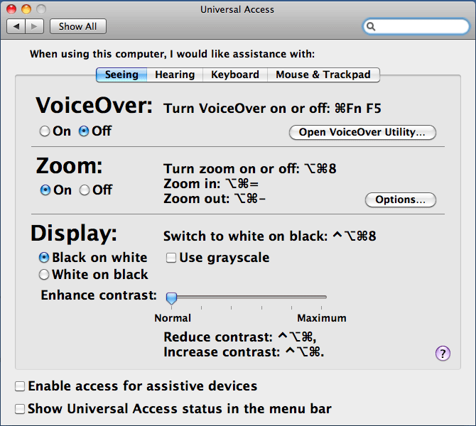
Figure 1: Control panel for universal access, tab "Seeing", with zoom set to on
But who had turned it on? Of course, it must have been me! And eventually I could even explain why: There is a keyboard shortcut for turning screen magnification on and off: "Alt+Cmd+8" (see figure 1). How could I have inadvertently pressed such an awkward key combination? This question has a simple answer: In Adobe Photoshop Elements, which I had been using to prepare and print out the postcards, "Alt+Cmd+I" is the shortcut for scaling images, which I use frequently. However, I am a bad typist, and it is fairly easy to press an "8" instead of an "I," as a look at my laptop's keyboard reveals:
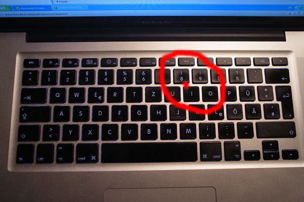
Figure 2: Keys "8" and "I" are close to each other on the keyboard – bad typists can easily hit the wrong key
So, what is the lesson from this story? In normal life, accidents usually happen only if a number of factors coincide. As long as only one factor is at work, we can avoid the accident more often than not. Similarly, in my case several factors contributed to the final disaster: Working at the computer and making a phone call at the same time, keyboard shortcuts having keys which are close together on the keyboard (with one shortcut that I did not know of), a bad typist, and a second monitor to confuse me even more and lead me up the wrong paths. But what saved me from my mishap and helped me find the solution? Firstly, there were a number of hypotheses that failed, so each could be excluded one by one. And secondly, some vague knowledge of how computers are made accessible for disabled people. I do not know, whether I would have ever found the solution without this knowledge. Would other people have found it?
P. S.: After my brother had read a draft version of this article, he criticized that there was no magic or brute force involved in resolving the error – it was all simple logic. That is indeed the case, but despite the logic behind the error, I spent an awful lot of time to recover from it!
December 14, 2010: Virtual Possessions
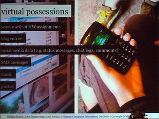
At the DIS (Designing Interactive Systems) 2010 conference in Aarhus Denmark, Will Odom from Carnegie Mellon University (CMU) was one of the speakers who stood out for me. In two talks, one directly devoted to the topic and another one touching on it, he discussed "virtual possessions" – a new category of possessions that people have increasingly acquired over the past few years. I had not heard of this term before, but was familiar with the concept. Others, however, may well ask: "What on earth are virtual possessions?" Although Will Odom did not provide an actual definition at the conference, he referred to their two origins and thus shed enough light on them to elucidate the concept:
- Material things that continue to lose their lasting material (or physical)
form and are converted into virtual (or digital) form:
Books, music, movies, photos, plane tickets, paychecks, money, and so on - New things that have never had a lasting material (or physical) form:
Avatars from different games and online services; electronic messages, including e-mail, SMS, and status updates; social networking profiles; logs of personal behavior such as purchase histories, locations visited from service, listings of activities (jogging routes, and so on).
In his study, Will Odom interviewed teenagers about their virtual possessions, what kinds of virtual things they use, and how value emerges with these kinds of possessions. He found that constraining storage to local devices complicates access to virtual possessions. As a result, there seems to be a strong trend, at least among young people, toward storage on cloud computing servers. That is to say that we are currently experiencing a transition from local to cloud computing-based storage.
 |
 |
|
|
|
In a second talk "Designing for Dynamic Family Structures: Divorced Families and Interactive Systems," Will Odom pointed out that children from divorced families have difficulty living in two places: They miss the things they are familiar with and that make them feel at home, such as photos on the wall, toys, and many other items. Odom observed that these children make digital copies of the physical things they possess or like and store the images on social Websites such as Facebook. Thus, they create virtual possessions in order to have access to them from any location and overcome their difficulties with making a home.
Virtual possessions are not restricted to children – all of us are following this trend to a greater or lesser extent. However, some virtual things have become so familiar to us that we no longer even give them a second thought, such as virtual money transactions, digital photos, and videos. Other virtualization trends, such as the transition from physical to online books, are just emerging – e-book readers seem to be experiencing a boom at present. In my own life, virtual possessions have a long tradition, beginning with documents that I created on the computer and stored there for archiving purposes. My archiving habits have also changed dramatically: Nowadays, I rarely print out an e-mail. In my early years at SAP, at the beginning of the 1990s, however, I printed out all the e-mails that I sent or received and stored them in a "real" folder. Nonetheless, I am not ont to jump on all new trends: I am still unwilling to make the transition from local storage devices to the cloud. My virtual possessions fit on two hard-disk drives (plus two more for backup purposes), and I like to have them under my own control (like the old woman at the bank counter who asked the clerk to show her all her money – she just wanted to know whether it was still there...).
References
December 7, 2010: Processing Strikes Back: Simple Table Lenses Programmed Using Processing
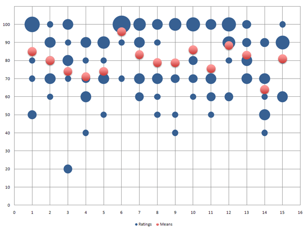
In my previous UI Design Blink, I was very imprudent: I promised to write a further blink about my experiments with presenting the bubble chart data as a Table Lens that I would program using Processing. This promise committed me to actually perform such experiments, despite the fact that I had more pressing tasks in my work queue than playing around with Table Lens charts.
It turned out that it was not difficult to modify my bubble chart application into one that creates a basic Table Lens: I merely had to replace the bubbles with boxes and move these from their positions on the grid lines further down into the cells. The programming of the mean values remained unchanged.
There is, however, a minor issue with the vertical axis: The horizontal histogram bars are no longer positioned on the lines that their values correspond to, for example 100%, 90%, and so on. Instead, they are positioned now in the cells, and that means between the lines: between 100% and 90%, between 90% and 80%, and so on. The mean values, on the other hand, are still positioned vertically as if the vertical axis represented a continuous scale from 0% to 100%. This difference could cause confusion and should be addressed in the legend.
Here is a comparison between my original bubble chart and the corresponding Table Lens version, both created using Processing:
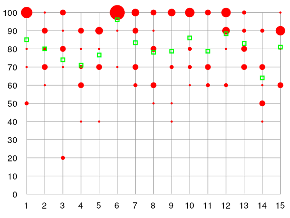 |
Table Lenses look better if you squeeze the vertical axis (Table Lenses are actually intended for data sets using large numbers of rows) |
|
| Figure 1: Bubble chart (frequency diagram) using mean values programmed with Processing (fictitious data) | Figure 2: Table Lens (frequency diagram) with mean values programmed with Processing (fictitious data) |
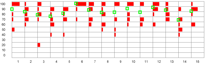
Personally, I still prefer the bubble chart version. In my opinion, the Table Lens version is less clear (it looks better if you click the preview and look at the version in its original size). This comes at no surprise, because Table Lens charts are intended for very large data sets, where they really shine. Thus, if you squeeze my table lens vertically so that the rows are mere lines, and several hundred rows are displayed in the same space, you get a completely different visual pattern. Now, the histogram bars in the columns melt into large vertical histograms. This is demonstrated in the following figure from a commercial Table Lens application:
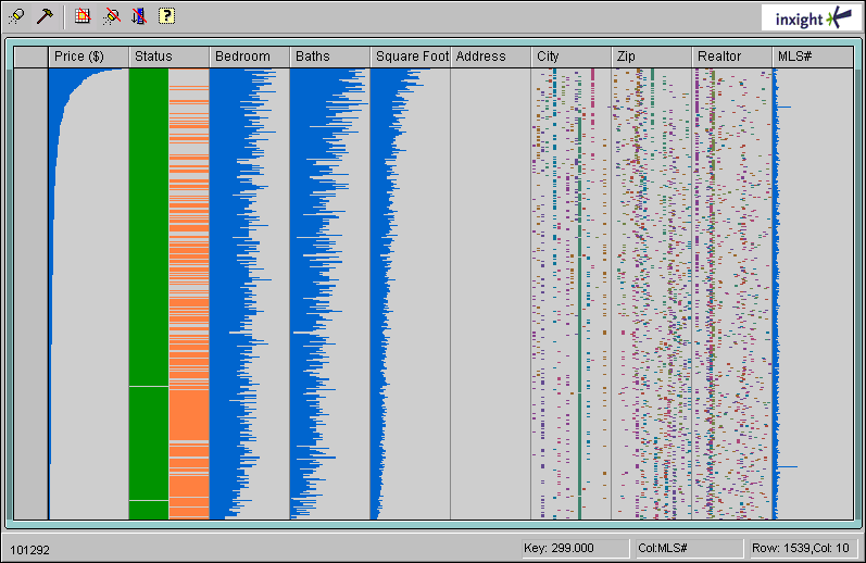
Figure 3: Table Lens from Inxight
In order to create a Table Lens with more data rows, I resorted to using random numbers. I also removed the horizontal grid lines. Here is a simple Table Lens simulation that I created with random numbers:
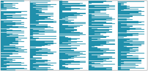
Figure 4: Table Lens simulation in Processing with random numbers (no horizontal grid lines)
My simple simulation of a Table Lens cannot, of course, compete with commercial applications that allow you to sort and filter the columns and inspect very large data sets in real time. This is where we finally reach the limits of a few lines of Processing code...
Some Information on the Table Lens
The Table Lens was developed at Xerox Parc by Stuart Card, Ramana Rao, and Peter Pirolli (see references) in the mid 1990s and was later commercialized by Inxight, a spin-off of Xerox. Inxight was acquired by BusinessObjects, which is now part of SAP and called SAP BusinessObjects. The Inxight Website has vanished along with all its references to the Table Lens (and to Inxight's hyperbolic browser, which was named Star Tree...). Regrettably, I was unable to find any references to the former Inxight products on the SAP BusinessObjects Web pages.
The Inxight Website described the Table Lens as follows: "Table Lens revolutionizes exploratory data analysis by applying information visualization principles like 'Focus+Context' and 'putting the graphics first' to the problem of interacting with large tabular data sets. Users can quickly get an overview of large data sets, looking for patterns and relationships, as well as focusing on specific items in their full context. The interactivity of Table Lens allows users to make sense of data even when it is published to the Web."
References
- Casey Reas & Ben Fry (2007). Processing: A Programming Handbook for Visual Designers and Artists. The MIT Press, 2007 • ISBN-10: 0262182629, ISBN-13: 978-0262182621 • Review
- Peter Pirolli, Ramana Rao (1996). Table Lens as a Tool for Making Sense of Data. Advanced Visual Interfaces Workshop, AVI '96. (www2.parc.com/istl/groups/uir/pubs/items/UIR-1996-06-Pirolli-AVI96-TableLens.pdf)
- Ramana Rao, Stuart K. Card (1994). The Table Lens: Merging Graphical and Symbolic Representations in an Interactive Focus+Context Visualization for Tabular Information. Proc. ACM Conf. Human Factors in Computing Systems, CHI '94. (www2.parc.com/istl/groups/uir/pubs/items/UIR-1994-07-Rao-CHI94-TableLens.pdf)
November 25, 2010: Excel Strikes Back: Bye-Bye Processing – Hello Excel?
After my colleague had presented her slides to her team, another colleague – who is interested in data visualization – contacted her and made a number of suggestions for improving them. In particular, he suggested using the table lens as a graphical representation of some of the data that was presented in the slides. He also suggested using Excel's bubble chart feature to present the rating data on one of the slides and provided some sample graphs and data. However, as you may recall, I previously reported that I had failed to create bubble charts from my colleague's rating data using Excel and instead used Processing to program a chart myself. Also, the sample data we received looked very different from our data, which was given in the following tabular form and thus not directly usable for an Excel bubble chart:
| Rating/Topic >>> | 1 | 2 | 3 | 4 | 5 | 6 | 7 | 8 | 9 | 10 | 11 | 12 | 13 | 14 | 15 |
| 100% | 6 | 1 | 3 | 8 | 4 | 3 | 4 | 5 | 3 | 5 | 2 | 1 | |||
| 90% | 3 | 1 | 3 | 4 | 1 | 3 | 1 | 4 | 2 | 2 | 5 | ||||
| 80% | 1 | 2 | 3 | 1 | 1 | 2 | 1 | 3 | 1 | ||||||
| 70% | 1 | 3 | 1 | 2 | 3 | 1 | 3 | 3 | 2 | 2 | 3 | 3 | 3 | ||
| 60% | 1 | 3 | 2 | 1 | 1 | 2 | 2 | 1 | 3 | ||||||
| 50% | 2 | 1 | 1 | 1 | 3 | ||||||||||
| ... |
Table 1: Section of the (fictitious) data
As a physicist, I knew (or should have known...) that data often needs to be transformed in some way to make it appropriate for a specific visualization or visualization tool. And indeed, I was able to solve the riddle by consulting Excel's bubble chart help. There, I learned that, to create a bubble chart, I needed a list of data points in the following format:
| Data Series | Topic | Rating | Frequency |
| 1 (data) | 1 | 100 | 6 |
| 1 | 1 | 80 | 1 |
| 1 | 1 | 70 | 1 |
| ... | |||
| 1 | 2 | 100 | 1 |
| 1 | 2 | 90 | 3 |
| ... | |||
| 2 (means) | 1 | 85 | 2 |
| 2 | 2 | 88 | 2 |
| ... |
Table 2 : Section of the (fictitious) data in the format that is required for Excel bubble charts
Thus, all I needed to do was reformat the data so that I had as many data rows as there were data points (or bubbles). From then on, everything depended more or less on my "fluency" in Excel. It therefore took a while for me to format everything, including the grid lines and bubbles, in the way I wanted. Moreover, I had to understand that the mean ratings had to be represented as a second data set. To cut a long story short, here is the result of my efforts using Excel, or better, one exemplary result out of myriads of possible options (the bubble size is set to 30%):
 |
|
|
| Figure 1: Frequency diagram with mean values created with Excel (fictitious data) | Figure 2: Frequency diagram with mean values programmed with Processing (fictitious data) |
Please note that I was aiming to make the graph look similar to the one that I had programmed with Processing, not to create the coolest-looking diagram.
Actually, this was not my initial bubble graph from this data. Figure 1 represents frequency based on bubble diameter. I chose this approach with Processing because it was easy to program. Initially, however, Excel selects the bubble area as an indicator of frequency, and I thought that this would be the best way of presenting the data. However, when I look at both results now, I prefer the diameter option (figure 4), because it makes the differences more obvious (though the mean values could be a little bit larger...):
 |
|
|
| Figure 3: Frequency represented using bubble area (fictitious data) | Figure 4: Frequency represented using bubble diameter (fictitious data), same as figure 1 |
To sum up, the message of this article is that it is important to look closely at your data, experiment with it, and learn how you can transform it in a way that it can be represented best. Does this mean that Excel has thrown Processing out of the game? On the contrary! If, for example, you want to present your data in table lens fashion, Excel will leave you in the dark. This is a job for Processing (or any other tool of your choice)! But that will be the subject of another article, in which I will demonstrate my simple table lens implementation using Processing.
References
- Casey Reas & Ben Fry (2007). Processing: A Programming Handbook for Visual Designers and Artists. The MIT Press, 2007 • ISBN-10: 0262182629, ISBN-13: 978-0262182621 • Review
- Peter Pirolli, Ramana Rao (1996). Table Lens as a Tool for Making Sense of Data. Advanced Visual Interfaces Workshop, AVI '96. (www2.parc.com/istl/groups/uir/pubs/items/UIR-1996-06-Pirolli-AVI96-TableLens.pdf)
- Ramana Rao, Stuart K. Card (1994). The Table Lens: Merging Graphical and Symbolic Representations in an Interactive Focus+Context Visualization for Tabular Information. Proc. ACM Conf. Human Factors in Computing Systems, CHI '94. (www2.parc.com/istl/groups/uir/pubs/items/UIR-1994-07-Rao-CHI94-TableLens.pdf)
November 16, 2010: Bye-Bye Excel – Hello Processing!
Recently, my colleague had to prepare a presentation that included two tables full of numbers. We realized immediately that these tables were hard to read and the main phenomena difficult to detect. Therefore, I decided to export both tables to Excel and create diagrams from them. One of the tables consisted of ratings for test stations and also included the mean values. A scatter diagram was the solution to this presentation problem, and the mean values could be highlighted so that they would stand out. This proved to be easy enough to do in Excel, and the resulting diagram looks like this:
Figure 1: Scatter plot with mean values created in Excel (fictitious data)
The second set of values described how well the testers were suited to the applications that they tested at the stations, and again we included the mean values. While both tables looked very similar, this time I wanted to present the frequencies of the ratings, rather than just single values. I tried over and over to do this in Excel, but eventually gave up because I could not find any diagram type that displayed the data the way I wanted.
Then I remembered that at the CHI 2008 conference (Florence, Italy) I had heard about a Website that allows people to display data as diagrams – they can use either predefined data or their own data. This is the Many Eyes Websites, which was created by people from IBM. The site requires you to register first, and then you can import and present your data. However, whatever I tried, I was not able to create a sensible diagram from my data – the plot used just one line of the data, and that was it. Eventually, I gave up again...
Finally, I remembered that some years ago I had reviewed a book describing the open source programming language Processing. This Java-based language was developed by Casey Reas and Ben Fry, and is targeted at visual designers. I had not programmed for years, but as I had done so for a long time in my life and had also had some experience with graphic programming, I thought I might give it a try. So I downloaded a new version of Processing – it no longer has beta status – grabbed the book, and bought an online version of the new book Getting Started with Processing and started with programming. I will spare you the details and present only the final result here. It is nothing fancy, but something that Excel does not deliver:
Figure 2: Frequency diagram with mean values and programmed with Processing (fictitious data)
Spurred on this success, I also reprogrammed the scatter plot. Here is the result:
Figure 3: Scatter plot with mean values and programmed with Processing (fictitious data)
All in all, for someone who has a little programming knowledge, creating a graph with Processing (or any other programming language at hand such as Java, JavaScript, or even PHP) is not difficult. You can even skip the more laborious things, such as labeling, and add them later in an image processing program or PowerPoint. So don't just reach for Excel – think differently and do it yourself!
References
- Casey Reas & Ben Fry (2007). Processing: A Programming Handbook for Visual Designers and Artists. The MIT Press, 2007 • ISBN-10: 0262182629, ISBN-13: 978-0262182621 • Review
- Processing.org Website
- Many Eyes Website (information visualization; Fernanda B. Viégas, IBM Visual Communication Lab)
November 12, 2010: Annotators Not Welcome in the Age of Ebooks
I was recently busy preparing a review of the book Analyzing Social Media Networks with NodeXL by Derek Hansen, Ben Shneiderman, and Marc Smith. This was my first "real" review of an ebook because I do not have a printed copy of the book as backup. So this review was my test bed for reviewing ebooks.
Writing a review usually takes some time, often several weeks, and generally involves lots of interruptions. So when I am writing a review, I adopt a habit that many people exhibit but is not normally typical of me: I highlight relevant passages, and sometimes I also add comments so I can easily pick up again where I left off. If I have a hard copy of the book, I use a marker pen for highlighting (constantly taking off the cap and putting it back on, which is a nuisance...), and sometimes I use a pencil for annotations.
Ebooks generally come in PDF format and are read using the Adobe Acrobat Reader or some other reader software. Adobe Acrobat offers a wide range of tools for commenting and marking up documents, as the following screenshot from the Acrobat Reader help file shows:
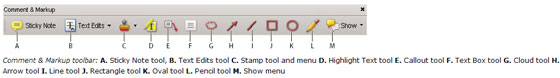
Figure 1: Comment and markup toolbar in Adobe Acrobat
However, when I opened the ebook in Acrobat Reader, these tools did not show up. After some fiddling around I found out why: The document's security properties (called "document properties" in the dialog title) indicate that commenting is not allowed for the document at hand:
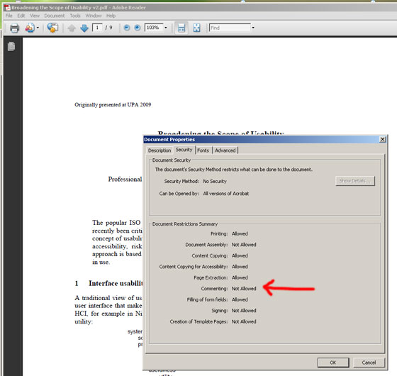
Figure 2: The security properties indicate that commenting is not allowed
I was disappointed by this, and wondered whether the publisher of the book had disallowed commenting, or whether this is generally the case. To find out, I looked at other documents, starting with Nathan Shedroffs book Design is the Problem, and then inspecting various PDF documents on my computer. No matter which document I opened, the result was the same: It was not possible to add comments. Finally, I created a PDF version of a Word 2007 document. Again, I could not add any comments (at least, I could not find an option in the Save dialog that allowed me to enable commenting).
All in all, I find this outcome hard to understand. While I agree that readers should not be able to modify certain documents, such as books, a simple highlight and comment functionality should be allowed. After all, this is what we do with printed documents all the time, and it does not clash with any copyright laws, particularly as you are allowed to copy passages from the text (see the second figure).
So here is my proposal to Adobe: Please allow highlighting and commenting for PDF documents by default so that we can use online documents in the same way as we use printed ones.
But how did I get round the problem of not being able to highlight text and add my comments to the ebook I am reviewing? The answer is simple and disillusioning: I resorted to the Preview application on my Apple laptop. In the current version at least, it does not impose any restrictions on adding comments to documents. This strategy, however, meant that I had to take my private laptop to the office...
References
- Derek Hansen, Ben Shneiderman & Marc Smith (2010). Analyzing Social Media Networks with Node XL. Morgan Kaufmann • ISBN 13: 978-0123822291 • Review
October 20, 2010: A Lengthy Substantiation of Jeff Johnson's Book, Designing with the Mind in Mind
 In
his foreword to Jeff Johnson's book, Designing with the Mind in Mind,
HCI pioneer Stuart Card states that the design of interactive computer
systems is, at least aspirationally, a science. But he immediately confines
this activity to "a kind of joint computer-cognitive engineering,
that is, science-based techniques to create interactive systems satisfying
specified requirements." The phrase "science-based techniques" implies
that there is a counterpart to UI design in science. Card, who together
with Allen Newell and Thomas Moran, gave a name to this counterpart back
in 1983, reveals it: "Providing a supporting science and engineering
for building interactive artifacts has been a founding aspiration of the
field of human-computer interaction."
In
his foreword to Jeff Johnson's book, Designing with the Mind in Mind,
HCI pioneer Stuart Card states that the design of interactive computer
systems is, at least aspirationally, a science. But he immediately confines
this activity to "a kind of joint computer-cognitive engineering,
that is, science-based techniques to create interactive systems satisfying
specified requirements." The phrase "science-based techniques" implies
that there is a counterpart to UI design in science. Card, who together
with Allen Newell and Thomas Moran, gave a name to this counterpart back
in 1983, reveals it: "Providing a supporting science and engineering
for building interactive artifacts has been a founding aspiration of the
field of human-computer interaction."
 Contrary
to typical engineering disciplines, however, the connection between engineering
practices and the scientific foundation behind them is often hard to detect
in the daily work of user interface designers. They would appreciate much
more guidance from science than they actually encounter. There are a number
of reasons for this lack of guidance, one being the simple fact that humans
are involved: They are the users of the software to be designed, and human
users introduce a great deal of variability and unpredictability into the
equation, which makes any attempt to prescribe good design in advance appear
fruitless. Software design would definitely be much easier if there were
no users – and sometimes it looks as if designers and developers
behave as if this were actually the case. As a consequence, usability people
preach their "ask-the-user" mantra wherever and whenever they
can. Because of the variability and unpredictability of human behavior,
many practitioners rely almost exclusively on empirical approaches. One
such approach is usability testing: Watch users doing tasks and fix the
observed problems through redesign and so on ("iterative design").
For large Websites, it has become a common design practice to introduce
small changes, watch what works best (based on log files or just sales),
and modify the site accordingly. Card regards usability testing as useful
and necessary, but also as inefficient; the same applies to iterative Website
modifications. Neither provides much insight into why users behave the
way they do and why certain design solutions are better than others. Card
comes to the conclusion, and I wholeheartedly agree with him, that it would
be better "to avoid many errors in the first place and have reliable
guidance that tells designers in advance what they should do."
Contrary
to typical engineering disciplines, however, the connection between engineering
practices and the scientific foundation behind them is often hard to detect
in the daily work of user interface designers. They would appreciate much
more guidance from science than they actually encounter. There are a number
of reasons for this lack of guidance, one being the simple fact that humans
are involved: They are the users of the software to be designed, and human
users introduce a great deal of variability and unpredictability into the
equation, which makes any attempt to prescribe good design in advance appear
fruitless. Software design would definitely be much easier if there were
no users – and sometimes it looks as if designers and developers
behave as if this were actually the case. As a consequence, usability people
preach their "ask-the-user" mantra wherever and whenever they
can. Because of the variability and unpredictability of human behavior,
many practitioners rely almost exclusively on empirical approaches. One
such approach is usability testing: Watch users doing tasks and fix the
observed problems through redesign and so on ("iterative design").
For large Websites, it has become a common design practice to introduce
small changes, watch what works best (based on log files or just sales),
and modify the site accordingly. Card regards usability testing as useful
and necessary, but also as inefficient; the same applies to iterative Website
modifications. Neither provides much insight into why users behave the
way they do and why certain design solutions are better than others. Card
comes to the conclusion, and I wholeheartedly agree with him, that it would
be better "to avoid many errors in the first place and have reliable
guidance that tells designers in advance what they should do."
 This
is exactly what guidelines and design rules do. However, they usually tell
designers little about what "good UI design" means, only how
to do things. Moreover, the issue is not a lack of guidelines – guidelines
abound, particularly for Web design. But, as the original authors of the Research-Based
Web and Usability Guidelines once stated at a CHI conference, they
were surprised to find that most of the guidelines they considered for
inclusion in their selection were based on common sense or on conventions,
not on science. I would not regard this observation as a bad thing in itself,
but Card points to a problem: "Design rules may be ambiguous, or require
subtle interpretation of context, or simply contradict other guidelines." Thus,
criteria are needed that help resolve ambiguities and conflicts. However,
conventions and common sense are usually not sufficient for deriving such
criteria. For example, conventions are typically arbitrary (for good reason).
But how do you decide between arbitrary alternatives? Everyone will come
to a different conclusion. In the end, there seems to be no better way
than to resort to "objective" science for deriving useful decision
criteria – even though science may appear too remote from the daily
practice of design. We conclude, then, that design rules and the science
behind them need to be tied more closely tied together. Jeff Johnson's
book Designing with the Mind in Mind leaps to our rescue here, because
it represents a targeted attempt to "unite design rules with the supporting
cognitive and perceptual science that is at their core."
This
is exactly what guidelines and design rules do. However, they usually tell
designers little about what "good UI design" means, only how
to do things. Moreover, the issue is not a lack of guidelines – guidelines
abound, particularly for Web design. But, as the original authors of the Research-Based
Web and Usability Guidelines once stated at a CHI conference, they
were surprised to find that most of the guidelines they considered for
inclusion in their selection were based on common sense or on conventions,
not on science. I would not regard this observation as a bad thing in itself,
but Card points to a problem: "Design rules may be ambiguous, or require
subtle interpretation of context, or simply contradict other guidelines." Thus,
criteria are needed that help resolve ambiguities and conflicts. However,
conventions and common sense are usually not sufficient for deriving such
criteria. For example, conventions are typically arbitrary (for good reason).
But how do you decide between arbitrary alternatives? Everyone will come
to a different conclusion. In the end, there seems to be no better way
than to resort to "objective" science for deriving useful decision
criteria – even though science may appear too remote from the daily
practice of design. We conclude, then, that design rules and the science
behind them need to be tied more closely tied together. Jeff Johnson's
book Designing with the Mind in Mind leaps to our rescue here, because
it represents a targeted attempt to "unite design rules with the supporting
cognitive and perceptual science that is at their core."
By the way, I touched briefly on "good UI design." But what is good UI design? I will probably get as many answers to this question as there are UI designers in the world. At least some of them, perhaps, might be willing to agree on the following: Good UI design fits the users' needs as well as their perceptual and cognitive abilities. People who regard design more as an art will probably be disappointed by this definition, because it makes no mention of "coolness" and the like. But it helps us find places in the big picture of UI design for Johnson's book and for user research (including task analysis). Science tells designers about human perceptual and cognitive strengths and weaknesses, while user research tells them what users want and what they need to accomplish their tasks.
References
- Jeff Johnson (2010). Designing with the Mind in Mind: A Simple Guide to Understanding User Interface Design Rules. Morgan Kaufmann • ISBN-10: 1-012375030X, ISBN-13: 978-0123750303 • Review
- Stuart Card, Thomas Moran, and Allen Newell (1983). The Psychology of Human-Computer Interaction. CRC.
- U.S. Department of Health and Human Services (2006): Research-Based Web Design & Usability Guidelines • Complete guidelines (PDF)
October 7, 2010: People, Elevators, and Sustainability...
Sustainability has become a frequent topic in the UI field, be it in magazines (such as Interactions), at conferences, or in practical work to design products that help reduce carbon footprint or energy consumption. Nathan Shedroff's book, "Design is the Problem", is a good and comprehensive resource for starting activities in this field. In particular, I found the following distinctions in his book useful: Reduce, Reuse, Recycle, Restore, and Process. I can quickly assign activities, presentations, or papers to one of these five categories and thus get an idea of their significance and possible impact on the overall sustainability issue. For example, most paper presentations on sustainability-related topics at the DIS 2010 conference in Aarhus, Denmark, can be subsumed under the "reduce" aspect. One notable exception was Paul Dourish's paper, "HCI and Environmental Sustainability: The Politics of Design and the Design of Politics."
This leads me directly to a project that Yvonne Rogers discussed in her DIS 2010 keynote. In an effort to encourage more ecological (sustainable) behavior, the project aimed to promote the use of the stairs rather than the elevator in a multi-storey building. The researchers wanted to investigate "in the wild" how stair usage could be encouraged. Traditional signage is little emotional, "in your face," and plays on people's weaknesses and feelings of guilt. When the team looked for a playful and subtle solution, it decided to use an ambient display. To be effective, such a display needs to be placed at the point of decision-making. The team solved this issue by arranging a band of lights in the floor, which led to both the stairs and the elevator and flickered in different colors in order to guide people toward the stairs. Regrettably, the team was not overwhelmed with success: According to a survey, 93% of the visitors did not change their behavior at all. However, log data revealed that more people actually used the stairs than said they did. This is a typical example of researchers getting conflicting findings "in the wild"...

Figure: Signage at an elevator that encourages SAP employees to take the stairs
But the story does not end here! Recently, I saw some signage at an elevator in my office building (see photo). As I did not have my glasses with me, I did not study it further and simply took the elevator. Later, however, I took a closer look. The signage encourages SAP employees to take the stairs instead of the elevator and lists all the advantages of doing so (health, energy, carbon footprint). Thus, it falls more into the category of "playing on people's weaknesses and feelings of guilt"... Anyway, I am susceptible to this kind of advertising, and in the meantime, its current success rate is well beyond 93% – at least for me. Although the signage was located at the point of decision-making, its creators did not think of older people who forgot their glasses. Which looks like an argument for an ambient display like the one used in the project mentioned above. However, the problem there was that visitors to the building did not understand what the colors meant – so we are thrown back to the realms of a classic visual design issue...
References:
- Nathan Shedroff (2009). Design Is the Problem: The Future of Design Must be Sustainable. Rosenfeld Media- ISBN: 1-933820-00-4 (Paperback + PDF), ISBN: 1-933820-01-2 (2 PDF editions) • Review
- Pervasive Interaction Lab, Current Projects, Persuasive Ambient Displays (Yvonne Rogers)
- DIS 2010 conference • DIS 2010 – A UI Design Practitioner's Report
October 7, 2010: User Experience??? Hmmm...
The term "User Experience" resounds throughout the world. Today, many companies claim that their products offer an outstanding user experience. One of the most frequently cited companies in this context is Apple Computer, Inc., and its life-style products (iPod, iPhone, and the recent iPad). See, for example, Bill Buxton's discussion of Apple products in his book, "Sketching User Experiences". However, some designers claim that it is not possible to design a user experience; that it is the users who create the experience in their minds. But I will leave the resolution of this conflict to others... After all, UI professionals have conferences at which to discuss what the term actually means. Not surprisingly, everyone seems to have a different opinion, as I learned at the INTERACT 2009 conference.
Last but not least, my own team at SAP is called SAP User Experience (note: this refers to 2010). I have to admit that I never felt "at home" with this name and still prefer the old one, "User Productivity." In my opinion, productivity should have the highest priority in professional business software. Satisfaction, which is one element of user experience, definitely plays an important role in whether users like and adopt software and thus, ultimately, in their productivity. If users are not satisfied with a piece of software, they tend to avoid using it. But satisfaction arises from more than a fancy look and from other UI bells and whistles. In my opinion, professional users primarily want to get their work done and not be impeded by the software they (have to) use. Their satisfaction depends to a large extent on how successful they are in accomplishing their work.This makes up an important part of their user experience. In addition, many of the highly appraised design products have a physical component. The look and physical (not virtual) feel are major ingredients of the users' experience and, in particular, a strong argument for desiring and buying a product. Software lacks this physical aspect.
Recently, Jeff Johnson's new book, Designing with the Mind in Mind, added fuel to my already existing doubts about user experience: It reminded me of a distinction that Schneider and Shiffrin introduced back in 1977, namely "controlled" versus "automatic" processing. As Johnson writes, "most real-world tasks have a mixture of automatic and controlled components." The more a task is automated, the less conscious thought is required to perform it, or better, the more attention can be directed to the "real task" instead of the tool. In the case of expert users, it is well known that they literally "merge" with their tools – be they airplanes, cars, or word processors. For these users, the tool retreats completely into the background: They are more or less unaware of it. Thus, for them, nothing like a user experience exists. I therefore find myself asking, "Why all the hype about a great user experience if it will eventually disappear for frequent users (including experts)?"
References:
- Bill Buxton (2008). Sketching User Experiences: Getting the Design Right and the Right Design. Morgan Kaufmann • ISBN-10: 0123740371, ISBN-13: 978-0123740373 • Review
- Jeff Johnson (2010). Designing with the Mind in Mind: A Simple Guide to Understanding User Interface Design Rules. Morgan Kaufmann • ISBN-10: 1-012375030X, ISBN-13: 978-0123750303 • Review
- Schneider, W. & Shiffrin, R.M. (1977). Controlled and automatic human information processing: 1. Detection, search, and attention. Psychological Review, 84, 1-66.
October 7, 2010: Means and Thresholds as Attractors – The Boomerang Effect
After an election, there are usually heated debates about why a party lost votes, particularly if it turned in an excellent result at the previous election. Similarly, people wonder why a sportsman fails in a competition if he excelled in a previous one, when he performed much better than usual. However, this "movement toward the average" is not at all mysterious – it is just the effect of a statistical phenomenon known as "regression toward the mean". Wikipedia explains the phenomenon as follows:
"Regression toward the mean is the phenomenon that if a variable is extreme on its first measurement, it will tend to be closer to the average on a second measurement, and – a fact that may superficially seem paradoxical – if it is extreme on a second measurement, will tend to be closer to the average on the first measurement."
While these movements toward the average happen unintentionally, there are similar movements at a psychological or social level, as I learned just recently at the DIS 2010 conference in Aarhus, Denmark. In her keynote, Yvonne Rogers talked about the Tidy Street project and pointed to the power of social norms. The inhabitants of this street wanted to reduce their energy consumption and oriented themselves to a standard, such as a household, street, or country average for energy consumption. The researchers observed that people move toward the standard from either direction. If they learn that they are consuming much less energy than the standard, they increase their energy consumption instead of trying to maintain it at its current low level. This behavior is referred to as the "boomerang effect" and is, of course, undesirable.
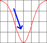
Figure: Explaining the boomerang effect through an inverse Gaussian curve...
Just recently, at a meeting with colleagues, we discussed threshold values for the "permitted" duration of UI events, such as opening a window after the user pressed a button. The performance team at SAP measures these durations throughout the development process in order to point developers to areas in which their applications need improvement. These threshold values reminded me of Yvonne Rogers' story about the Tidy Street project: They are a kind of "standard," just like the energy consumption averages that the inhabitants of Tidy Street used for their orientation. So I told the story to my colleagues, expecting that I would bore them. On the contrary! They had observed the boomerang effect for developers as well. As soon as developers learn that the response times of their applications are below the respective thresholds, they tend to add new functionality that eats up all the gains or they simply stop optimizing their applications for responsiveness.
In the case that Yvonne Rogers reported on, the researchers were able to eliminate the boomerang effect by using emoticons to reward low energy consumption (the power of a smiley...). But how can we eliminate the boomerang effect among developers? Any ideas???
References:
Last Revision: 03/16/2014
|
Gerd Waloszek |
made by |