UI Design Blinks 2012
By Gerd Waloszek
 Welcome
to this column of brief, blog-like articles about various UI design topics – inspired
by my daily work, conference visits, books, or just everyday life experiences.
As in a blog roll, the articles are listed in reverse chronological order.
See also the overviews of UI Design Blinks from others years: 2010, 2011, 2013.
December 12, 2012: Meeting the Drum Again...
This October, I revived an old design proposal of mine, and yesterday I inadvertently came across the implementation of something similar. "Am I too backwards-oriented, or was I sometimes ahead of my time?" I asked myself. Anyway, after having recovered from my surprise, I decided to write a UI Design Blink about my new discovery.
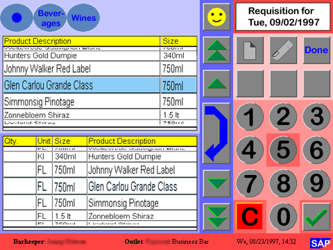
Throughout 1997 I was involved in an SAP project exploring touchscreen applications for hotels and restaurants. In this "hotel project", I built HTML prototypes that were based on a 10x7 grid, with grid cells of 64x64 pixels, plus a bottom row for information, which resulted in a screen size of 640x480 pixels (VGA screen). The grid cells correspond to a touch target size of 2.2 cm (at 72 dpi) or 1.67 cm (at 96 dpi), which is much larger than today's recommendations (Rachel Hinman, for example, recommends 1 cm). The screens (which one developers called "idiot screens" at the time) were designed to be used exclusively with fingers. "Tap" (or "point") was the only gesture available; "swipe" and other gestures were discouraged or unknown back then. Therefore, some design elements were implemented differently than one would do today. Below is a sample screen of the prototype (Figure 1). I have to admit that I blush, when I see the colors. At that time we used web-safe colors, but a visual designer would have done much better even back then. My static prototype was therefore polished by a graphic designer in Palo Alto and transferred into a dynamic JAVA version. I am still trying to find out whether the developers really implemented the feature that I want to report on here.
Figure 1: Static HTML prototype of a touchscreen application for hotels (around 1997; click image for larger versions)
So much for the opening speech. Now I would like to draw your attention to the two lists on the left-hand side of the prototype. Like in the old Apple "font mover pattern," you can move items from one list to the other and back again. I called the two lists "drums" when I invented them (there may have been "parallel" inventions I didn't know about). Drums are a special list variant, in which the list looks like it is glued to a cylinder or drum (like in gambling machines). Because of the resulting 3D effect and the "blown up" middle row, they are better suited to selecting items by tapping. I conceived the list items to be arranged in a cyclical fashion, like in a real drum, but I never had a working prototype on hand to verify whether this really makes sense. Drums could also be arranged horizontally so that the columns would scroll.
By the way, one of Adobe Photoshop's filters helped me distort an ordinary list to achieve the 3D-effect of a drum.
What about the buttons to the right of the drums? As I have already mentioned, "swipe" gestures were considered harmful at that time, only "taps" were allowed. Users therefore had to tap buttons to turn the drum (row-wise, page-wise; I also included "go to first item" and "go to last item" buttons for longer lists). The buttons at the top navigate users within a hierarchy of items. I called this mechanism a "stack" at that time (and, together with a drum, a "stack drum"). Today I would call it "breadcrumbs."
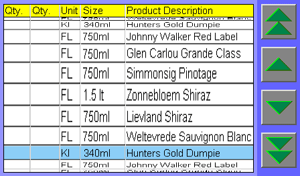
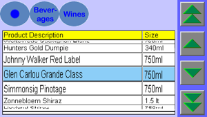
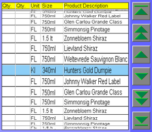
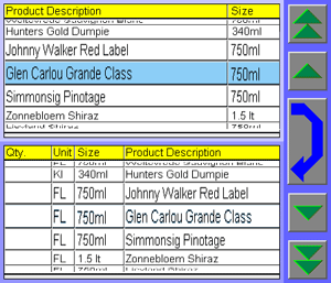
I later consolidated my explorations of touchscreens into guidelines (Interaction Design Guide for Touchscreen Applications), a rare beast at that time and, although completely outdated, is still available for historical interest on the SAP Design Guild Website. Here are the drum variants that I included in the guidelines (direct link to lists and drums page):
 |
 |
|
| Drum | Stack drum | |
 |
 |
|
| Long drum | Double drum |
Figures 2-5: Variants of the drum touchscreen control (from Interaction Design Guide for Touchscreen Applications on the SAP Design Guild; click images for larger versions)
Last, but not least, I should mention that the prototype above uses a combination of a stack drum and a double drum.
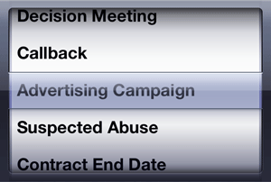
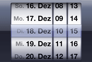
So what surprised me yesterday? It was something that reminded me strongly of my drum design proposal, but it looks much nicer and also works a bit differently because it utilizes swipe gestures: the iPhone's picker, which I found in Luke Wroblewski's book Mobile First (if I were an iPhone user, I would of course have encountered the picker already much earlier). I present two variants of the iOS picker that a colleague provided for me for comparison below:
 |
 |
|
| Figure 6: iOS picker (click image for whole screen in German) | Figure 7: iOS date picker (click image for whole screen in German) |
All in all, the picker implements the same basic idea of listing items on a turnable cylinder and enlarging the central items for easier picking. However, in the iOS version you can turn the cylinder with a swipe gesture. Apple's date picker is comprised of three to four independent pickers that allow users to synthesize a date. As for the picker itself, Apple writes, "A picker is a generic version of the date and time picker. As with a date and time picker, users spin the wheel (or wheels) of a picker until the value they want appears."
We can see that, after about 15 years, a lot has changed in the world of touchscreens: Designs have been polished to the extreme (or the extremely "natural" – some blame it on "skeuomorphism"), and new gestures add more flexibility and elegance to the interactions. I am itching to redesign my old prototypes for an iPhone or iPad using the new options. But at the moment, I am unable to create even the simplest prototype with Apple's development environment Xcode. It looks as if I'll have to get some practice there, first...
P. S.: I never considered applying for a patent for the drum at that time. In hindsight, perhaps I should have.
December 5, 2012: A Few Books and Links for Familiarizing Oneself with Mobile
Recently, I reviewed Rachel Hinman's book, The Mobile Frontier, and in the course of the review, I came across a couple of books and links that, in my opinion, might help you, too, get a foothold in the new and exciting realm of mobile design. The topics covered comprise getting ready for mobile, responsive (Web) design, HTML5, and CCS3.
 |
 |
 |
 |
 |
 |
Figure 1: My private collection of e-books for mobile that I would like to present here
All the books that I present here are recent e-book purchases. I have read a lot of them already, but am still in the middle of others. A colleague suggested some of these books to me. I came across most of the links presented here while preparing articles. All in all, I hope that my small collection of reading suggestions is helpful for you.
Getting Ready for Mobile
The following two "non-technical" books will give you a jump start into the mobile design field:
- Luke Wroblewski (2011). Mobile First. A Book Apart • ISBN:
978-1-937557-02-7
Description at A Book Apart • Short presentation - Rachel Hinman (2012). The Mobile Frontier: A Guide to Creating
Mobile Experiences. Rosenfeld Media • ISBN: 1-933820-55-1
(Paperback), ISBN: 1-933820-05-5 (Digital editions)
Description at Rosenfeld Media • Short presentation • Review
Hinman's book can be regarded as a call to action for designers to engage in the new field of mobile design, which she characterizes as "the mobile frontier". Wroblewski's book is another call to action, based on the "small" idea, as he calls it, to design Websites and applications for mobile first. While both books have similar intentions, they differ in detail and complement each other well. It's probably a good idea to start with Wroblewski.
Responsive (Web) Design
Originally promoted by Ethan Marcotte, responsive (Web) design comprises a mixture of techniques that allow HTML pages to adapt to different platforms (screen size and orientation; possibly interaction styles): fluid grids, fluid graphics, and HTML5 media queries. Here are some references that illuminate this approach:
- Ethan Marcotte (2011). Responsive Web Design. A Book Apart • ISBN:
978-0-9844425-7-7
Description at A Book Apart • Short presentation
You can find essential parts of the book in the following articles:- Ethan Marcotte: Responsive Web Design: www.alistapart.com/articles/responsive-web-design (A List Apart 306)
- Ethan Marcotte: Fluid Grids: www.alistapart.com/articles/fluidgrids (A List Apart 279)
- Ethan Marcotte: Fluid Images: www.alistapart.com/articles/fluid-images (A List Apart 328)
- Luke Wroblewski: Device Experience & Responsive Design (originally published: Mar 28, 2012): www.uie.com/articles/device_experiences
- Responsive Web Design (Wikipedia) • Responsive Design (Wikipedia, German)
- Responsive (Web) Design (SAP Design Guild)
HTML5 and CCS3
There is currently a debate going on among designers as to whether native apps, Web applications, or mobile-optimized Websites are the better choice when designing for mobile devices. Each of these approaches has its advantages and disadvantages, as my brief overview shows (see the books by Hinman and by Wroblewski for details):
| App Type | Description | Built Using ... | Pro | Con |
| Mobile-optimized Website | Traditional Website that is optimized for mobile consumption (for example, using responsive design) | Standard HTML | Offers universal access, no major redesign necessary | Not "uniquely" mobile |
| Web App | Mobile app that is designed like a native app but accessed through a mobile browser (not downloaded from an app store) | Platform-independent tools (HTML5, jQuery mobile, and so on) | Offers universal access, easier maintenance, better Web access (following links is easier) | Cannot use all the features that a platform offers, not so pretty, user experience not as good as in native apps, cannot reside on home screen, not in app store (limited discoverability) |
| Native App | Custom-made application, typically downloaded from an app store | Platform-specific tools | Can use all the features that a platform offers (address book, GPS, camera, audio input and other sensors, NFS, and so on), prettier, better user experience (smoother transitions) | Platform-specific, audience limited to platform |
Both Hinman and Wroblewski recommend designing both native and Web apps. Luckily, if you are opting for mobile web apps, you can build on what you already know about Web design and development. But you probably still need to familiarize yourself with HTML5 and CSS3. Here are three books that might get you going the "easy way":
- Eric Freeman, Elisabeth Robson (2011). Head First HTML5 Programming – Building
Web Apps with JavaScript. O'Reilly Media • ISBN: 978-1-449-39054-9
Assumes only basic knowledge of HTML and CSS; Javascript knowledge is not assumed but helpful • Description at O'Reilly - Jeremy Keith (2010). HTML5 for Web Designers. A Book Apart • ISBN:
978-0-9844425-0-8
Description at A Book Apart - Dan Cederholm (2010). CSS3 for Web Designers. A Book Apart • ISBN:
978-0-9844425-2-2
Description at A Book Apart
Final Word
Particularly, the "A Book Apart" books are short and concise and therefore allow you to pick up speed quickly. They can often be read within a day. The other two books take more time. The Head First book also invites you to some practical exercises, taking you through the process of building a Website using HTML5 and exploring all the new HTML5 elements, including geolocation, canvas and video, local storage, and Web workers. I found the following reviewer comment about this book: "There's a saying here in the UK: 'It's a bit like Marmite, you either love it or hate it!' Well I think this applies to Head First books – people tend to love them or hate them." I personally am still undecided. This book probably not that useful for people looking for a concise introduction or a reference. Even though it does not provide a reference, Keith's book, HTML5 for Web Designers, is probably better-suited to these readers. The same applies to Freeman and Robson's book about CCS3.
References
Are provided in the article...
November 28, 2012: Reviewing an E-book – Another Experience Report
My recent review of Rachel Hinman's book, The Mobile Frontier, was my third review of an e-book. It was also the first one for which I used a tablet computer – an iPad – for reading and annotation. However, I wrote the review itself on different laptop computers. In the following, I would like to share some of my experiences in this endeavor.
Reviewing a book takes quite a while, several weeks or more, and the process is typically hampered by unexpected and often long interruptions. Therefore, when I read a book for a review, I highlight relevant text passages and sometimes also add comments so that I can easily pick up where I left off after an interruption. Moreover, there is also often a longer break between reading the book and writing the review. If I did not mark relevant text passages in the book, it would appear to me as if I had never read it. In printed books, I use a marker pen for the highlighting; for e-books, I had to switch to "electronic" highlighting. This is where the challenges began...
Highlighting Text
While conducting my first purely e-book review, a review of Analyzing Social Media Networks with NodeXL by Derek Hansen, Ben Shneiderman, and Marc Smith in 2010, I encountered the issue that Adobe Acrobat Reader did not allow me to highlight text passages in the PDF version of the book (see this UI Blink for details). However, I found a work-around by using the Mac OS X Preview application. This time around, I hit on the same issue on the iPad: The e-book reader, iBooks, does not allow you to highlight text passages in PDF documents with a marker tool either. This restriction required me to additionally download the ePub version of the book. Incidentally, Mac OS X does not offer a reader application for this format. I had to download a free ePub reader for the Mac and chose calibre.
On a laptop computer, I use the mouse to select text for highlighting. This is easy because I am well practiced in using it. However, selecting text on the iPad with my fingers was tedious, to say the least. Often, I needed several attempts before the text was selected and marked the way I wanted it, which slowed down my "average" reading speed considerably. My finger tips are just not small enough for this. Perhaps I should use a dedicated iPad pen?
Paging and Navigation
PDF versions of books typically present pages as they are printed (a "screen version" may also be available, as is the case for Nathan Shedroff's book, Design is the Problem, which is the first e-book that I reviewed). E-books in ePub format, however, follow a different approach, creating screen pages dynamically according to the formatting options (such as font type and size) that the user has selected. Depending on these settings, Hinman's book, with its 281 pages in PDF format, can have between a few hundred and several thousand pages when viewed in the iBooks app in ePub format. Navigating within e-books with so many pages, can become confusing at times... Moreover, printed page numbers in tables of content or indexes of course make little sense, but can still be used for navigation if they are links.
Figure 1: E-book slider that indicates sections and chapters in the book – a first idea...
You have quite a few options for navigating within an e-book: you can scroll page-wise scrolling the content; scroll using a slider at the bottom or right (for the continuous vertical scroll mode in iBooks); use the search function; or resort to the table of contents or the index. But none of these options makes me really happy. Somehow, the "direct" and "intuitive" NUI interaction is too slow and indirect for me. This is probably just a question of practice though... For example, I find page-wise scrolling in e-books "sticky" and more cumbersome than paging through printed books where you can flip pages at high speed to get where you want to go. Sure, depending on your viewing mode, you can scroll using the bars at the bottom or to the right to move faster through the book, but the pages themselves do not flip to provide orientation – only the page numbers and chapter titles change. This is not the user experience that I would like to have and that a book provides. Moreover, in the iBooks app, chapter titles do not indicate their level and are not always informative (they can, for example, be ambiguous). I also find it also "fiddly" to get exactly where I want to go. Usually, I have to correct my "landing position" by scrolling a few pages back and forth. So, here comes a personal design proposal: I would like to have a scrollbar with different colors or gray levels that indicate the book chapters or sections, easy-to-hit anchor points for the chapter/section beginnings, and perhaps some sort of zoom mechanism for "tuning in" on the target page. Of course, a real-time animation of the flipping pages would be welcome, too, but this would probably require a 32-core processor...
Harvesting the Notes
Having read a book, I scan it for marked text passages and comments to base my review on or potentially include in it. With "electronic marks" at my disposal, I wondered whether it would be possible to collect all the notes and also export them to another computer. This was indeed the case. In the collection, each note is surrounded by text that provides some context, with the originally highlighted text being highlighted again (see Figure 2 below). In addition, each note is assigned to a chapter or subchapter in the book. This looked very helpful to me at first sight. However, wrong assignments to chapters or subchapters caused a lot of work for me, because I wanted all the notes to be assigned to their proper locations in the book. I corrected the wrong assignments after I had exported the collection as an e-mail – the only offered option – and created an MS Word document from it on my laptop computer. Finally, I printed the notes out, because browsing through paper is still easier for me than scanning a long online document. I also opened the notes on my laptop computer (and sometimes on my iPad too) to be able to search for specific words or to copy citations correctly into the review.
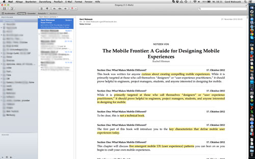
Figure 2: My collection of highlighted text passages in Hinman's book
Preliminary Conclusions
Did all the effort make preparing the book review easier and faster for me? In the end, I do not think so. I felt lost in the huge amount of notes that I had collected and struggled for orientation. Luckily, Hinman includes chapter summaries in her book, and my notes from the summaries (which I transferred to a separate document) allowed me to eventually gain an overview of the book's content. Based on this experience, I think that I still have a lot to learn and I certainly need more practice in order to develop a smooth workflow for my e-book reviews.
References
- Rachel Hinman (2012). The Mobile Frontier: A Guide to Creating Mobile Experiences. Rosenfeld Media • ISBN: 1-933820-55-1 (Paperback), ISBN: 1-933820-05-5 (Digital editions) • Review
- Derek Hansen, Ben Shneiderman & Marc Smith (2010). Analyzing Social Media Networks with Node XL. Morgan Kaufmann • ISBN 13: 978-0123822291 • Review
- Nathan Shedroff (2009). Design Is the Problem. Rosenfeld Media • ISBN: 1-933820-00-4 (Paperback + PDF), ISBN: 1-933820-01-2 (2 PDF editions) • Review
November 8, 2012: From GUIs to NUIs – The Torch Relay of "Direct" and "Intuitive" UIs
I have been working with computers for decades, having started out preparing
punch tapes and cards for input and taking home heaps of computer paper
in the early 1970s. As the era of micro and personal computers dawned,
I bought my first computers and was happy to finally have them on my desk
for my own use. These computers already featured a keyboard and a screen
and allowed me to handle them interactively through a command line interface
(CLI). In the mid-80s, I eventually and somewhat reluctantly acquired my
first computer with a graphical user interface (GUI), a demonstration model
of the Apple Macintosh 128k (don't ask me for the price...). Over the years,
my relatives, friends, and colleagues – actually, the whole world – joined
me and other forerunners in buying computers with GUIs. Why did we all
buy computers with GUIs? We bought them because we were told that these
machines were easy to understand and intuitive to handle thanks to the
GUI. Interacting with them was promoted as being as "direct" as if we were
handling physical objects in the real world. Ben Shneiderman once coined
the term "direct manipulation" for this interaction style. For a long time,
computers had been regarded as "experts only" devices. Now, the
GUI's "WIMP" (windows, icons, menus, and pointer
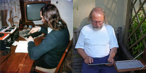
Figure 1: My first computer, still with a CLI, and my first encounter with NUIs (right) – fingers seem to be needed for both computers...
Nearly thirty years later, Rachel Hinman indicates in her 2012 book The mobile Frontier that all this seems to be wrong. She got her inspiration from a workshop held by Microsoft's Dennis Wixon who co-authored the book Brave NUI World. There, Wixon presented a brief overview of the history of computing paradigms, which, omitting the tape and card (and even switch) phases, started with CLIs, moved on to GUIs, the upcoming UI paradigm of natural user interfaces (NUIs) (Hinman sees us on the verge of a paradigm shift), and finally to organic user interfaces (OUIs) that will take over in a not so distant future. In her book, Hinman presents a tabular sketch of the UI paradigms, and here is a commented excerpt of it:
UI
Paradigm |
||||
| CLI | GUI | NUI | OUI | |
| Psychological Principle | Recall | Recognition | Intuition | Synthesis |
| Interaction | Disconnected (abstract) | Indirect | Unmediated (direct) | Extensive |
| My comment | Can be very efficient for professionals | Can be very inefficient when using the mouse only | Can lead to perplexing effects when you touch the screen inadvertently | No idea... |
For me, through Hinman's book all of a sudden GUIs had become "non-intuitive" and "indirect", whereas "direct" and "intuitive" handling is now attributed to NUIs.
I have to admit that, after my first encounters with mobile systems (in the incarnation of an Apple iPad), I am far from believing that NUIs are intuitive. Actually, I also never believed in the myth that GUIs are intuitive. It's all a matter of conventions and "cultural" traditions. It took me quite a while to become familiar with the effects of single, double, and even triple mouse clicks. And it will again take some time before I find out what all the swipes and other gestures will do for me. At the moment, I am still in a learning state for NUIs. By the way, the NUI motto is: "What you do is what you get" (WYDIWYG) – which can be quite surprising and even perplexing at times if you are a newcomer.
Whenever I see photos of children or gorillas using tablet computers, suggesting that they are so easy to use, I get annoyed. My young nieces and nephews could also use my Mac long ago for simple things even though they were not able to read. But they were never able to help me, for example, with my spreadsheet data. And I guess that the gorilla also cannot tell me how I can move my photos and data files from my iPad to my laptop computer. I had to consult the Internet on this matter – the manuals were of little help to me.
So, what's next? In about twenty to thirty years, when OUIs will have caught on, people will tell us that these are the really intuitive interfaces because "input = output" and thus, handling is "direct" – no pointing with fingers to virtual objects on a flat screen. I hope that I will still be in good shape around the age of 90 to experience all this. But perhaps I should skip that stage, try to reach the age of 120, and find computers that herald the motto "What you think is what you get" (WYTIWYG). But isn't such a computer already built into my body???
References
- Rachel Hinman (2012). The Mobile Frontier: A Guide to Creating Mobile Experiences. Rosenfeld Media • ISBN: 1-933820-55-1 (Paperback), ISBN: 1-933820-05-5 (Digital editions) • Review
- Widgor, Daniel & Wixon, Denis (2011). Brave NUI World – Designing Natural User Interfaces for Touch and Gesture. Morgan-Kaufmann • ISBN-10: 0123822319, ISBN-13: 978-0123822314
October 16, 2012: Fitting a Device to Usage Habits – A Usability Lesson
My wife usually keeps a diary when we are on vacation. On our hiking tours, she now and then takes notes in it for later use. Because this is cumbersome and holds us up, years ago we experimented with a voice recorder. But we found it too awkward to handle for regular use. This year, we decided to buy a new one with better handling that also allows us to download the sound files to a computer. Regrettably, you cannot download files to the iPad, which I wanted to take with me to store photos. So we had to live with the limitation that the audio recorder cannot hold more than 199 audio files, regardless of how much memory they use. This UI Design Blink tells the story of how we got along with the device, its options, and its limitations.
By the way, one of the first things I did when I set up the audio recorder for my wife, was to mute the beep on each key press. My wife found it annoying and unnecessary.
Initially, we had no clue what the limitation to 199 audio files would mean to us, because we did not know how many notes my wife would take in the course of a day. But I suspected that we would have to delete the files after one or two days before she could record new notes. This proved correct. In anticipation, we looked for a strategy that would allow us to use the recorder without having to delete files so often. I suggested creating only one file (or only a few files) per day and pausing the recording after each note instead of stopping it. Pausing is indicated by a flashing REC symbol in the display, and the red recording LED at the top also blinks during pauses. However, you can only see the LED if you are in dark forest, so it was mostly useless for our purposes. To pause the recording, my wife had to press the Record button again, not press Stop. To resume recording, she also had to press Record. Thus, using this strategy, she had to press Record all the time, and press Stop only at the end of the day or for longer breaks.
 |
 |
Figures 1-2: The audio recorder; The recorder in action
My wife gave this a try on our first walk, and it seemed to work well. Our pleasure was short-lived, however. After about an hour, my wife discovered that she had created a file of more than 40 minutes length, which reproduced our walking noises and our talks – although not very clearly because all this was recorded from within her pocket. On the other hand and to her great dismay, all the notes that she had added in the meantime were missing. What had happened? At one moment in time, my wife had gotten "out of sync" by not pressing Record hard enough. From then on, she had created pauses when she thought she was taking notes and had recorded pauses instead. After we had analyzed the issue, my wife decided to continue with that procedure and revolved to observe the display more carefully. This seemed to work, and she got along with creating only three or four files that day. So, this procedure would have allowed her to record comments about our entire vacation without deleting any audio files.
Nevertheless, the following day we changed the procedure because my wife found it awkward and error-prone. From then on, she created a new file for each note. In the course of the day, she remarked that pressing two different buttons was easier, and she observed that she was pressing Record harder when she wanted to record something. I was relieved that, at last, everything was working smoothly. The new strategy required me to delete the audio files from time to time. Luckily, the recorder provides a command for erasing them in one step. Regrettably, this did not allow us to keep specific files where my wife had recorded, for example, dogs barking or cocks crowing.
My satisfaction lasted only two days. Then, on another walk, my wife discovered that, once more, quite a few notes were missing. This time, she was really dismayed and proclaimed that she would no longer use the audio recorder. I was sad and cross – sad because of the loss of notes, cross because we had repeatedly discussed visually checking whether the recording had started. After we had both calmed down, we came to two conclusions: (1) From time to time, the Record button did not react to my wife's press, which might have been the button's fault, not hers. (2) She rarely checked the display to see whether the recording had actually started. This procedure was too cumbersome and time consuming for her – she just wanted to pull the device out of her pocket, press Record, and start speaking.
I considered this for a moment. Then I pressed the audio recorder's Menu button and reactivated the beep that echoes each key press. This "fix" worked more or less for the remainder of our vacation. Eventually, an initially annoying feature came to our rescue and allowed us to fit my wife's usage pattern to the device's limitations. For me, the experience was a real eye-opener and lesson in usability.
Leaving aside the issue with the number of files it can store, the question arises whether the audio recorder was perfect for its intended use? Of course, it was not. For example, if different keys produced different sounds, the resulting – up-down or down-up – "melody" would tell my wife immediately whether she had hit the correct button or was out of sync. The recorder's simple universal beep is definitely archaic and leaves room for usability improvements. A future firmware update could make different sounds easily available, but I guess this will never happen.
After Word
After I had finished this article, it came to my mind that different sounds for the keys would have allowed my wife to use the first strategy successfully. She told me afterwards that she had already had the same idea. In the third millennium, assigning spoken commands like "Record", "Pause", and "Stop" to keys to replace the ambiguous beeps should not really be a problem. I would be content with English commands. And in the fourth millennium, or perhaps a little bit earlier, it might even be possible to assign your own spoken commands to the keys – but these are just dreams...
October 12, 2012: Designing for Beginners and Experts – Reviving an Old Design Proposal
In a previous UI Design Blink, I pointed to the design practice of arranging figures and explanatory text closely together, and justified it with the contiguity effect described by the cognitive load theory. However, the same theory's redundancy effect implies that this practice can be detrimental for users for whom a figure is self-explanatory (I will call them "expert users" in the following). Therefore, I asked the obvious questions: "How can designers know in advance if their users are experts, casual users, ore mere beginners? And if designers do not know their audience, how can they address this dilemma?" In this UI Design Blink, I primarily focus on the second question and revive an – admittedly, old – design proposal. Please note that the topic of designing for different user groups in general is a huge field in itself, which would definitely exceed the scope of this article.
When designers know their audience, they can act appropriately. For example, they can place descriptive text close to figures* for beginners and casual users or show figures alone for expert users, as I have described in the above-mentioned article. They can also display different amounts of text explanations on the screen – we experimented with this approach at SAP. But if designers do not know their audience, they either need to design differently for each prospective user group, for example, by applying the mentioned design principles in different versions of their application, or they face the challenge of finding a solution that more or less fits all. The latter is the preferred approach as it promises to cause less effort for the developers. In the following, I will turn to such "universal" solutions, but note that they still require some additional effort. The question is, however, on whose side the effort will be.
One possible line of attack originates from a fundamental difference between printed matter and – my focus here – software. The first is static, whereas screens realized in software can also be dynamic and thus, give designers more freedom than static media. Tooltips are a well-known example of a "dynamic" strategy for supporting beginners and casual users: When users move the mouse over an object on the screen, a tooltip appears showing an explanatory text. Tooltips are the perfect solution to the beginners-experts issue, because beginners can point the mouse to those objects on the screen that need explanation, while experts can simply ignore tooltips. I personally do not like tooltips, though, because pointing requires physical effort, and if you need explanations for more than one object on the screen, pointing becomes a sequential process that takes time. (There are more disadvantages to presenting explanations only sequentially, but I will skip them here.)
To alleviate the mentioned issues, one might display all explanations at once. Moreover, similar to printed material, a parallel presentation would allow users to easily compare related objects. This approach usually requires putting the application in a "help" state in which users cannot continue to work (the user needs to issue a menu command or press a dedicated key combination to put the application in this state). I encountered a few applications that had adopted this approach many years ago. Obviously, this approach did not persevere as it was too cumbersome for users, plus it was not applicable to Web pages and applications.
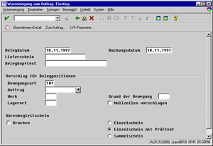
Nonetheless, I would like to revive this approach and pull an old design proposal of mine out of the drawer. It was too difficult to realize technically when I came up with it in 1998. I suggested adding an "explanation overlay" to critical screens, which can be turned on and off using a dedicated key (such as the Windows key; either used as a toggle key or as a switch – photographers will know this as "T" and "B"), and which does not prevent users from working with an application. Today, transparency has become commonplace and therefore, implementing an overlay screen should no longer face any technical obstacles. Overlays could either be delivered by the software manufacturer (which makes little sense in the case of ERP screens, which are typically customized at customers' sites), designed by consultants or system administrators, or even be created and modified by the users themselves. In a simple version, overlays could be designed with a text tool for writing and placing annotations. A more advanced version would also offer simple drawing tools like lines and arrows, brush and pen of different widths, and colors for all drawing and text elements – just like in a drawing or presentation program. With the advanced version, we would probably leave the realm of cognitive load theory and its statements on text explanations, because it also allows you to indicate dynamic aspects such as screen flow, dependencies between fields, or proposals for input values. See Figures 1 and 2 for an example of the original proposal:
 |
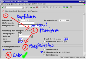 |
Figure 1-2: Original R/3 screen (left) and with overlay screen showing screen flow and suggestions for input values (right) (both screens from 1998 and in German)
All in all, overlay screens would support beginners and casual users, while experts could easily ignore or adapt them to their own purposes.
Of course, this proposal represents just one of many possible approaches to the beginners-experts issue, or the design for different user groups. It is a dynamic approach in that users need to activate the overlay (itself static), and it shifts the effort in the direction of the administrators and users once the technology has been provided by the software manufacturer. I did not apply for a patent in 1998, nor will I now, but I guess I am not the only one who came up with this idea.
Technical Note: My original proposal for an overlay screen was based on bitmap graphics. I created the prototypical screens in Adobe Photoshop using layers, drawing tools like brushes, and a small graphic tablet. A current version would instead use vector graphics, layered objects that can be freely arranged, and a number of useful drawing and text tools.
*) Note: For this article, I would like to broaden the term "figure" to "anything object-like on a screen that needs explanation." I assume that the implications of the cognitive load theory still hold, provided that the texts are simple descriptions and not, for example, content summaries.
References
- Wikipedia: Cognitive Load Theory
- Online Learning Lab (OLL), University of South Alabama: Cognitive Load Theory
October 10, 2012: Sushi Rolls and the Effects of Contiguity and Redundancy
In this UI Design Blink, I present a design principle that is based on a psychological effect – I will disclose its name below – and typically adhered to by designers. Sometimes it is violated, though, because of, for example, what I once called "careless design." At the end of this blink, I will show that there are even cases, where designers should violate it because of another psychological effect.
I would like to introduce the design principle by recounting a recent incident at my home. My wife and I were longing to eat sushi rolls for supper. Luckily, our desire could be satisfied because our refrigerator still contained a package of frozen sushi rolls, which we took out to thaw (note, however, that you need to do this in time...). I grabbed the empty package and looked at it to see what it had contained. The front boasted a large photo showing all 24 sushi rolls nicely set out on a plate. There was also a description of how many pieces of each roll type were the package contained (see Figures 1 and 2).

Figure 1: The complete package with a photo of the sushi rolls on the front and a separate description of how many sushi rolls of which type are in the package

Figure 2: The description of the package content enlarged (in German)
However, not being an expert in sushi rolls, I was unable to assign the names of the sushi rolls to the pictures (additional information like the quantities of the different roll types did not really help me because several types were provided in the same quantities). I told my wife about my failed attempt at identifying the rolls but she didn't believe me and just laughed at me. However, after she had tried to do this herself she had to admit that she couldn't work it out either.
What went wrong here – at least for people who are not experts in sushi rolls? The package designers did not observe a basic principle: They did not arrange the descriptions close to or on the pictures. Alternatively, they could have placed the names around the picture and used lines or arrows to connect them to the samples in the photo. Either way I would have known immediately how each sushi roll type looks. Just to illustrate this, here is a quick-and-dirty example of how this might look:

Figure 3: The package with added names to identify typical sushi rolls
Although violated in this example from daily-life, the principle of placing visual information and its description close together is usually common design practice, and I asked myself, "Which theory supports this practice and how does it justify it?" I faintly remembered that I had stored this principle in the innards of my brain as the "locality principle," but felt unsure about its background. However, when I searched the Web for this term, I mostly found references from computer science that have a completely different meaning. Then I remembered that a colleague of mine had recently held a presentation about cognitive load theory for our team. This theory is primarily applied to the design of instructional materials to make learning easier. My colleague had encountered this theory when she did research on online learning materials at university. She pointed out that it is also applicable to user interface design and, as my example above demonstrates, to any kind of information design.
I searched the Web for references to the cognitive load theory, and learned that it basically "starts from the idea that our working memory is limited with respect to the amount of information it can hold, and the number of operations it can perform on that information" (from OLL, University of South Alabama). There, I also found a number of design implications of the theory. One of them is the contiguity effect*, which means that "people learn better when you place print words near corresponding graphics." Wow, I had finally found a name and a justification for the design principle that I, up to now, had understood only intuitively: The design principle of putting graphics and text close together is based on the contiguity effect postulated by the cognitive load theory.
However, as always, things are not as simple as they originally seemed to be. The cognitive load theory has another implication, called the redundancy effect*. It states that "simultaneous presentations of similar (redundant) content must be avoided. Avoid words as narrations and identical text with graphics" (from same source). This reads like a direct contradiction to the contiguity effect, but, as I also found out, is valid only for self-explanatory texts. Thus, with respect to the optimal placement of figures and associated text, designers are in a dilemma:
- If a figure is self-explanatory (here people are in an "expert" state), research data indicates that processing the additional text unnecessarily increases working memory load.
- If the text is essential to intelligibility (here
people are in a "learner" state), placing it on the figure
rather than separately will reduce the cognitive load associated with
searching for relations between the text and the figure
(both from OLL, adapted).
In the sushi rolls example above, my wife and I were definitely in the "learner" state, and we would have appreciated descriptions close to the pictures. As an example of the "expert" state, it is detrimental to our understanding if a presenter reads the text that is on his or her slides because the audience tends to compare spoken and written text and is thus distracted from understanding the content (one might say that the comparison activity reduces working memory capacity). Recently, I experienced such a case during a presentation myself and found the redundancy indeed distracting.
But how can designers know in advance in which state their target audience will be? Sometimes they are lucky enough to know this, but in general they don't. It looks as if there were no short answer to this question. Therefore, in a forthcoming UI Design Blink, I will take a closer look at how designers might deal with this dilemma.
*) Note: These terms were introduced by different researchers under different names using different, but related theories; often, however, both theories are mixed together in the literature. Here is an overview of the related theories and the names of the effects or principles in each theory:
| Researcher | Theory | Effect 1 | Effect 2 |
| John Sweller | Cognitive load theory | Split-attention effect / principle | Redundancy effect / principle |
| Richard E. Mayer | Cognitive theory of multimedia learning | Spatial/temporal contiguity effect / principle | Redundancy effect / principle |
| Remarks | Both theories are applied to multimedia learning | Mayer lists two different kinds of the contiguity effect | Note that for simple materials the redundancy effect is less prominent for experts |
Alternative:
| John Sweller | Richard E. Mayer | Remarks | |
| Theory | Cognitive load theory (CLT) | Cognitive theory of multimedia learning | Both theories are applied to multimedia learning |
| Effect 1 | Split-attention effect / principle | Spatial/temporal contiguity effect / principle | Mayer lists two different kinds of the contiguity effect |
| Effect 2 | Redundancy effect / principle | Redundancy effect / principle | Note that for simple materials the redundancy effect is negligible for experts |
References
- Wikipedia: Cognitive Load Theory
- Online Learning Lab (OLL), University of South Alabama: Cognitive Load Theory
September 14, 2012: Let the Graph Tell Us the Answer
This morning, a colleague of mine made me aware of Jeff Sauro's blog and provided me with a link to it. I soon learned that some other colleagues from our user research team also know Sauro and his blog articles on methodological topics. Therefore, I decided to add him to the SAP Design Guild people list and his blog to the list of design columns.
Then, I took the time for a quick look at Sauro's blog and scanned the titles of his articles. And indeed they deal with usability testing, heuristic evaluation, personas, and other method-related topics. Sauro's latest article, entitled Applying the Pareto Principle to the User Experience, attracted my attention in particular, because I felt that I had heard the name "Pareto" before, but I was not sure what it was about. An image showing "80/20" suggested that it is related to the 80/20 rule, called the "Pareto principle" by Joseph Juran, and this proved to be the case. However, for details on the Pareto distribution and principle, I would like to refer you to Sauro's article. In short, the generalized Pareto principle is often formulated as follows: Roughly 20% of the effort will generate 80% of the results.
The Pareto principle also applies to software. For example, when users are asked in usability tests what one thing they would improve about a Website or software, and these open-ended comments are converted into categories, the resulting frequency graph shows a Pareto distribution (see Figure 1 for an example). The same applies to formative usability testing where researchers are looking to find and fix usability problems. When researchers log which user encounters which problem in a user-by-problem matrix, this also results in a Pareto distribution. The graph in Figure 1 below, based on one in Sauro's article, shows the problems users encountered while trying to rent a car from an online service. The researchers observed 33 unique issues that were encountered a total of 181 times.
Sauro states that "nine problems (27%) account for 72% of all poor interactions", but I asked myself, "How can I see that in the graph?" I decided to play around with the data and to look for a graph that can answer this question easily. First I copied Sauro's graph into Photoshop, measured the pixel height of the columns, and put the data into an Excel spreadsheet. This allowed me to show you the Pareto distribution without the need to use Sauro's original graph (Figure 1):
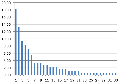
Figure 1: User-by-problem matrix showing a Pareto distribution (vertical axis: percentage of users, horizontal axis: usability problems by ID)
The first idea for an alternative visualization that came to my mind was to use a pie chart instead of a multiple bar chart (Figure 2):
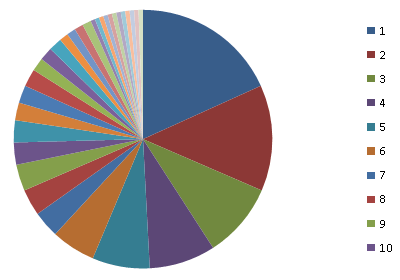
Figure 2: Pie chart illustrating how many problem encounters account for which fraction of the total number of encounters
The pie chart in Figure 2 illustrates roughly how many problem encounters account for which percentage of the total number of encounters – the whole pie represents 100% (or 181 encounters). I might have added a scale at the circumference to make the chart easier to read. I did not add any labels to the chart because I just wanted to illustrate the principle. At least, we can fairly easily recognize that four problems account for nearly 50% of all poor interactions.
However, the pie chart did not satisfy me fully, so I looked for a graph that is even better suited to answering my question – and similar ones. Finally, I ended up with a stacked bar chart that like the pie chart adds up to 100%. After some fiddling around with the Excel bar chart (I had to switch row/column), I arrived at this result (Figure 3):
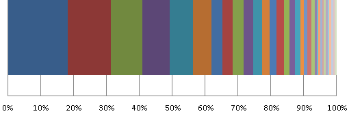
Figure 3: Stacked bar chart illustrating how many problem encounters account for which percentage of the total number of encounters
Of course, a simple line would serve the same purpose as the stacked bar chart, but the bar looks nicer in my opinion. Moreover, the stacked bar chart makes it easy to answer arbitrary questions like, "How many problems account for X% of the poor interactions?" Now it is easy to verify Sauro's statement that nine problems account for 72% of all poor interactions.
References
- Jeff Sauro (September 12, 2012): Applying the Pareto Principle to the User Experience
- Jeff Sauro's blog
September 12, 2012: Completing My Designing the User Interface Collection – at Least for the Time Being
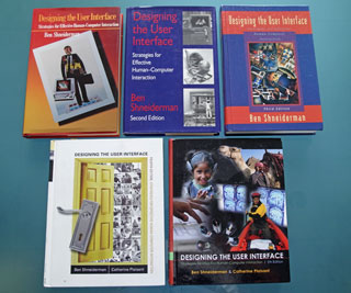
Yesterday, the postman finally delivered the first edition of Ben Shneiderman's classic textbook Designing the User Interface. This completed my Designing the User Interface collection – at least for the time being. I had ordered a used copy of the first edition from a book store, hoping that it would be the correct version. It did indeed turn out to be the first edition, but true collectors will probably be quick to point out that it is not the "real" first edition, because it is a reprint with corrections from November 1986 (copyrighted for 1987). Personally, however, I do not mind because I was interested in the content, not in having a collector's item. And the 1986 corrections are welcome. My collection now looks like this:
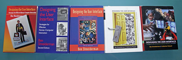
It was not easy to find the original publication date of the first edition. I searched Worldcat – Formats and Editions of Designing the User Interface and found several references to 1987 publications and one to a version from 1986; however, the respective link also leads to a 1987 version. Anyway, I thought that it would be a nice exercise to relate the publication dates of the editions (which span more than 20 years) to events in my own computer and usability history:
- First edition (1986/7): Moving from the command-language- and character-based TRS-80 computer (finally, a Model 4p) to a used original Macintosh 128k and thus, to the world of graphical user interfaces. From then on, I never programmed in assembler again.
- Second edition (1992/3): Moving from the university to SAP (1993). In 1992, I attended a usability workshop held by the German computer science society (GI) and I met some future SAP usability colleagues. In 1993, I started working in SAP's usability group and edited the R/3 Styleguide (see the guidelines archive on the SAP Design Guild).
- Third edition (1997/1998): "Enjoy" initiative at SAP (1998). It introduced the frog GUI and a new application design to R/3; SAP also cooperated with external consultants such as Karen Holtzblatt and Alan Cooper (see the Philosophy edition on the SAP Design Guild for details).
- Fourth edition (2004/2005): From User Productivity to SAP User Experience. Dan Rosenberg took on the leadership of the newly established SAP User Experience team in 2005 (until April 2012).
- Fifth edition (2009/2010): Tenth anniversary of the SAP Design Guild (2010)
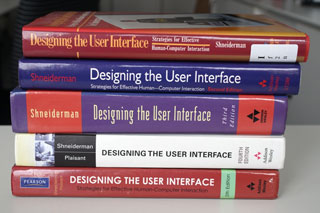
Here are two more views of my Designing the User Interface collection:
 |
 |
As already mentioned in Rounding Off My Designing the User Interface Collection four weeks ago, this addition to my collection will probably not be the last. I am convinced that Shneiderman and his co-authors are already busy with a sixth edition. Considering the intervals between the previous publications, which range from five to seven years, we should expect the sixth edition in 2014 or 2015. But only the authors know whether my prediction is correct...
P. S.: Ben Shneiderman suggested that I also look for an even older book of his, Software Psychology: Human Factors in Computer and Information Systems, from 1980 (at that time, I may have owned my very first microcomputer, a OHIO Superboard). However, it looks as if acquiring a copy of that book will be a challenge of some magnitude.
References
- Ben Shneiderman, Catherine Plaisant, Maxine Cohen & Steven Jacobs (2009). Designing the User Interface: Strategies for Effective Human-Computer Interaction (5th Edition). Pearson Addison-Wesley. ISBN-10: 0321537351, ISBN-13: 978-0321537355 1 • Review
- Ben Shneiderman & Catherine Plaisant (2004). Designing the User Interface (4th Edition). Pearson Addison-Wesley. ISBN: 0321200586 (Hardcover) • Review
- Worldcat – Formats and Editions of Designing the User Interface
September 1, 2012: Design Thinking, Interaction Design, and UI Design
When writing an SAP Design Guild article about Design Thinking, I hit on the question of how Design Thinking differs from other design disciplines, such as interaction design and my own domain, UI design (which regrettably and confusingly comes in many guises and has many names). Initially, I had planned to publish my thoughts and observations spurred by the question at the end of my article. But this would have made an already long article even longer. Not only for this reason but also to keep the more personal style of discussion, it is probably more appropriate to offer my thoughts and observations in the form of a UI Design Blink. I will start it with a prelude contrasting two somewhat oversimplified "archetypes" of interaction design and UI design.
Prelude: UI Design Versus Interaction Design
In several articles for the SAP Design Guild (see, for example, here), I have discussed the relationship between designing user interfaces for software* (UID, UxD) and the more general interaction design (IxD), which is more oriented toward designing physical artifacts (although software typically drives the artifacts). I have observed that many interaction designers still adhere to the model of the "genius designer" or "artist designer" and do not follow, or even reject, a user-centered design approach. A "prototypical" interaction designer might teach and work at an art school or university and, together with students, build exploratory artifacts that are meant to provoke or enlighten users and to stimulate critical thought.
Designers of user interfaces for software (UI designers, for short) on the other hand, have a strongly user-centered point of view. They feel and act as user advocates, and often follow a research-oriented approach in their work. User and task constraints are not the only constraints on their designs. On the one hand, international norms and UI guidelines, which are different for each platform and application, and at each company, limit their "creativity" severely. On the other hand, their designs are also confined to the options that the underlying technical platform makes available. All this makes me feel that working as a UI designer lies somewhere in the middle of a continuum between art (or design in the sense mentioned above) and science, specifically in the realms of craft or engineering, and leading to a mindset that definitely differs from that of a "real" designer.
*) Please note that some of the people who I would call UI designers call themselves interaction designers. In the end, everything is some sort of interaction design: In the case of the UI designers that I speak of, it is human-computer interaction (or computer-human interaction), while in the case of the "general" interaction designers it can be any kind of interaction between humans and designed artifacts.
Design Thinking Versus Other Design Approaches
Design Thinking brings the "designerly ways of working" from the world of design into the business world, and, as a general problem-solving approach, even to "any of life's situations." However, it differs from other design approaches by being user-centered and empirically-oriented: Design Thinkers observe users and their physical environments, confront them with prototypes, and feed the outcomes of their experiences back into the design. "Genius designers" would never do this; instead, they would confront or even provoke people directly with their designs. Some designers "throw" their designs at people and observe how they engage with the designs – they get empirical only "after the fact". Thus, Design Thinking seems to build a bridge between more "designerly ways of working" and more "user-oriented ways of working". Now, a natural question would be, "But what the heck is the difference between Design Thinking and UI design (or its siblings User Experience (UX) and User-Centered Design (UCD)) – aren't both user-centered?"
Design Thinking Versus UX/UCD
Many people do equate Design Thinking with User Experience or User-Centered Design. This is, in my view, an oversimplification. In some ways, Design Thinking is much broader in scope than UI design, which in the end is a highly specialized design discipline, yet in others it is much narrower in scope. By "broader in scope" I mean that Design Thinking is a general problem-solving methodology, which is particularly suited to generating a large number of new ideas. It can rightfully be regarded as a creativity method and as an approach to spurring innovation. Being a general problem-solving methodology, Design Thinking can not only be applied to the design domain itself, but also to any problem, particularly if it is ill-defined.
By "narrower in scope" I mean that Design Thinking by primarily being a creativity method cannot cover the wealth of methods and tools that UX/UCD has to offer in the course of the software development process. UX/UCD is based on the research discipline Human-Computer Interaction (HCI), which looks back at a history of developing empirical, user-oriented methods of more than 25 years. The methods used in UX/UCD form a mix of more scientifically-oriented tools and "best practices" that practitioners have developed in the field. Among these are tools that allow you to measure the ease of use and other characteristics of applications quantitatively and qualitatively. KPI studies, for example, provide reliable and reproducible numerical results that can be generalized over a wide range of software applications and also allow you to track improvements over time. Design Thinking methods, on the other hand, focus on spurring creativity and supporting experimentation, and not so much on providing "hard" results. But because Design Thinking is user-orientated, there is a natural overlap with UX/UCD methods, particularly early on in the design process when the problem is defined and later when ideas, that is, potential solutions, are tested by users (see also my SAP Design Guild article on Design Thinking for a side-by-side list of methods). .
This simple difference gives you some idea of the broader scope of UX/UCD: Several years of university study are required if you want to take up a UI-design-related profession, while Design Thinkers are trained in courses ranging from one day to one semester. One might say that the first is a profession, while the latter is a "mindset" – an important one, I would like to add.
Finally, while there is some overlap in UCD and Design Thinking methods, UX people approach the same problem very differently from designers: UCD people appear to be more serious, are method-oriented, and analytical, and are often perceived as the "design police" who spot design and guideline errors, while Design Thinking people are more playful and experimental, and highlight the "creative" aspects when looking for ideas – and in the end solutions.
Outlook
In the recent past, some designers have bemoaned the limitations of traditional HCI methods. The Internet and mobile devices have created new usage contexts, where "users" no longer seem to have goals or perform tasks (Janet H. Murray therefore speaks of "interactors"). Designers have to "go out into the wilds" to understand these contexts, but the methods currently available no longer fit. A more playful, creativity- and artifact-oriented approach like Design Thinking may come to the rescue and offer methods that are more appropriate in such "wild" contexts.
References
- DIS 2010 – A UI Design Practitioner's Report
- August 15, 2012: Users Don't Have Goals and Don't Do Tasks – Do They?
- Janet H. Murray (2012). Inventing the Medium – Principles of Interaction Design as a Cultural Practice. The MIT Press • ISBN-10: 0-262-01614-1, ISBN-13: 978-0-262-01614-8 • Review
August 16, 2012: Rounding Off My Designing the User Interface Collection
In my review of the fifth edition of Ben Sheiderman's classic textbook, Designing the User Interface, I wrote:
Three editions of the book are lying in front of me as I write this review (I hope to acquire the first and second editions one day). They demonstrate that this book is not only a standard in itself but also an interesting resource for investigations into the history and changing orientation of the user interface design field and community. However, such an investigation would require access to all five editions, because the changes between editions are subtle and each edition has been updated to accommodate the current UI design topics and trends.
Yesterday, I became one step closer to fulfilling my hope of acquiring all five editions of the textbook: The postman delivered the second edition. Here is the nice packaging:

And here is the story behind it: At the beginning of April 2012, a SAP Design Guild reader from Toronto, Canada, sent me an e-mail telling me that she had read the review and my remark in it. She wanted to give (or throw) away her copy of the second edition of Designing the User Interface and asked me whether I wanted it and would be able to figure out the easiest way she could get the book to me. I wanted it, indeed, but figuring out how to send it and pay for the postage took quite a while and a produced number of e-mails in both directions, interrupted by external events such as the UEFA EURO 2012 championship, which, of course, had absolute priority. But at the beginning of July, we had finally figured everything out, and the book could go on its long journey from Canada to Germany, which took nearly six weeks.
Thus, thanks to our Canadian reader, my current collection of "Shneidermans" looks like this:
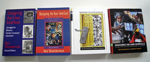
Now, I hope that, one day, someone will offer me the first edition to complete my collection. But I am probably right in assuming that Shneiderman and his co-authors are already eagerly working on a sixth edition...
P. S.: In the meantime, I also got a response from Ben Shneiderman. He pointed out that the first edition has become "something of a collectors item and historic document", and he expressed his hope that I can get one. He also suggested to hunt around himself to see if he has an extra copy. However, I have decided to order a used copy of the first edition from a book store – hopefully it will indeed be the correct version.
References
- Ben Shneiderman, Catherine Plaisant, Maxine Cohen & Steven Jacobs (2009). Designing the User Interface: Strategies for Effective Human-Computer Interaction (5th Edition). Pearson Addison-Wesley. ISBN-10: 0321537351, ISBN-13: 978-0321537355 1 • Review
- Ben Shneiderman & Catherine Plaisant (2004). Designing the User Interface (4th Edition). Pearson Addison-Wesley. ISBN: 0321200586 (Hardcover) • Review
August 15, 2012: Users Don't Have Goals and Don't Do Tasks – Do They?
At the Interaction 2012 conference in Dublin, Ireland, I attended two presentations that both questioned the traditional HCI notion that users – of software and devices – have goals and do tasks. I assume that both authors positioned their presentations as "mild provocations" toward the design audience. Actually, I did not feel provoked by the presentations, but somewhat confused. In this UI Design Blink, I will explain why and also propose a "way out" of the confusion.
Users Don't Have Goals
 Andrew
Hinton started his presentation, Users Don't Have Goals, with
a photo of his well-filled refrigerator (see the photo on the right for
a facsimile). Imagine that the "user" is standing in front of
the fridge and pondering what to eat. Hinton pointed out that, in this
context, he was not able to recognize any user goals. He contrasted this "goal-free" situation
with the HCI concepts and methods that have been developed and employed
for more than 25 years and are presented, for example, in famous books
such as The Psychology of Human-Computer Interaction, The
Design of Everyday Things, and About Face (see references below) – goals
and tasks are at the core of these publications.
I will skip Hinton's rant about traditional HCI and goals (see his public slides for details) and turn to his conclusions. There, Hinton admitted that sometimes users do have fully articulated goals. But he argued that designers should not start designing with that assumption. If, instead, they were to start by saying, "These users don't have goals... so how do I design for everything else?", he is convinced that "they would end up discovering contextual facets they would otherwise have missed, and that they would be satisfying more users than they would otherwise." Hinton also made an appeal for "designing for the fuzzy, desire-driven, pre-conscious, situationally complex area of people's lives, where our increasingly pervasive, ubiquitous, embedded products are available to people. ... It's where they are most relevant ... where desires and behaviors truly begin." I agree that this is an exciting and challenging new action field for designers, but I am not yet convinced that this has already become the core domain of my profession: the design of business software. Somewhat confused, I asked myself, "Should all designers now design 'goal-free'?" (Quotes taken from conference notes)
Real Users Don't Do Tasks
In her presentation, Real Users Don't Do Tasks: Rethinking User Research for the Social Web, Dana Chisnell took the same line when she questioned the usefulness of traditional HCI methods. However, he included an important restriction in the title: She referred to the social Web, not to typical desktop or even business applications. I wondered what she meant by "real users"? I assume that she was using this term to refer to the users that Hinton had in mind and who, indeed, far outnumber far the users of traditional software and of business software in particular.
 |
 |
 |
 |
Figure: The "holy" books of HCI that Hinton mentioned; Dana Chisnell's book is pictured on the right (in preparation)
Chisnell started her presentation by telling the audience that "the state of the art is a generation old" and that it is "time for a new generation of user research methods". She definitely knew what she was talking about, because she co-authored the second edition of the well-known Handbook of Usability Testing with Jeff Rubin (who wrote the first edition on his own). She added that "usability testing isn't telling us what we need to know for designing for social. ... People don't live in the world doing one task with one device out of context." I admit that in the business domain, we are lucky because usually the context is clearly defined, that is, the user's role, goals, and tasks as well as the business goal.
By the way, I heard similar arguments from Kia Höök in one of the keynotes at the INTERACT 2009 conference in Uppsala, Sweden. Höök talked about "going to the wild" and about pervasive games, a domain that is definitely very different from performing business tasks like processing a purchase order or even booking a flight on the Web (actually, pervasive games might even include such elements). Clearly, novel approaches and methods are needed to cope with open-ended domains, and, as the presenters pointed out, we are still at the beginning of developing the necessary methodology.
A Man of Straw?
These presentations were meant to create awareness but, in my opinion, they also built up a "man of straw". The "anti-goals-and-tasks" proponents made such universal claims that I felt confused and even irritated. Actually, I cannot discover any "real" contradictions. Yes, there are – in addition to the old scenarios – new, exciting, and challenging opportunities for designers. I agree to the message that when designers seize these opportunities and "go to the wild" or to "the complex area of people's lives" (or whatever label you wish to put on it), traditional HCI methods are no longer sufficient and novel approaches are needed. But this should not come as a surprise to us. On the other hand, I work for a company that develops business software, not pervasive games or social media. For these applications, starting from user goals and tasks still seems an appropriate and useful approach. Therefore, I do not agree that all of us should now dance around a new "golden calf". Nevertheless, it is a good idea to make designers aware of the limitations of the "goals and tasks" approach, because "times they are a-changin'" in the business world, too: business software is leaving the desktop and also "going to the wild" – which should be reason enough for UX people to check their methods inventory and prepare for the future.
A Way Out
Recently, I came across Janet H. Murray's textbook, Inventing the Medium, in which she criticizes the term "user" as being too limited for people who interact with digital media (which include software applications and mobile devices). She still refers to "users" when she talks about interactions that are based on the tool or machine model, as she calls it, because there the term "user" is established and useful. For all other contexts, she proposes the term "interactor" as "someone who is not so much using a device as acting within a system. Interactors focus their attention on a computer-controlled artifact, act upon it, and look for and interpret the responsive actions of the machine." She continues: "A user may be seeking to complete an immediate task; an interactor is engaged in a prolonged give and take with the machine which may be useful, exploratory, enlightening, emotionally moving, entertaining, personal, or impersonal. Interactors are also engaged with one another through the mediation of the machine, and with the larger social and cultural systems of which the automated task may only be one part."
When Murray states that "by designing for interactors rather than users we remind ourselves of the larger context of design beyond mere usefulness", she is not too far from Hinton's appeal for "designing for the fuzzy, ... , situationally complex area of people's lives."
While the term "interactor" may sound somewhat abstract and artificial, it might help avoid the confusion that the presentations described above – which are only examples – caused for me. The presentation titles would have immediately lost their provocative appeal if they had been phrased as Interactors Don't Have Goals and Interactors Don't Do Tasks, because they would have been more or less self-evident. All in all, I have come to the – hopefully universally accepted – conclusion that users have goals and do tasks, while interactors usually neither have goals nor do tasks. Designers should be aware of which group they are designing for – users or interactors.
Conclusion
In my opinion, the problem with statements like "users don't do tasks/don't have goals" lies in their absoluteness – probably as a reaction to the long-prevailing focus on goals and tasks. Users who have goals and do tasks may already have been outnumbered by the "interactors" of digital media, as Murray calls them, but they are still an important clientele – or fraction of "interactors" – whose needs UI designers have to address. And last but not least, designers of business software should also be prepared for new types of users – or interactors? – and scenarios in the future.
References
- Stuart Card, Thomas Moran, & Allen Newell (1983/86). The Psychology of Human-Computer Interaction. CRC • ISBN: 0898598591 (Paperback)
- Donald A. Norman (2002). The Design of Everyday Things. Basic Books • ISBN: 0465067107 (Paperback) • Review
- Alan Cooper, Robert M. Reimann, & Dave Cronin (2007). About Face 3.0: The Essentials of Interaction Design. John Wiley & Sons • ISBN: 0470084111 (Paperback) • Short presentation
- Andrew Hinton: Users Don't Have Goals (public slides)
- Dana Chisnell & Jeffrey Rubin (2008). Handbook of Usability Testing: How to Plan, Design, and Conduct Effective Tests (2nd ed.). Wiley • ISBN-10: 0470185481, ISBN-13: 978-0470185483 • Review
- Interaction 2012 – Again, a UI Design Practitioner's Report
- INTERACT 2009 – Research & Practice?
August 8, 2012: Now I Know What "Cloud" Means
This blink continues my reports on my experiences in the new mobile world. My experiences have also introduced me to a "world" that I have avoided up to now: The cloud and its specific incarnation, Apple's iCloud.
I got 5GB iCloud space for free for my new iPad. It allows me to synchronize my contact data, calendar, photos, documents, and more between my iPad and my other computers (actually, between any Apple computers). I decided to give the iCloud a try for my documents and contact data. For the latter, I use the Address Book application (called "Contacts" as of Mountain Lion). And indeed, thanks to the iCloud, my contact data from my laptop appeared on my iPad within seconds. I was amazed!
A few weeks later, I bought a new laptop – I had planned this acquisition for quite a while – and once again, my contact data appeared there with a blink of the eye (I chose to migrate my data manually because automatic migration via wireless connection would have taken between 120 and 150 hours). Again, I was impressed with how smoothly iCloud operated. The cloud approach began to look very attractive to me.
 |
 |
Now comes part two of my story. I have to admit that this part is not a success story – it is more of a "lessons learned" story. I wanted to sell my old laptop computer to one of my nieces and therefore deleted all of my programs and data, which took quite a while. Finally – it was already late at night – I deleted my contact data from the Address Book application, deleted my user account, shut down my old laptop, and waved good-bye to my trusty companion. (In retrospect, I do not know why I did it this way, because deleting my user account from the laptop might have automatically deleted all the contact data as well. It was probably because I am used to doing things in "orderly" fashion.)
I decided to relax a little before going to bed: I turned on my new laptop, and began to surf the Internet, when suddenly I got the urge to open the Address Book application. To my great dismay, all my contact data had vanished – thanks to the cloud, I immediately realized! I admit that shook me up then. Not only was my contact data lost, much worse was the fact that all of my personal access data for various Websites and the serial numbers of my software were also lost. Why? Because I had "misused" the Address Book application for storing this data as well. As a UI person, I know that some users "misuse" applications for purposes that designers do not think of – and now I was a "culprit" myself.
My last hope was that my iPad still held the data. I had turned it off in the evening and therefore hoped that the data had not yet been synchronized. But alas, when I finally managed to open the Contacts application, I once again stared at an empty address book – the cloud, or to be specific, iCloud, had been faster than me.
In hindsight, I of course "know" that I should have turned off the WiFi connection when deleting my contact data on my old laptop. But I hadn't been aware yet of what cloud synchronization means. Now I know what using the "cloud" can entail and will – hopefully – be more careful in the future.
 |
 |
There is a third part to my story. I would call it "partial success by accident". Long ago, I had installed Bento, a simple flat file database application, on my old laptop. I have never really used Bento, but updated it regularly. I also bought Bento for my iPad, because I thought I might perhaps need and use it one day. Older Bento versions provided direct access to the data in the Address Book application. The latest Bento version, however, imports the data from the Address Book application; it creates a copy of the original data and cuts the connection to it. This design change actually came to my rescue.
The following day, I found out that I had in fact imported the contact data to Bento, probably by playing around with the application on my iPad. As the new version of Bento cuts the connection to the original data, the data in Bento had not been deleted and was still there! Whew! I was deeply relieved! Using the Bento manual, I managed to export the data in CVS format, transfer the CVS file to my laptop, and finally import the data to Excel and Bento. They looked rather disorganized there, due to the many fields that the Address Book application uses internally. I therefore decided to create two new databases, one for the access data and one for the serial numbers, allowing me to streamline both databases for their specific purposes. Thus, I was not only able to restore my data thanks to a design change in Bento, I also finally found a use case for Bento: From now on, I will (have to) use Bento regularly to retrieve the personal data needed to log in to Websites!
Moral of the Story
The moral of this story is that modern life can be highly complex and that "knowing" about these complexities does not mean that we have internalized them and act accordingly. Only experiences like the one described here provide this awareness – at least for a short while. Secondly, sometimes the complexities interact with one another in intricate ways. This does not always cause even worse problems, rather, this can sometimes be our salvation.
July 20, 2012: Bridging the Gap Revisited – Are UI Patterns Removing the Mystery from Design?
During the Enjoy initiative at SAP (around 1999), I gave the Bridging the Gap presentation at the Enjoy forum. I did this in the hopes of helping designers and developers bridge the gap between specification and design, or, as I called it then, analysis and implementation. This "bridging" step has always seemed miraculous or mysterious to me, and I wanted to "demystify" (a hip word among designers at the moment) it at least a little. At that time, we collaborated with Cooper Interaction Design (today simply called Cooper), and we took the opportunity to ask them about the bridging "magic step". They more or less confirmed that some magic is indeed involved, and thus did not shed much light on the issue.
Several years later, I transformed my presentation into a guideline and offered it on the SAP Design Guild Website for a couple of years, until it seemed outdated to me. However, I was still fascinated by the mystery, and in 2009, I made another attempt to document my ideas about the "magic step". The results could be found in the Design Tidbits of the SAP Design Guild. They were broken down into a three-part article series called Bridging the Gap: From Structured Data to UI Designs. I introduced the series as follows:
In the user interface (UI) design field a gap still seems to exist between the requirements that have been gathered for guiding a design and the concrete design itself. For their part, designers' might be pressed to ask, "How can we derive a design from a requirements specification?"
Assuming that the requirements data had already been collected allowed me to look at what we have at our disposal and where we want to go before taking the "magic step". Only then can we focus on transforming of such a description into a UI design:
- On one side of the gulf (the description), we have items, such as user goals, task steps, links between tasks, task priorities, and the like.
- On the other side of the gulf (the design), there are computer screens filled with lots of controls that (should) relate to each other and to the users' actions in meaningful ways.
By the way, some people still seem to believe that UI design is just about putting controls on a screen, but even they have to admit that there must be a "system" behind all of this if the result is to be anything other than a random screen. I proposed mapping and structural (analogies) approaches as such a "system". In the context of this article, only the mapping approaches are of interest:
- Map to patterns (canned solutions)
- Map to elementary actions (abstraction)
- Map to existing solutions (imitation)
I recently came across the first and the second approach again while reading the "User Interface Patterns" chapter by Sonja Sander and Anke Richter (Siemens AG) in the book UX Best Practices (edited by Helmut Degen and Xiaowei Yuan), for which I wrote a review. The authors present a library of about 140 UI patterns that is used at Siemens Energy Automation in order to cope with a variety of issues: the mismatch of 800 developers versus three UX professionals, time pressure, budget cuts, and global distribution of team members. But it was not the UI pattern library itself that caught my attention, it was the way in which it is structured and how UI patterns are selected, namely based on user intentions and subintentions. Together, these lead the way to – competing – solutions, or UI patterns. This is illustrated by the following example taken from the book:
- Intentions are, for example: Viewing, changing view, selecting, editing, doing/executing, ...
- Subintentions for "Viewing" are: Computer status feedback, attracting attention, help and information, tabular data, charts, ...
- Competing solutions, that is, UI patterns, for "Viewing > attracting attention" are: Alarm summary, health indicator, critical event, limit violation, thermometer, quality codes, ...
Developers select appropriate UI patterns primarily based on "Use when" and "Do NOT use when" recommendations associated with the UI patterns.
If we concede that intentions lead to actions, we are not too far away from what I had called elementary actions or typical interaction patterns in my early papers. There, I had proposed a preliminary set of generic actions to which specific tasks could be mapped:
- Enter Data | Inspect Data (+ Compare Data) | Manipulate Data | Search | Browse | Select Data, Functions, or Options | Initiate Action(s) | Decide | Get Help
The example below, looking up a colleague's address, shows how you can use a table to map elementary actions:
| Screen or Screen Area |
Task-Specific Step |
Elementary Action |
|---|---|---|
Log-on screen |
Enter name and password |
Enter data |
Press "Log-on" button |
Initiate action |
|
--- Screen change --- |
||
Search area of screen |
Enter name of colleague using certain fields (for example, last name, first name, and so on) |
Enter data |
Hit list area below search area |
Scroll hit list and search for colleague |
Browse data |
Select line where colleague is displayed |
Select data |
|
Press "Details" button |
Initiate action |
|
Quit application |
Initiate action |
|
I have come to the conclusion that the authors' and my ideas are quite similar. The UI patterns library at Siemens Energy Automation and its structure seem to have removed to a large degree the mystery from the "magic step". And, as the authors point out, the library frees the department's UX people from overwhelming consulting work and allows them to focus on UI knowledge transfer and on the UI pattern library itself, which is a medium that entails concentrated UI knowledge instead of mysteries.
Returning to my ideas, all I need is design UI patterns – sometimes competing – for the elementary actions, as well as some "compound elementary actions". Then, developers can classify task steps into elementary actions or compounds and choose the appropriate associated UI patterns. And "poof!", the mystery has vanished for me, too.
P. S.: If you look at Andreas Hauser's article, Institutionalizing User Experience to Achieve Business Success, in the same book, you will find that the SAP Business ByDesign Suite also uses a pattern-based user interface with UI patterns that are designed to fit users tasks. In the design phase, generic user tasks are mapped to UI patterns. For more information, see the references below.
References
- Degen, H.; Yuan, X. W. (2011). UX Best Practices – How to Achieve More Impact with User Experience. McGraw-Hill Osborne Media • ISBN-10: 007175251X, ISBN-13: 978-0071752510 • Review
- Bridging the Gap – Part I • Part II • Part III
- Finding Common Ground...
- Introduction to User Interface Patterns at SAP
- User Interface Patterns • Components for User Interfaces
- The Promise of Using UI Patterns For Large Software Packages Revisited
July 3, 2012: Retrospect after Five Weeks of Owning an iPad
After five weeks of owning an Apple iPad, I think the time has come to give a first account of how I have used my new mobile device.
As I already mentioned in a previous Design Blink, First Encounters with Gestures – Viewing Photos, one driving force behind buying an iPad was my need to store large numbers of photos during vacations. I therefore spent the very first days of my life with an iPad finding out how to store photos on the device and, even more importantly, how to retrieve and store them on my laptop computer. So I began my iPad encounter by using it as a "media device" and I have to admit that this hasn't changed much since. I subsume surfing the Internet under this category, because one might rightfully denote this usage as "reading the Internet magazine." This is probably what I do most often at the iPad. I also watched a lot of TV on the iPad over the last few weeks because of UEFA EURO 2012. Now that the tournament has come to an end, though, my TV watching will decline rapidly. I also watched a few short videos, but I am not a video-watcher and will probably never download any movies onto the device.
Naturally, I used the iPad for viewing photos. Here the new retina display really shines. I also tried out the iPad's photo frame functionality, but I used it only rarely. Nevertheless, it does seem to offer an easy way of looking at my own myriads of photos. I did not make serious use of the inbuilt cameras to take photos and videos either. I just played around with them a little bit and created some fun portraits of me in the Photo Booth app. But that was it. Things that you do when you are too tired to do serious things...
 |
 |
 |
 |
Figures 1-2: Playing around with Photo Booth
I also used my new iPad to listen to music, although I have to say that the small loudspeaker cannot compete with good audio equipment (ear phones would be better, but then I would be "unavailable" to my wife). By the way, I was only able to listen to music after I had synchronized my iPad with iTunes on my laptop, where I store some music CDs and downloads. Synchronization also made electronic books available on the iPad (they need to be imported into iTunes). But before I was able to read them, I had to download the free iBooks application from Apple's App Store. This app was actually the first thing that I downloaded from there (or was it the iPad manual?). Because my electronic books are all in PDF format, they do not appear as "books" on the iBooks book shelf; they appear as PDFs, instead.
I did not play any games on the iPad. Actually, I rarely play games. But I suppose you could argue that downloading apps from Apple's App Store is a game. Usually, it is not very clear what you actually will end up with when you download an app, that is, whether it is really worth it. Other users' recommendations are not always helpful and sometimes contradict each other, but they may prevent you from downloading complete rubbish. During the past five weeks, I have downloaded nearly 20 apps. Some were free and some were not. The low prices sometimes quickened my buying decisions, which can be a dangerous thing at least for my budget. Among others, I downloaded the SAP EMR and SAP Business One apps, because I wanted to get an impression of what SAP applications look like in the mobile world.
To start with, I downloaded weather and astronomy apps, that is, things that I already use on my laptop computer. Then I moved on to photo-editing apps (iPhoto and Photoshop Touch) and, finally, to "productivity" applications like Pages, Keynote, Numbers, and even the Bento 4 database. I have to admit that Apple's business model was successful in my case: In addition to my existing Microsoft Office package, I also purchased the OS X applications for my Mac that I had purchased for the iPad but that were lacking a counterpart on my Mac. At the moment, however, I am still figuring out how I can send Office documents from the iPad to the Mac. I think I understand the basics now, though. All this involved searching the Internet and reading documentation. It was not as self-evident for me as I had expected. I still do not know how to get rid of apps (at least the free ones) that I downloaded from the App Store and that proved to be useless for my purposes. While working with the Office apps, I realized that – for serious work – I need the external keyboard that I purchased with the iPad. I cannot type efficiently on the onscreen keyboard and I sorely miss the cursor keys. I still have not found a way of pointing inside words to edit them. There probably isn't one.
To cut a long story short: Not totally unexpectedly, my mobile device– the iPad – has become something like a media player and surf combo for me. I assume that the results would be similar for an Android device or any other tablet computer. I have tinkered a little with counterparts of the applications that I use on my laptop, like photo-editing and Office software but, so far, I haven't really used them. Indeed, I suspect that I will never make real use of the photo-editing apps on my iPad.
May 31, 2012: First Encounters with Gestures – Viewing Photos
In this UI Design Blink, I will report on my first experiences with my new iPad3. Not surprisingly, they deal with gestures – and also, not too surprisingly either, with viewing photos on it. One of my primary reasons for buying the iPad was to store and view photos on it during our vacations – and we take lots of photos...
Before I was able to view any photos on the iPad, I had to transfer them to the device. So I connected the camera connection kit, which I had bought separately, to the iPad and entered an SD card into the card slot. This setup did not look like an elegant solution to me, but Apple's chief designer Jonathan Ive will know why it has to be done that way... My first attempt to transfer photos failed already at the third photo (and I was already regretting my purchase...), but further attempts on the next day were successful and provided hope. The day after, I also solved, thanks to the Internet, the mystery of transferring photos from the iPad to my laptop computer, which is essential for using the iPad as a storage medium during vacations. This cannot be done using file system commands; instead, I have to use an application on my laptop that I have never used before (alternatively, I can import the photos in Apple's various photo applications).
Now let me turn to the main topic of this article, viewing photos on the iPad using gestures. I have to admit that I had heard about a few gestures beforehand and was not completely naive when addressing this task (sorry, users don't do tasks, as I learned at a recent conference...). Therefore, I knew that you can tap once or twice, swipe a finger, and move two fingers closer together or farther apart. From the beginner's instructions at the Apple Store I also remembered the four- or five-finger pinch for returning to the home screen. Soon I was able to perform the basic functions that I needed in an image browser: move from one image to the other (backward and forward), zoom and rotate images, select images for a full screen view from a list of thumbnails, and return to the home menu. But, of course, I did not know what every possible gesture would do in the photo viewer.
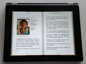 |
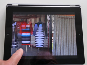 |
Figures 1-2: Book version of the iPad manual (left); swiping a finger to the left shows the next photo (right)
Then, I handed the iPad over to my wife to show her photos from our recent trip to Poland. She also managed to move from one photo to the next in both directions. However, from time to time, tool bars appeared on the screen and vanished again for unknown reasons. Sometimes, a "Copy" dialog came up, and my wife did neither know why it showed, nor what she should do, nor how she could get rid of it. All in all, my wife can be regarded as a nearly naive user who did not read the manual, which should hold true for the majority of iPad users and users of mobile devices in general.
I decided to take a look at the manual to solve these mysteries. It was available online or could be downloaded as a "book", requiring me to download the free iBooks app first. Reading the manual, I learned that a single tap shows and hides the toolbars that puzzled my wife. A double tap zooms the photo to full size and back again. Finally, pressing the screen a little bit longer opens the "Copy" dialog. Thus, some of my wife's "imprecise" gestures resulted in puzzling side-effects because they evoked unknown commands (my wife believed that she had swiped a finger...).
As a UI professional, I have, of course, some practice in dealing with such situations: I am used to checking a number of "plausible" gestures and observing their effects, although gestures may be imprecise and therefore not always lead to consistent results. And as already mentioned, I belong to the few people who still consult the manual. Although I find manuals boring these days and tend to use them less and less often (in contrast to decades ago), I am usually able to retrieve the information that gets me going (remembering this information is another matter, though...).
All in all, this initial exploration into gestures revealed what I more or less knew beforehand (as is often the case): Some gestures are intuitive, while others are not. A certain precision in executing gestures is also important – otherwise they may lead to surprising or even, puzzling results.
A colleague of mine told me that babies and even gorillas are able to work with tablet computers using gestures. But I would bet that they use a limited set of gestures – the obviously "intuitive" ones. Furthermore, while "learning by doing" was the main motto of this exploration, it also taught me that, despite all the proclaimed intuitiveness, consulting the manual is still a good idea.
May 30, 2012: Finally Adopting "Mobile" – The End of a Long-Term Refusal
Finally, "it" got me, or better, I got "it", namely the iPad3. For a long time, I had refused to use smart phones and tablet computers and to engage in gesture-based, mobile computing. Last weekend, however, my abstinence ended: I, too, have jumped on the bandwagon of mobile computing and come closer to social and cloud computing. Many people could never understand why I didn't want to participate in the recent developments of mobile and social computing after so many years of "spearheading" computing trends. Well, they can all relax now, because I'm – nearly – up to date again.
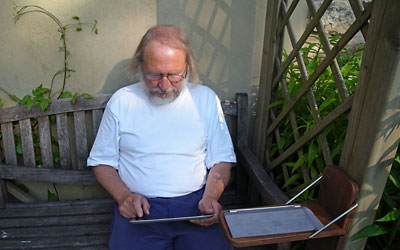
Figure 1: My first steps in doing less at more locations
I had many arguments or, better, excuses for not following the social and mobile computing trends. For example, I generally found discussions in social media boring and a lot of the information provided by "friends" pointless. It all just seemed like a waste of time to me. The same applied to the new mobile devices. With my laptop, I had reached a "plateau", where I was able to do everything I wanted and needed: write texts, crunch numbers, edit, store, and view photos, surf the Internet, play music, watch videos (although rarely...), and so much more. On a mobile device, I can do less, albeit at more locations. And, being a computer, a mobile device requires my attention in the same way as my laptop does: I have to organize its content, maintain the system, install updates, buy and install new apps, synchronize the mobile device with my laptop. The list goes on and on... Each additional device you own eats up another slice of your precious time. I decided that – for me – this wasn't worth it...
In retrospect, my refusal to use mobile devices – based on the argument that they would eat up my time and resources – may be related to my advanced age and to the fact that time is increasingly precious to me. In my thirties, I used computers as a medium for bold investigations into and explorations of the world of computing. I rarely "used" them for serious purposes, at least not on my own initiative. Over the years, however, this attitude changed gradually without my really noticing it. Eventually the day came when I realized that I was annoyed by cumbersome interactions, with requests to update my computer before I could start or continue my work, with slow and unpredictable response times, and with crashes that "destroyed" my work. What used to be challenges were now obstacles and annoyances.
There were a few things, though, that bothered me a little: The world of desktop computing had matured and, thus, become a little boring for me (for example, I rarely read the computer magazine I subscribe to...). I also realized that I had excluded a field of growing importance and relevance for a UI professional from my interests and thus felt that my professional competence was decreasing. I was no longer able to join in discussions or write articles on these "hot" topics.
Last weekend, I suddenly decided that this current and dreadful state of affairs had to come to an end. Because I could not "embrace" the new world of mobile computing in its entirety, I had to make a decision about which "toy" I would buy and use as a door-opener into the "brave new world" of mobile devices. As a long-time Apple user (since the first Macintosh 128k), I opted for the iPad3. Its highly praised retina display promised to present my photos more brilliantly than any other display in the world and helped me in making this decision.
Now that I am able to join in discussions on mobile devices and computing, I intend – starting with this UI Design Blink and as time permits and noteworthy issues show up – to report on my experiences in this "new" world. I will try to keep my reports as general as possible so that users of other platforms will profit from them as well. So, watch out for upcoming UI Design Blinks on mobile computing!
I would like to close this UI Design Blink with an initial observation. Gestures are said to be "intuitive" but I have already learned at conferences that this may not be completely true. Older people, for example, were reported to have more difficulties with gestures than younger ones, at least at the beginning. Like mouse actions, gestures encompass "cultural knowledge" that has to be acquired and consolidated. In a few years, the use of gestures may be obvious to us, but until then, we may well have similar experiences to the one I had when I turned on my first-ever Macintosh computer: I couldn't run applications or open folders because I didn't know that I had to double-click the icons. While certain interactions like pointing and clicking seem obvious, others are not (who knows about the triple-click?). The same applies to gestures: Pointing your finger at an object or wiping to the left or right may seem intuitive, but the meaning of a single or double tap in a certain context may not be and will have to be learned – and remembered.
April 18, 2012: Wearable Computing
At the recent "Interaction 2012" conference in Dublin, Ireland, I attended a keynote by Amber Case. Case calls herself a "cyborg anthropologist" (and user experience designer) and started her keynote with a definition of cyborgs: A cyborg is an organism "to which exogenous components have been added for the purpose of adapting to new ambient spaces". The Wikipedia definition of cyborgs is perhaps a little easier to understand: "A cyborg, short for cybernetic organism, is a being with both biological and artificial (e.g. electronic, mechanical or robotic) parts. Case presented Steve Mann (from MIT) as a prototypical example of a cyborg. . In 1981, he began wearing computers on his body to augment reality through a view-piece, called a "wearcam", strapped around his left eye (see Figure 1). According to Case, this may have been one of the first examples of an extension to our mental selves (but see Mann's history starting with wearable abacuses and wrist watches...).
Figure 1: Steve Mann in 1981 (photo of Amber Case's slides)
Case remarked that while technology has advanced since the 1980s, our perception of cyborgs is still influenced by the augmentation of the physical. Nevertheless, the progression of physical to mental augmentation is reflected in today's devices, which are unstable, change, and are proclaimed (by Mark Weiser and Don Norman, for example) to become invisible in the end. This is reflected in Steve Mann's "evolution" and his state today (see Figures 2-3):
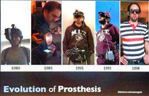 |
 |
Figures 2-3: The evolution of prosthesis, demonstrated by Steve Mann (photos of Amber Case's slides)
I tell this story here, because yesterday, Mads Soegaard, editor of the HCI encyclopedia at interaction-design.org, notified me of a new encyclopedia chapter written by Steve Mann entitled, Wearable Computing. "Oh, it's a small world", I said to myself...
I learned about wearable computing many years ago at the CHI 2002 conference, but at that time I thought it was just a flash in the pan. Shortly afterwards, the links to manufacturers of smart clothing no longer worked. And, admittedly, despite all the fuss about ubiquitous computing, I have not heard a great deal about wearable computing since.
Figure 4: Kevin Warwick appeared via QuickTime video and cell phone
At the CHI 2002 conference in Minneapolis, I also attended a remote interview with Kevin Warwick, who was then exploring transplants that connect the nervous system to electronic circuits, which command electronic devices. It was interesting for me to learn that Steve Mann includes both implantable and portable devices like smartphones in his definition of "wearable", or as he prefers to say, "bearable" or "body-borne" computing.
Once again, the encyclopedia chapter is accompanied by several commentaries. I would like to recommend reading the commentary by Woodrow and Jessica Barfield as an introduction to Mann's chapter. They write:
"Steve Mann has written a comprehensive and informative chapter on the general topic of wearable computing (which Steve describes as miniature body-borne computational and sensory devices). We use the phrase – "general topic" because Steve expands his discussion of wearable computing to include the more expansive term, "bearable" computing (essentially wearable computing technology that is on or in the body). In the chapter, Steve also discusses how wearable computers may be used to augment, mediate, or diminish reality. ... While much of Steve's current chapter is historical in content, he also discusses many of the wearable computing applications he has created, often with Steve's insight as to the rationale behind his inventions."
I could not have provided a better description. Finally, I would like to point you to some buzz words in the area of wearable computing that might help you extend your vocabulary:
- Augmented reality means to super-impose an extra layer on a real-world environment, thereby augmenting it. An "augmented reality" is thus a view of a physical, real-world environment whose elements are augmented by computer-generated sensory input such as sound, video, graphics or GPS data.
- Diminished reality is used in situations where it is appropriate to remove or diminish clutter. For example, visual reality can be re-drawn as a high-contrast cartoon-like world where lines and edges are made more bold and crisp and clear, thus being visible to a person with limited vision. Another situation in which diminished reality makes sense is to filter out unwanted advertising and reclaim that visual space for useful information.
- Mediated reality refers to a general framework for artificial modification of human perception by way of devices for augmenting, deliberately diminishing, and – more generally – for otherwise altering sensory input. Thus mediated reality is a proper superset of augmented reality.
- From logging to glogging... A by-product of wearable wireless webcam was the concept of lifeglogging, also known as cyborGLOGGING, glogging, lifelogging, lifecasting, or sousveillance (I do not give any guarantees for the correct spelling of these terms...). Sousveillance refers to the recording of an activity by a participant in the activity, typically by way of small wearable or portable personal technologies. Life(g)logging seems to extend logging to one's whole life.
Enough said. Now it's your turn to put on your glasses (if you need them and which, by the way, are a very old analog wearable computing device) and delve into Mann's chapter and the commentaries.
References
- interaction-design.org Website (HCI encyclopedia)
- Wearable Computing: www.interaction-design.org/encyclopedia/wearable_computing.html
- Definition of cyborg (Wikipedia)
- CHI 2002 – Changing the World, Changing Ourselves (SAP Design Guild)
March 27, 2012: Visual Aesthetics
When I was a student, a fellow student of architecture told me that he attended a lecture about "numeric aesthetics". I was surprised that such a topic existed at all and asked him to provide me with the lecture notes. When I looked at the notes, I was surprised again to encounter stuff that was familiar to me as a physics student: Numeric aesthetics has a lot in common with thermodynamics, and as I found out later, also with information theory (which made perfect sense to me). In my simple words, this approach was measuring order and disorder in visual scenes. This reminds me of my own behavior when placing objects on tables and shelves: I cannot stand when they lie around in an irregular, "chaotic" fashion (see the figures below).
 |
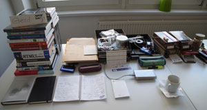 |
Figures 1-2: Chaotic vs. more orderly desk at work – I prefer the more orderly version on the right (lower entropy)
In his new HCI Encyclopedia chapter Visual Aesthetics, a term that refers to the "beauty or the pleasing appearance of things", Noam Tractinsky surveys the field of visual aesthetics in HCI and in the course of it also touches on the issue of measuring aesthetics in the context of interactive systems (and potentially providing guidelines or heuristics for creating aesthetically pleasing designs). Interestingly, this has been a research topic in the HCI domain for only about 15 years. Tractinsky actually co-established this research field within HCI, and in his chapter provides an overview of the current state of affairs. He discusses, among others, the following questions:
- What makes systems look aesthetic?
- What are the effects of visually aesthetic systems?
- What mechanisms are involved in people's judgment of aesthetics in the context of interactive systems?
The theme of my introduction to the new HCI encyclopedia chapter refers to the first question. One might be tempted to assume that formal, objective attributes of the visual scene determine people's aesthetic judgments. And indeed, according to Tractinsky, "some researchers argue for the prospect of identifying formal, objective, attributes that determine aesthetic judgment." These "will ultimately lead to automatic composition or checks of displays such as Web pages." However, as the third question suggests, formal attributes are only part of the story. Tractinsky cautions his readers that "this approach has been criticized on the grounds that aesthetic laws engrained in the object as 'universal' would not survive individual, cultural and context differences." He comes to the more pessimistic conclusion that "the problem of finding universal visual aesthetic guidelines and laws is further exacerbated in the field of HCI because of the variety of applications and products and the uniqueness of so many use contexts. In addition, the dynamic nature of contemporary society and fashion-like approach to the design of many interactive devices and applications make aesthetics a moving and often unpredictable target."
By the way, two of my colleagues at SAP User Experience are investigating this field, and they do it from the "objective" point of view: At the Mensch & Computer 2011 conference in Chemnitz, Germany, Chris Lafleur and Bernard Rummel won the Best Paper Award (Research Award) for their paper Predicting Perceived Screen Clutter By Feature Congestion. They had evaluated an algorithm which calculates a measure of visual clutter from screenshots, called feature congestion. In a nutshell, the algorithm predicts how hard it is for an item in a picture to stand out by its visual features so a viewer can actually find it.
Let me conclude this UI Design Blink with two interesting topics that I found in Tractinsky's chapter. Firstly, according to Tractinsky, research in HCI primarily views the value of visual aesthetics as a mediating force between perceived attributes of the product: For example, visual appeal has been demonstrated to have positive effects on perceived usability (particularly, in the case of low usability) and performance (Norman: "attractive things work better"). He concludes that "there is empirical evidence that aesthetic design of interactive technology increases users' pleasure and engagement. Consequently, we expect pleasurable interactions to make us happier and thus to improve our well-being. Furthermore, they may make us more tolerable of other design imperfections and improve our task performance under certain conditions." But before you rush to focus on visual design be warned: A closer look at the chapter reveals that the studies provide "mixed results" and that the preconditions of positive effects are largely unknown.
Secondly, Tractinsky discusses the "(dis)connect between designers and users", which in his opinion has yet to receive attention as a research topic in HCI. He writes: "In other design disciplines, studies have found significant differences in aesthetic evaluation between lay people and designers. In HCI such differences were found between designers and software engineering students in assessments of Website design trends. Similarly, authors found that the minimalist design recommendations for charts made by Tufte's (1983) influential critique of "chartjunk" practices do not resonate with people's actual preference of chart types." I assume that every designer has faced this disconnect in his or her professional life. I found that there is often a huge difference between what professionals like and what lay people prefer.
In this UI Design Blink, I picked only a tiny bit of what Tractinsky discusses in his HCI encyclopedia chapter about visual aesthetics, but I hope I have, once again, whetted readers' appetites. As always, the chapter is accompanied by a number of commentaries from researchers, regrettably not from design practitioners. Personally, I found the commentary by Alistair Sutcliffe most useful, and I also like Mark Hassenzahl's remarks about the aspect of authority in our aesthetic judgments. He states: "It is not an immediately perceivable inherent quality that distinguishes a design classic from any other object. It is the very fact that accepted authorities announce it to be a design classic – through exhibiting, reviewing, and giving away precious awards – which counts." Hassenzahl illustrates his remark with two striking examples, and I suggest that you read them in the HCI encyclopedia, because I will not disclose the punchline here... All in all, I think that this chapter is, once again, a useful read for HCI professionals. While Tractinsky's chapter focuses on research, I found unexpectedly many connections to my daily work in it.
References
- interaction-design.org Website (HCI encyclopedia)
- Visual Aesthetics: www.interaction-design.org/encyclopedia/visual_aesthetics.html
March 13, 2012: Context-Aware Computing and Activity Theory
This time, I would like to introduce two new HCI encyclopedia chapters, namely Victor Kaptelinin's chapter on Activity Theory and Albrecht Schmidt's chapter on Context-Aware Computing.
Introducing Albrecht Schmidt's chapter about context-aware computing looked like the easier task to me, so "easy" things first. Although the term itself might frighten people, context-aware systems are, as Schmidt points out, ubiquitous and therefore familiar to us. In his chapter, he presents simple examples of such systems and assures his readers that these already "outline the basic principle of a context-aware system". One of his examples is the exterior lighting of houses. Here, two sensors come into play which detect the state of the environment, more scientifically called "context": a light sensor for detecting darkness and a motion sensor for detecting moving people (which sometimes also detects the neighbors' cats or cars that pass by). When it is dark outside, the light switches on when it detects a movement, switches off again after a period of time if no more motion is detected. The system's "computing" is based on analog circuitry, or at least it could be – no "digital computing" is required.
Now it is my turn to find examples. A very simple and primitive context-aware system comes to mind: the light inside a refrigerator. It switches on when we open the fridge and off when we close it (at least we hope it is switched off). This is not even a "computing" system, but a mechanical one, including the "sensor". My laptop is another example of a context-aware system: It has several sensors that help it accommodate the state of its environment. One of them detects when I close the lid to send the laptop into sleep mode. When I open the lid, the laptop wakes up again (well, most of the time anyway). This sounds like another fridge door example, but the "lid behavior" is "computed" and actually more complex: When the lid is closed and I connect a second monitor and a power supply to the laptop (see Figure 1), the laptop wakes up again to be used like a desktop computer (it took me quite a while to figure out how to get this to work).
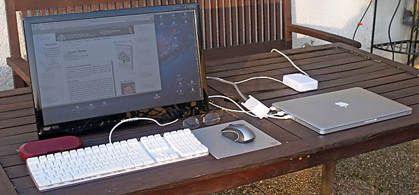
Figure 1: My laptop is an example of a context-aware system – although the lid is closed, the laptop is "awake", because a monitor and a power supply are connected to it
And then there are zillions of so-called location-aware systems such as trip computers for cars, bicycles, and even walkers that use GPS data and other information sources. Everyone seems to have one – except me. Just mentioning these devices should therefore suffice. To sum up, context-aware computing basically is about a couple of sensors connected to a device plus some algorithms to process the sensors' data. That's how I will explain it to my family and friends. But you as a reader of this UI Design Blink should now be ready and eager to digest Schmidt's chapter. You will find out that there is a lot more to context-aware computing than I have mentioned so far: for example, (hierarchical) feature spaces, the User-Context Perception Model (UCPM), the notion of an awareness mismatch, and a lot more. You will also learn that designing context-aware systems is a difficult task. Some systems work flawlessly – while others fail miserably… Moreover, UI design becomes much more complex than in the good old days of desktop computing because you have to design for multiple usage contexts and to decide effectively (depending on location, time, movement, presence and many more factors) which context is present and when.
Now to the second chapter, namely Victor Kaptelinin's chapter Activity Theory. Mads Soegaard from interaction-design.org and editor of the HCI encyclopedia announced to me with the words "We're happy to give you and your readers at your UI Design Blinks blog some real brain gymnastics". He was right and after having read parts of the chapter, I wrote to Mads: "I am just trying to read the Activity Theory chapter. Hard stuff for me as a physicist! I have problems when people "formalize" vague ideas... I need well founded mathematical formulas or algorithms to understand the effects... And sometimes, I would call the effects of the "object" on the "subject" simply learning... Have to read on…" As a consolation, Mads replied: "I know exactly what you mean. I spent *ages* trying to understand activity theory. And I still don't fully understand it. But it keeps popping up everywhere and all the time, so I force myself to read up on it every once in a while. But yes, really complicated stuff." Oh dear, how can I explain such a theory to my wife and my friends?
First of all, when I try to talk with other people about my profession and the related scientific background, they tell me that they knew that all along and ask me why science only confirms what we already know. I believe this is the key to explaining, or better introducing, activity theory to other people: Tell them what they already know. Even Victor Kaptelinin states in his chapter: "Most people have an intuitive understanding of what activities are. Is there any need for a theory here?" So, what's the issue? One of the issues is probably how activity theory is presented. Kaptelinin states: "A common problem with interpreting Leontiev's [the original author of activity theory] texts is that they often reflect the unfolding logic of his conceptual explorations rather than provide a systematic overview of the logical structure of the framework as a whole." Together with Bonnie Nardi, he translated Leontiev's framework, as it is described in his texts, into a structured set of distinct principles, which can be found in his chapter. But I have to make it much simpler for my friends. Here is an attempt:
- People have various needs and thus engage in activities to satisfy their needs. For example, they want to process and improve their digital photos to show them to other people or just for their own satisfaction. For this purpose, they (have to) use tools like an image editing application on their computer. They struggle with the editor at first, but over time, they get used to it and even get better and better. They also learn to adapt the tool to their needs, for example, by personalizing its user interface or by writing scripts. In activity theory jargon, Kaptelinin describes this process in his chapter as follows: "Activities and their subjects mutually determine one another; or, more generally, activities are generative forces that transform both subjects and objects". For "ordinary" people, this transformation is something they are familiar with and that happens all the time – people who are engaged in activities learn to use their tools and thus are "transformed" by them, and they also "transform" their tools in multiple ways in the course of their activities, including using the tools in ways that the designers did not anticipate.
I am far from believing that I have even touched the gist of activity theory with this example, but perhaps it helps readers lose their fear of this theory and makes them curious about Kaptelinin's chapter – which is a precondition for reading it. Will this example also work for my wife? I will check this even if she doesn't not ask what my article is about.
References
- interaction-design.org Website (HCI encyclopedia)
- Activity Theory: www.interaction-design.org/encyclopedia/activity_theory.html
- Context-Aware Computing: www.interaction-design.org/encyclopedia/context-aware_computing.html
March 1, 2012: More Experiments with Skyline Graphs
My previous UI Design Blink about skyline graphs inspired a response and also a question from a reader. He sent me a 3D column chart and asked me my opinion about it. Because the graph contained the values for the columns, I was able to recreate the graph in Excel so that we are not confined to the original chart and its specific characteristics for the discussion here:
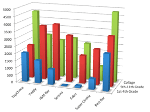 |
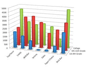 |
Figure 1-2: Two variants of 3D column charts for the same data set (created in Excel: Click images for larger versions)
One thing is obvious to me: It is hard to estimate the lengths of columns that are not located along the grids (of course, I could use a ruler, but that's not the intention of graphs). Comparisons are also difficult, partly because the columns start at different heights. The creators of the original graph indirectly conceded this point by adding values to the columns. That, however, made the graph even more illegible... At the end of the day, I still prefer the simple multiple column chart (see Figure 3) to its fancy siblings. And, with this chart type, there's no need to add numbers to the columns.
Figure 3: 2D multiple column chart using the same data (created in Excel: Click image for larger version)
You can find information about problems with charts in Recommendations for Charts and Graphics in the Goodies section on the SAP Design Guild Website ("Problems with Charts" page).
I then turned my attention to skyline graphs, although, based on what I already knew of the, I ran into a serious issue straight away: Namely, that you can only compare two data sets at a time. The example above, however, contains three data sets. Therefore, in my initial attempt, I took the obvious approach and created two skyline graphs – using the "College students" data as a measure of comparison:
 |
 |
Figure 4-5: Relative changes and skyline graphs for younger vs. college students (left) and older vs. college students (right) (click images for larger versions)
As always, it took me some time to get familiar with the skyline graphs. But, having overcome my initial state of confusion, I could easily see that the younger students eat a lot less chocolate than the college students, and that they more or less shun two particular brands. The older students, on the other hand, do not differ much in their overall chocolate consumption from the college students, but their preferences are different. They have also accepted the two brands that the younger students do not like...
And then I asked myself: "Why not combine the two skyline charts into one?" So, I now proudly present the first result of my own experiments (I have never encountered such a graph, but someone else has probably tried it somewhere already):
Figure 6: Combined skyline chart with college students as a reference (click image for larger version)
"Oh dear!" you might think, "What is this weird graph trying to tell me?" I will leave it to you to answer this question and to decide whether or not you like the graph. As a consolation, I will divulge one small secret: The blue-bordered boxes indicate the changes for the older students and the magenta-bordered boxes the changes for the younger students. I hope this helps at least a little...
References
- Bill Caemmerer's slides: www.slideshare.net/billcaemmerer/telling-the-data-comparison-story-using-a-skyline-graph-instead-of-two-pies
- Processing.org Website (Processing programming language): www.processing.org
- Recommendations for Charts and Graphics (SAP Design Guild)
February 21, 2012: Skyline Graphs – New Insights on the Horizon...
Sorry for the obvious title of this UI Design Blink, which was inspired by a paper presentation that I missed, entitled "Telling the Data Comparison Story Using A Skyline Graph (Instead of Two Pies)". Bill Caemmerer gave the presentation at the Interaction 2012 conference in Dublin in early February this year and introduced it with: "Just like every picture, every graph tells a story, or it should. Frequently the story we want to tell is a comparison to the past or to our plans, a 'what happened' story. Do we have the best tools to tell this story visually, in graphs?" He believes that traditional graphs do no tell the whole story and offers a new graph type that does – the skyline graph. While I had missed Caemmerer's message, a former colleague told me at the conference that he had attended the presentation and made me curious about skyline graphs. I searched for Caemmerer's slides and found them on the Internet. In the following I will briefly disclose what I have learned from them and from searching the Web. I will also present some results of my own programming exercises in skyline graphs using once again Processing, a programming language for designers.
The Starting Point
Let's assume that you have two sets of data and want to make a "Before-After" (or an "After-Before") comparison:
| Data | 1 |
2 |
3 |
4 |
5 |
6 |
| Before | 10 |
20 |
30 |
15 |
15 |
10 |
| After | 15 |
15 |
20 |
20 |
23 |
7 |
Table 1: Two data sets for comparison
The data in Table 1 might represent categorical item values, for example, the yearly spending for different budget items (for two different years). In this particular example, each data row totals to 100 so that the data might be treated as percentages, but this is not relevant here. This data can be presented visually, as the title of Caemmerer's presentation suggests, as two pie charts:
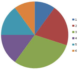 |
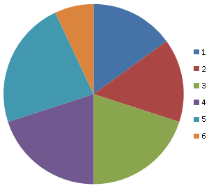 |
| Figure 1: "Before" pie chart (created in Excel) | Figure 2: "After" pie chart (created in Excel) |
It can also be presented using a horizontal bar graph with two columns for each item and each column representing one data row:
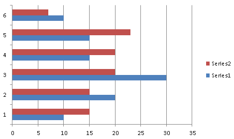
Figure 3: Bar graph with "Before" and "After" bars (created in Excel)
According to Caemmerer, and I agree completely, the following questions are hard to answer from these charts: Questions on...
- Relative changes ("Left shoe sales are up 15%")
- The biggest most important changes ("You spent $500 on what?!")
- Absolute changes ("Right shoe sales rose from 80% to 120%"; added by me)
A Proposal
Because these graph types do not "tell the story behind the data", we need a better graph that makes relative as well as absolute changes visible. Caemmerer regards a skyline as a good approach to this, and the following slide from his presentation illustrates the basic idea behind the skyline chart:

Figure 4: Deriving the idea of skyline graphs (from Caemmerer's slides)
The horizon provides a reference and standard of comparison (it can be the 0% or 100% percent line, depending on how you scale your data). Relative changes are made visible through the height of the buildings/bars relative to the horizon, while absolute changes are made visible through the areas of the buildings/bars.
I searched the Internet for further references to the skyline graph, and encountered the RENOIR Website from 2003 (University of Augsburg, Germany; it seems to have had only a short "active" life). There, I found some useful explanations (slightly modified by me):
- In skyline graphs the x-value represents the size of the item (so that the widths of the columns are no longer equal) and the relative change of each item is plotted on the y-axis. That is, relative changes are represented by the heights of the columns and absolute changes by their areas (= relative change x size).
- It is not the exact size of the absolute change that is interesting (areas cannot be compared as easily as heights), but the area should give you a rough idea of the importance of each change. The relative change is a good criterion for identifying successful items, but in order to get the most important change you have to take the absolute change into account. Both variables are important!
Explorations with Processing
Inspired by the RENOIR Website, I will now derive the skyline graph in three steps using my "old friend" Processing for programming the charts. My first chart (Figure 5) allows us to compare relative changes using height only – all the columns have the same width. The colors indicate positive (green) and negative (red) changes with regard to the "before" data (= 0%; I might have chosen to do this the other way round as well).
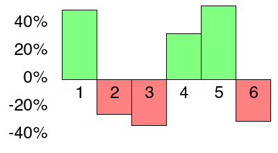
Figure 5: Graph indicating relative changes (relative to "before") (created with Processing)
In the second step (Figure 6), I also look at absolute changes, employing area (height x width) as an indicator. The red and green areas depict absolute changes, and the color and direction show whether the change was positive or negative with regard to the "Before" data. Again, the heights of the columns depict relative changes.
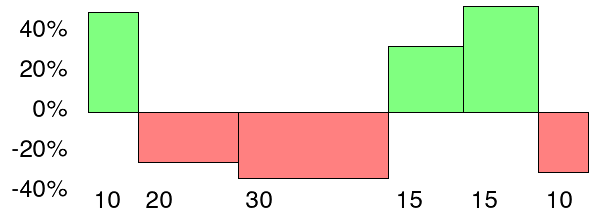
Figure 6: Skyline graph indicating relative (height) and absolute (areas) changes (relative to "before") (created with Processing)
In step three (Figure 7) I finally move from the RENOIR version of the skyline graph to Caemmerer's version by changing the standard of comparison from 0% to 100% and extending the columns down to 0% so that not only absolute changes but also absolute values are shown. The areas between 0% and 100% represent the absolute values of the "Before" data set. Like in the version above, red and green areas depict absolute changes, while the heights of the red and green columns depict relative changes.
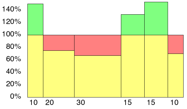
Figure 7: Skyline graph indicating also absolute values (areas
between 0% and 100%, "Before" = 100%) (created with Processing)
The chart in Figure 7 looks similar to one that Caemmerer presents in his slides ("Spending vs. Budget"). It may be a little bit confusing, though, that the "Before" data is represented either as yellow or as yellow+red columns, while the "After" data is represented either as yellow+green or yellow columns. Caemmerer uses different visualizations to solve this dilemma (see his slides). Although humans have more difficulties with comparing areas than with comparing heights, you can clearly see in the chart that large relative changes alone may not tell the whole story, because they can be connected with comparably small absolute and thus not so important changes.
There are many variations in the look of skyline graphs (see, for example, Caemmerer's slides) and many possible uses for them. This UI Design Blink was just meant as an appetizer for the readers. For more information, see the references below and search the Web.
Note: Above, I present charts that use the "Before" data as standard of comparison (100%). Click here to see charts for both "Before-After" and "After-Before" comparisons.
References
- Bill Caemmerer's slides: www.slideshare.net/billcaemmerer/telling-the-data-comparison-story-using-a-skyline-graph-instead-of-two-pies
- Coming soon: skylinechart.net
- Search online for: variable-width column charts, variwide charts, bar-mekko charts (www.mekkographics.com/chartfinder/Chart2.aspx), Marimekko charts
- Renoir: www.rosuda.org/Renoir
RENOIR is a project of the Department of Computer Oriented Statistics and Data Analysis (COSADA) at the University of Augsburg, Germany. It is an interactive tool for graphical portfolio-analysis focusing on changes between time periods, using skyline-plots. - Processing.org Website (Processing programming language): www.processing.org
February 15, 2012: Disruptive Innovation
Recently, Mads Soegaard, editor of the HCI encyclopedia, announced the new chapter Disruptive Innovation to me. He wrote: "We've hit a major milestone with our free educational materials: Our newest chapter is written by NY Times bestseller and Harvard professor Clayton Christensen."
Interestingly, I just returned from the "Interaction 2012" conference at Dublin, where Luke Williams held the opening keynote on disruptive design, entitled, "The Disruptive Age: Thriving in an Era of Constant Change". I assume that his keynote was more or less the essence of his new book "Disrupt: Think the Unthinkable to Spark Transformation in Your Business". The same is true for the new chapter by Christensen: It is based on his book "The Innovator's Solution", which was published in 2003 as the successor to his original book "The Innovator's Dilemma" from 1997. Therefore, and as Don Norman points out, many of the examples are already dated (Table 2 of the Appendix in particular). He leaves "the analysis of today's relevance of the companies to the points of the article as an exercise for the reader." This might indeed be an interesting and insightful exercise for the readers.
The new chapter is accompanied by commentaries from Don Norman, Mark Steen, and Paul Hekkert. For a change, I will not introduce the new chapter with Mads' ideas; instead, I will cite some of the commentaries (some of the emphasis is mine). Steen provides a very useful summary of the new chapter in his introduction:
- "Christensen discusses the concept of disruptive innovation in detail and with eloquence. He convincingly argues that most firms tend to focus on sustaining innovations-incrementally improving their products and services, aiming to serve the attractive higher end of their current customer base-and that they thus unintentionally, create opportunities for new entrants or new ventures of other firms. These new entrants or new ventures can introduce new products or services at the lower end of the market-offering a 'good enough' product for lower costs and for lower prices, serving people that are currently over-served (low-end disruptions), or offering 'good enough' products or services for new customers or new situations for consumption or usage (new-market disruptions). These new entrants or new ventures start at the lower end of a market and progressively move up through this market, and gradually conquer the established firms' businesses. Not by attacking them head-on, but by first taking a piece of the cake that nobody is really interested in, and then a next piece, and a next piece..."
- "In this chapter ..., Christensen adopts a business perspective and focuses on economics and market dynamics. But for those who feel less comfortable with such economic and commercial vocabulary, you may rest assured that disruptive innovation is also about empowerment and promoting development, freedom and well-being, and about promoting processes of design thinking, cooperation and creativity."
Thus, Steen found a niche that designers might be able to fill. Hekkert builds on this and points to the fact that the words "design" and "designer" do not appear in the new chapter (I found a few occurrences but these are not specifically related to the topic of "design"):
- "Designers talk a lot about innovation and every designer wants to be an innovator. Well, most... Christensen sketches a few trajectories along which a company can innovate and this is a great analysis for business people, managers, and decision makers, because he meticulously explains the conditions under which a disruptive innovation might fail and succeed. Since most companies (luckily) rely more and more on designers to drive this innovation process, he also shows designers where and how they can make a difference – if you read carefully."
- "Designers who just have a superficial knowledge of the innovation literature may be a bit puzzled. They may be familiar with the distinction between incremental – making existing stuff a little better ... – and radical or breakthrough – coming up with a completely new product type or category – innovation. Christensen proposes a completely different distinction between sustaining and disruptive innovations. Both can be incremental and both can be radical, it all depends on their effect on the established businesses and mainstream markets. And Christensen talks about companies, technology and the absorption capacity of customers. Design, or the designer, is non-existent in his scheme of things."
In the remainder of Hekkert's commentary, he investigates if he can fit designers in somewhere.
And then, there is the commentary by Norman, which is actually the first of the three. Since I already cited Norman above, I will close with just a remark from the end of his commentary:
- "Christensen's analyses are important and influential. I, myself, find them very compelling. But they are very difficult to apply. After reading Christensen's chapter I thought about each of the nine companies I am currently advising, attempting to see how the information in the chapter would be relevant. Some are small startups, but others are larger, including at least one of the largest companies in the world. In every single case I concluded that the company was different and didn't fit the mold. This was true even for the several companies that believe they are about to cause a major upheaval in product space. Yes, they might be disruptive, I concluded, but not in the sense described in these books for they were entering new territories where comparative products do not exist. Is my analysis correct? Only time will tell."
I hope that I have whetted the appetite of the readers to read the new chapter Disruptive Innovation and the three commentaries.
References
- interaction-design.org Website (HCI Encyclopedia)
- Disruptive Innovation: www.interaction-design.org/encyclopedia/disruptive_innovation.html
January 11, 2012: Affective Computing
Having returned from the holiday season, I found already a fresh e-mail in my inbox, in which Mads Soegaard, editor of the HCI encyclopedia at interaction-design.org, announced that they are preparing the publication of a new chapter, entitled Affective Computing, which took Kristina (or Kia for short) Höök from Stockholm University, Sweden, 18 months to write. The chapter includes four HD videos and four commentaries by notable designers, such as Rosalind Picard from MIT, whose presentation I attended at the CHI 2003 conference. I came across Kia Höök more often, particularly at Interact 2009 in Uppsala, Sweden, and at DIS 2010 in Aarhus, Denmark. At both conferences, she was a highly visible participant.
Mads sent me his thoughts about the new chapter - to which I have added a few words:
- Leisure-oriented applications, such as games, social computing, artistic tools, and tools for creativity seem to dominate the marketplace over traditional work-oriented software. As a consequence, we have to consider what constitutes an experience, how to deal with users' emotions, and understand aesthetic practices and experiences. I have to admit that this trend has only just begun in business software, SAP's home turf. But here, too, people are already talking about "gamification".
- According to popular prejudice, women embody "emotion" and "irrationality" whereas men embody "rationality" and "objectivity". As such, designing for emotions/affect stir up gender issues. Are women better designers of technology that uses emotion and affect? Of course, I do not have an answer to Mads' question, but at CHI 2003 I noted that most of the researchers in the "emotional design/affective computing" field were female. The only notable exception that I know of (which does not mean a lot...) is Don Norman who wrote the book Emotional Design.
- The pioneers of affective computing continually try to design products that can "sense" what the users feel when interacting and then adjust the actions of the product accordingly. The success of such products relies on how well the products can recognize people's emotional responses/states from people ’s behavior, physiological responses, and facial expressions. And that's actually what makes me shudder a little bit. I, for one, do not want my refrigerator to sense my emotions and then make respective recommendations regarding its content (for example: "Drink a beer to cool down.")...
Höök presents three approaches to research on emotions: "affective computing", "affective interaction" (which is the approach that she pursues), and "technology as experience". As the commentaries show, her view of the approaches may not be universally shared by other researchers. Therefore, I would like to encourage you to also read the commentaries on the chapter by Rosalind Picard, Paul Hekkert, Egon van den Broek, and Joyce Westerink. In particular, Picard, a pioneer and proponent of the "affective computing" approach, objects to Höök's view that "affective computing" is "cognitivistic".
References
- interaction-design.org Website (HCI Encyclopedia)
- Affective Computing: www.interaction-design.org/encyclopedia/affective_computing.html
Last Revision: 03/21/2014
Gerd Waloszek |
made by |

