
- DAU Stories
- UI Design Thoughts
- UI Design Issues
- ---
- UI Design Blinks 2013
- UI Design Blinks 2012
- UI Design Blinks 2011
- UI Design Blinks 2010
Clicking is Easy – As Long as You Know Where to Click and How...
By Gerd Waloszek
To overview of UI Design Thoughts
Recently, the new iPod touch was presented (see figure 1). As the Apple Website was busy, I downloaded the video, which demonstrates all the new features, and watched it offline. The basic message of the video was: The iPod touch is easy to use – a click here, a click there, and you're done. Simply amazing – the presenter was hooked on the device! Considered that the iPod touch is so easy to use, would I donate one to my 83-years-old mother for browsing the Web and, for example, look for health information? That's very unlikely, because I do not believe that my mother will succeed with the iPod touch. There we have a discrepancy: From one perspective, performing tasks with a device or piece of software seems simple and easy – it requires just a few button presses or mouse clicks. On the other hand, however, there are a lot of people who still fail (or, as in the case of my mother, are assumed to fail...). In this article, I ask for the reasons why people nevertheless fail.

Figure 1: The Apple iPod touch (from Apple Website, modified)
Let me start with a software example. On the SAP Design Guild Website, wich I maintain, each guideline is "only two clicks away." That's even better than Jakob Nielsen's requirement of three clicks. Do people find guidelines on the site easily? Obviously not, as we painfully discovered. The users' failures relate to a number of factors, such as the terminology used and the location of links. For example, one colleague could not find the SAP Web guidelines, because she did not know that SAP called its Web applications "Internet Application Components" (or IACs). Other users did not expect to find guidelines behind the "Resources" tab.
In the old days, when cognitive modeling was "en vogue," tasks, such as finding guidelines, were modeled using rule-based systems like GOMS or production systems. And indeed, the rules for finding a guideline on the SAP Design Guild are fairly simple:
- Rule 1: Locate the "Resources" tab and click it
- Rule 2: Locate the link to the respective guideline and click it (you may have to scroll the page a little bit...)
The problem with these rules is that they describe ideal, error-free behavior. These models can be useful, particularly if you want to compare different procedures with respect to their efficiency or complexity. But the sad truth is that these rules completely neglect the complexity of the context into which a task is embedded. In other words, the procedure itself may indeed be simple, consisting of just a few clicks, but to find out where and what to click, and in which sequence or combination, may put up insurmountable barriers to users.
Sometimes, it looks as if there are no such barriers, for example, at software presentations. The presenter clicks here and there in the user interface and accomplishes the most complex tasks with ease – it's just like magic. I have become very skeptical of such presentations, though, particularly with respect to their significance regarding ease of use. Most computer tasks are easy if you know where and what to click – that's the power of direct manipulation. In real life, however, this knowledge – or better, the lack of it – may put up the barriers that prevent users from accomplishing their tasks. Again and again, users do not know where and what to click, because this is by no means obvious to them. They have to acquire this knowledge laboriously by repeatedly performing the task at the computer.
Hardware Examples
Next let me turn to a hardware example, the Apple iPod shuffle. As you may recall from another article, I recently got one as a present. Admittedly, I hesitated whether I should take it into operation, because I knew that I would have to transfer music from CDs to it using my computer (you see, I am getting old...). In the end, I succeeded, even though I initially suspected that the process would perturb my iTunes application... Now, let's take a closer look at the iPod shuffle: Its predominant control is a dial with a center button (see figure 2). This combi-control allows you to jump forward and backward between music titles, start and stop playing, and increase or lower the volume. At the bottom of the iPod, there are two more switches, not as easy to find as the dial, for changing between linear and random playing order and for switching the iPod on and off (see figure 3). So far so good, at least, as long I put my glasses on... But there are also quite a few "hidden" functions provided by these buttons. For example, when I press the center button for three times, I will restart the shuffle mode. As another example, I have to press the center button for three seconds in order to lock the buttons. Will I ever remember these functions? Probably not...

Figure 2: The Apple iPod shuffle and its front controls (from Apple Website, modified)
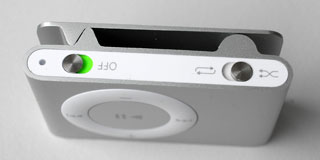
Figure 3 : The Apple iPod shuffle from below (photo by the author)
Luckily, these "hidden" functions are not essential for operating the iPod. But there are cases, where they are: For locking or unlocking the keypad of our mobile phone we have to press two special buttons in sequence (see figure 4). Both, my wife and me, always forget these buttons, because there is no indication of this function on the labels of the keys (I just learned that there is one on the display, once the phone is locked, but we overlooked that. And locking seems to be more important to me anyway...). This led to the result that my wife gave up using the phone, while I still try to find the buttons through trial-and-error...
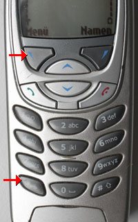
Figure 4: My mobile phone and the keys for locking or unlocking the keyboard (photo by the author)
Hidden functionality is, of course, not only a hardware issue, software may also suffer from this problem. For example, the Macintosh OS comes with barely any printed documentation (forget the online help system...). As a consequence, Mac magazines boast of "hidden secrets," particularly "unknown" or "undocumented" key combinations. These "tricks" are not essential for using the Mac, but they can improve efficiency considerably. Thus, hiding functionality may not only have an effect on the users' success or failure, but also on how efficiently they work. I must admit that I never collected these tips or tried to remember them. Hidden functionality contradicts my notion of an easy-to-use computer.
Affordances
Gradually, I have reached "difficult territory" in this article, because I am approaching the term "affordance." Probably, I would use this term in the wrong way. Therefore, let me state my point as simply as possible: Some controls, devices, or software applications clearly reveal their functions to the users, while others do not. If they don't, particularly if they provide essential functionality, a lot of users will get stuck and fail. Users may compensate for the intransparent user interface by learning the functions by heart, but this works only if they use the device or software on a regular basis.
Controls may not reveal their functions for a variety of reasons, some of the reasons have already been touched above:
- Text labels of buttons, links, tabs, menus, etc. are not understood by the users, for example, because the terms are alien or unusual to them (so they do not associate them with the function they want to perform)
- Icon labels are not understood by the users, for example, because the icons can mean a lot of things (or nothing) to the users
- There are no labels at all
- There are labels, but, as in the case of the mobile phone, these describe other functions than the needed one
- The controls (buttons, links, tabs, etc. cannot be found because they are hidden, for example, off-screen, or not recognizable as controls, for example, for design reasons...
- The controls (buttons, links, tabs, etc. cannot be found, because they are "buried" within their context – here we have a signal-noise problem
- And many more reasons, such as that some users do not want to put their glasses on...
In addition, as the mobile phone example shows, buttons may have to be pressed in certain sequences or combinations, which are not at all obvious to the users. These rules are even harder to remember and to discover (in the mobile phone example, this is on purpose to prevent accidental locking or unlocking). Similarly, software-based tasks often require long chains of simple actions for which there is no guidance in the user interface. Users typically follow some heuristics, such as processing goes from left to right and from top to bottom (for Western cultures). If these rules are violated, users run into severe problems.
Conclusion
All in all, the difference between users' success and failure can often be tracked down to the difference between a transparent and an intransparent user interface. In the case of devices, such as mp3 players or mobile phones, failures typically lead to the result that people are not using the device anymore after a while. With computers, the situation is similar and for parts of the population may be even more severe: For example, many elderly people avoid using computers altogether, because they do not want to fail and disgrace themselves. In addition, they often do not see any value in using computers, considered the effort needed to master them. What is needed are so-called "self-explaining" user interfaces, but we all know that these are often hard to design. Moreover, user interfaces are often intransparent for engineering, economic, or design reasons. The price users have to pay, is high, though: For many people it may mean not being able to use the device or application.
Originally Published: 09/07/2007 - Last Revision: 01/31/2009
|
Gerd Waloszek |
made by |