The Long, Long Dropdown List...
By Gerd Waloszek
To overview of UI Design Issues
There's a Beatles song called "The long and winding road." This time, I will discuss a design problem that reminds me of this song, namely the "long, long dropdown list." Most of us will probably have come across this phenomenon, particularly on the Web it is very common. Let's call it the VLDDL (very long dropdown list) to give it a name. Typically, VLDDLs appear in address data: For example, you want to order something in an online store and have to provide the country where you live using a VLDDL.
I found two variants of the VLDDL:
- Either an endless, non-scrolling dropdown list, or
- A list where the number of visible items is limited and where you have to scroll through the list. Scrolling a "transient" list is a hassle in itself, particularly, if you have problems with using the mouse.
After a short Web search, I could no longer find an example of the first type, although I found them often in the past (but see my addendum below). Maybe, this species is already extinct. Trying not to browse too far around, I found at least an example of the second type:
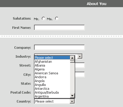
Figure 1: Scrollable, very long dropdown list on the contact page of a Website (page shortened)
At Amazon's Website, the dropdown list for selecting the country is very similar to the one above but they provide at least a default country, the United States. This most probable alternative makes life easier for a substantial fraction of the visitors:
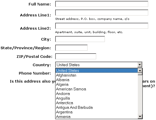
Figure 2: Scrollable, very long dropdown list on the Amazon Website with default value
You can use keyboard navigation to get closer to the desired item but, at least on Windows computers, you only can type the first letter. I also doubt that a lot of users know about this feature. Even fewer people may know that you need not even open a dropdown list. If the box has the focus, you can move within the list using the up and down arrow keys. As an example, for choosing Germany the best strategy is to press "G" and then three times the down arrow key.
What are my suggestions to this problem? Actually, I hope that you will send us some nice solutions. Therefore, I present only a few rash thoughts for your inspiration:
- "Adaptive" Dropdown List: Move the focus on the dropdown list, press the first letter. The list opens with a limited set of items only, namely all the items that start with the pressed letter. If no key is pressed the list will open with all items. With this solution, people will have to learn to use keys, and you need some scripting for implementing the feature.
- Hierarchical Dropdown List (actually, I hate hierarchical menus...): On the first level you may get, for example, the continents (or subcontinents), and on the second level on those countries that belong to it.
- Map Control: This control is an analogy to the calendar control. It opens a map, where users can select a country from. Keyboard users may enter letters and move the selection point that way: The selected and highlighted area narrows down, the more letters are entered. The map control might include an interactive zoom function: You might enlarge or downsize the region around the mouse pointer using the mouse wheel or arrow keys. In addition, the name of the currently selected country is shown as text.
As an example, here is a design proposal for a hierarchical dropdown list. I shortened the second-level list in order to avoid entering all African states. The second-level list should not be scrollable because that would be cumbersome to do with the mouse.

Figure 2: Design proposal for a hierarchical dropdown list
Probably, a good design solution may need more mouse clicks than a single, very long dropdown list does and also less "fiddling" with the mouse. Thus, the stage is set, and we are eagerly awaiting your design proposals!
Addendum
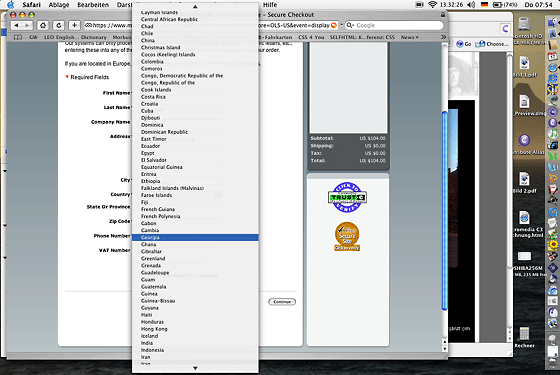
Finally, I found an example for a – nearly – endless dropdown listbox. Interestingly, its behavior dependens on the browser (or computer platform). Where did I find it? I found it on the Website of a company with some reputation, namely Macromedia, the creators of the famous Web tool Dreamweaver. When I wanted to preorder a copy of Macromedia Contribute 3 (to be out in September 2004) on my Macintosh using the Safari browser and select the country, I encountered the following screen:
Figure 3: Dropdown listbox stretching vertically over the whole screen (Macromedia Website, Safari browser on Mac OS X)
Interestingly, when repeating the ordering process with the Internet Explorer on a Windows XP computer, I got the following result:
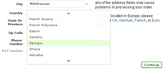 |
Figure 4: The same screen on a Windows computer
Actually, one might ask, which is the better solution – the list behind is of the same length...
PS: For those who took a closer look: Yes, Germany is missing on the list. Germans cannot order from the U.S. Website but have to use the German site, instead.
Addendum Two
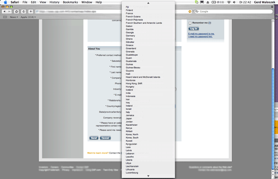
Nearly three years after the publication of the article, I encountered the following screen on the Apple Macintosh:
Figure 3a: Dropdown listbox stretching vertically over the whole screen (Safari browser on Mac OS X; slightly modified)
Once again, I checked the same screen using the Internet Explorer on a Windows XP computer:
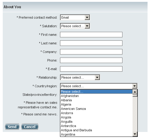 |
Figure 4a: The same screen on a Windows computer (slightly modified)
Scrolling such a long dropdown listbox isn't much fun, either...
Originally Published: 08/12/2004 - Last Revision: 02/01/2009
Gerd Waloszek |
made by |

