
- DAU Stories
- UI Design Thoughts
- UI Design Issues
- ---
- UI Design Blinks 2013
- UI Design Blinks 2012
- UI Design Blinks 2011
- UI Design Blinks 2010
Baby Hit Me One More Time
By Hendrik Achenbach
To overview of UI Design Issues
Going for a run in the lunch break is my favorite way of dealing with both the stress and the superfluous calories life imposes on me. The other day it was raining hard outside so I decided to try the running machine in the company gym again. As my eyes swept over the control panel (while running; putting it into motion with the QUICK START button was easy enough), I was instantly reminded of Gerd's column about everyday design problems. I am not a designer, but sometimes design problems are so obvious that even amateurs can spot them and identify potential for improvement.
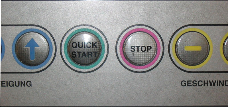
Figure 1: Detail showing the QUICK START and STOP buttons
As you can see in the photo above, there's a button labeled STOP right
next to the QUICK START button. Its function is to gradually decrease
the speed while displaying a blinking message that says: "Cool down".
It takes a minute or so before the machine comes to a halt, which is just
fine at the end of a run.
However, there's a second function to stop the
machine that could be called an "emergency stop". I've never
been in an emergency on a running machine, but I imagine the designers
thought about cases of "shoelace
caught in the moving parts of the machine" or "sudden dizziness
while running". Fair enough. I never tried this function, but it is
clear that its purpose must be to bring the machine to a halt as quickly
as possible.
However, the way in which the designers implemented the function will not be helpful in a case of emergency. Look at this picture before I explain why:
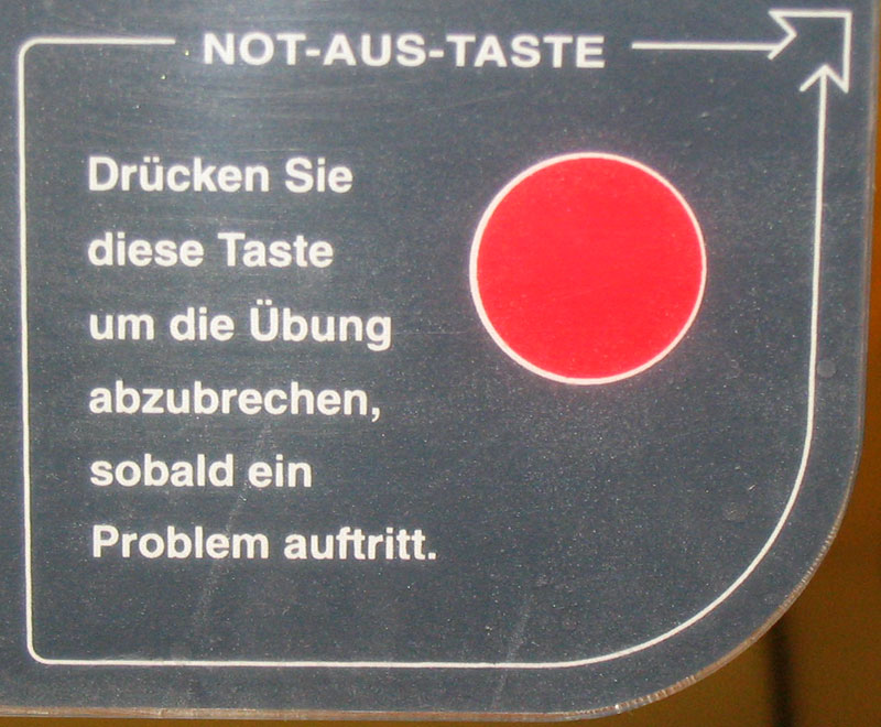
Figure 2: Detail of "Drücken Sie diese Taste ..." (Press this button to stop the exercise if there is a problem)
The picture shows a section of the control panel that contains a big red circle and some introductory text. The German roughly translates as:
EMERGENCY SWITCH OFF BUTTON
Press this button to stop the exercise if there is a problem.
The control panel of the machine uses this special kind of button that is almost completely flat (you only sense a vague "clicking" motion when pressing them). These are great for devices that need regular cleaning because you can cover them with a waterproof plastic coating cover so that no liquid or dirt can get in any cracks or spaces.
The problem is that you could think the red circle in the picture was one of them. This is not the case. It is just an illustration of the real button (like a figure in a piece of technical documentation) and thus part of the instructions on how to use the emergency stop function.
If you look at the picture again, you will see an arrow in the top right corner of the instructions. It points at the real button which has no label and is positioned as shown in the next picture:
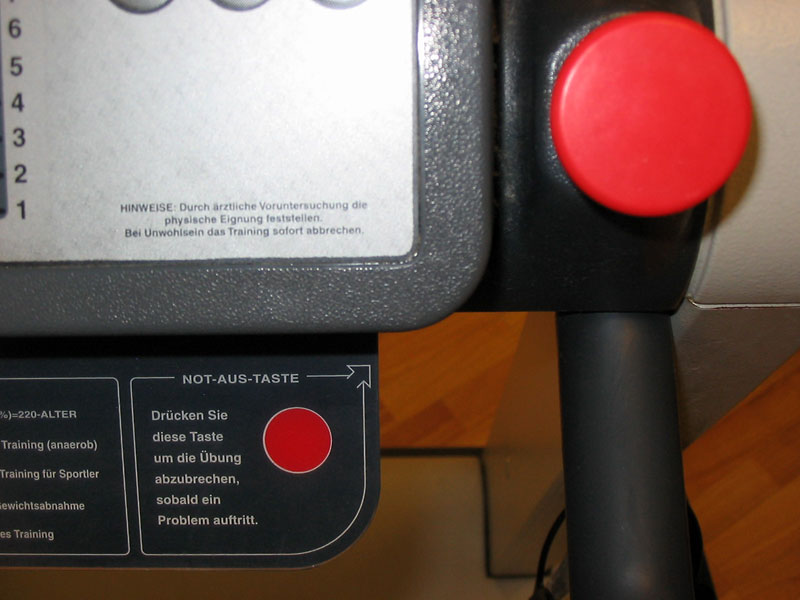
Figure 3: Instruction and the "real" emergency button
If you consider the use case for the emergency stop function – someone wanting to stop the machine as quickly as possible –, this machine has lots of design problems:
- A button that is labeled STOP although it does not stop the machine, it slows it down very slowly.
- A wordy explanation of what the real stop button is for. Should you ever need it, you will not have the time or inclination to read.
- This explanation is not located on or next to the button that you have to use to execute the function. It uses an arrow to point at the real button.
- The explanation uses a picture of the button as an illustration that can be mistaken for the real button. If you press it, nothing happens. Depending on the type of emergency, you might get only one chance to hit a button before falling off the machine. Too bad when you choose the picture instead of the real button.
- The explanation uses a demonstrative pronoun ("diese Taste" = "this button") which implies that the user already knows which button is referred to (before looking at the target the arrow points to).
- The explanation is in German only, but used in an environment where many potential users speak little or no German.
- The real emergency stop button has no label.
- The real emergency button is located where you won't be able to reach it when you are in danger of falling off the machine.
How could we improve the design?
- Change the label of the button that is labeled STOP to COOL DOWN, PHASE OUT or something similar.
- Get rid of the wordy explanation and the illustration of the button.
- Make the emergency stop button twice its original size so that you can hit it even when you are in a physical emergency (feeling dizzy, tripping, etc.)
- Use large black letters to label the emergency stop button with the one word that is widely understood to bring something to an end immediately: STOP.
- Install several identical emergency stop buttons on different parts of the machine.
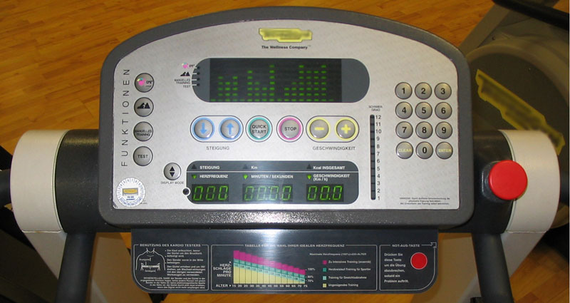
Figure 4: The complete control panel
It's true, when you look at the full control panel, you will realize that it did not take me very long to figure out what the problem was, so it cannot be that bad. But then I was in my relaxed lunch break run mode with lots of cognitive resources to pore over the design problem at hand. Any poor fellow getting himself into an emergency situation on the running machine will be grateful for some extra time to actually execute the stop function instead of reading unnecessary instructions on how to use it.
Originally Published: 03/12/2007 - Last Revision: 02/13/2009
|
Gerd Waloszek |
made by |